
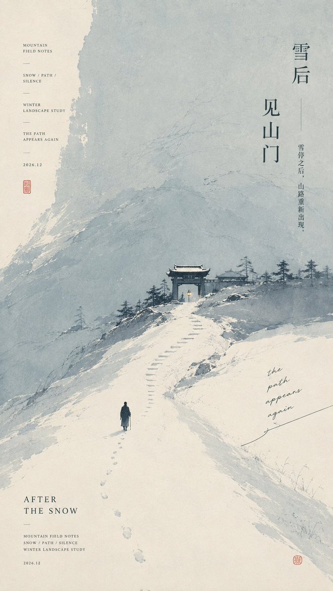
【Theme】: {fill in the work's theme} 【Main color field】: {e.g. terracotta red / sage green / deep indigo / ice-blue gray} 【Micro-landscape】: {e.g. riverbank / wetland / long bridge / mountain gate / coast / tea hill} 【Composition direction】: {horizontal / diagonal descent / upward extension / lateral intrusion / entry through negative space} 【Micro-narrative】: {small boat, figures, lights, pavilion, birds, boardwalk, etc.} 【Chinese inscription】: {write one short, original line} 【Aspect ratio】: 9:16 Generate a highly finished minimalist Oriental art exhibition poster that blends modern editorial design, the negative space of Eastern landscapes, abstract large color fields, paper-based art, and the look of independent publications. Use a clean, warm ivory-white art paper as the background, keeping a very light, delicate paper-fiber texture. Use a【main color field】occupying about 40%–55% of the frame to establish the main mood; the color block should carry the natural texture of gouache, mineral pigments, silkscreen and paper absorption, with irregular but clean edges and subtle density variation, water marks, brush strokes and exposed paper white inside, avoiding flat coverage and dirty textures. Add a set of tiny ink-black【micro-landscapes】: bridges, riverbanks, groves, wetlands, mountain gates, buildings or other distant structures related to the theme. Keep the landscape slim and restrained, building clear visual momentum through the【composition direction】, without forming huge black mountain masses. Place the【micro-narrative】within the landscape: figures, boats, buildings, lights, birds, etc., all kept very small, heightening the sense of story through the scale contrast of "large color field × micro-landscape × small narrative". The Chinese main title uses a tall, slim Song typeface or modern Ming typeface, arranged vertically, horizontally, in blocks or staggered according to the theme, so the text truly participates in the composition. Pair it with small serif English, a date, FIELD NOTES, location and theme keywords as micro editorial information, then add the【Chinese inscription】, a few natural handwritten notes and one tiny cinnabar-red seal. Each piece should redesign the color-field flow, landscape structure, reading path and micro-story according to the theme, not just swap color and title. Use horizontal spread, diagonal flow, wind field, vertical path, central valley or inverted negative space and other structures, keeping the series' unified visual language while giving each piece its own standalone character. Overall: from afar the large structure is clear and the color field has impact; up close one can find figures, buildings, paths, ripples, plants, lights, inscriptions and paper details. Minimal but not crude, spacious but not empty, rich but not cluttered. Avoid: template recoloring, simple rectangular color blocks, huge black mountains, ordinary travel illustration, screen-filling ink wash, excessive antique style, excessive aging, dirt, black dots, random cracks, heavy grain, AI gibberish text, UI cards, logo, watermark, image numbering, four-point starbursts and sparkles.