
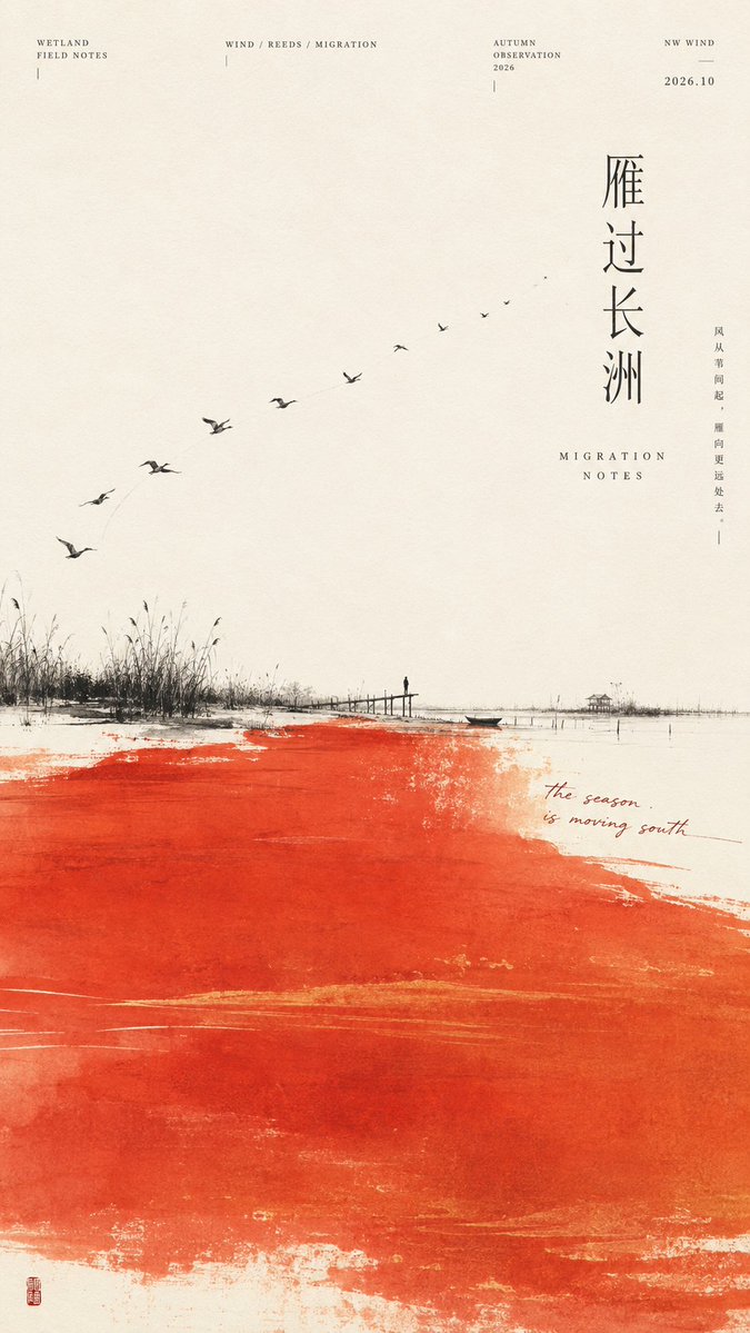
【Theme】: {fill in the work's theme} 【Main color field】: {cinnabar orange / indigo / mineral green / misty purple, etc.} 【Landscape】: {wetland / urban rooflines / bamboo grove / mountain gorge, etc.} 【Visual dynamic】: {migration arc / vertical rain curtain / diagonal wind field / bilateral framing, etc.} 【Micro-narrative】: {figures / flock of birds / small boat / suspension bridge / buildings, etc.} 【Chinese title】: {fill in} 【Chinese colophon】: {fill in a short sentence} 【Aspect ratio】: 9:16 Generate a highly finished Chinese-style minimalist contemporary art exhibition poster, fusing Oriental landscape negative space, modern editorial design, abstract large color fields, paper-based art, and the visual of independent publications. Use clean, warm ivory-white art paper as the background; a block of the 【main color field】 occupying about 40%–55% of the frame establishes the primary mood. The color field has the delicate texture of mineral pigments, gouache, silkscreen printing, and paper absorption, with natural, irregular edges, retaining faint brush marks, density variation, and paper whites inside, yet staying clean and intact, without dirtiness or random mottling. Add a low or partially cropped ink-black 【landscape】, and reorganize the composition according to the 【visual dynamic】. Create a clear sense of direction through flocks of birds, rain lines, wind paths, valleys, or bridges; do not copy the fixed template of "black horizontal line + color block below" in every image. Insert a very small 【micro-narrative】 within the landscape, using the scale contrast of "large color field × micro-landscape × tiny figure / tiny building" to increase spatial and narrative depth. Rich in detail but restrained: from afar you first see the color field and composition, up close you discover figures, paths, plants, buildings, and the micro-narrative. The Chinese main title uses a tall slim Song typeface or modern Ming typeface, preferring vertical layout, letting the text participate in the composition; paired with a little English serif, dates, FIELD NOTES, observation info, the 【Chinese colophon】, natural handwritten annotations, and a tiny cinnabar seal, forming a refined editorial information hierarchy. Overall requirements: clear macro-structure, rich micro-information, saturated yet restrained color, minimalist but not crude, spacious but not empty; each work redesigns the color-field form, landscape structure, and visual dynamic according to its theme, forming a unified series feel while maintaining each piece's independence. Avoid: crude flat fills, cheap vector feel, template recoloring, giant black mountains, ordinary travel illustration, overly antique style, excessive negative space, random cracks, dirty black dots, heavy grain, AI gibberish, UI cards, logos, watermarks, image numbering, four-point star flares, and sparkles.