
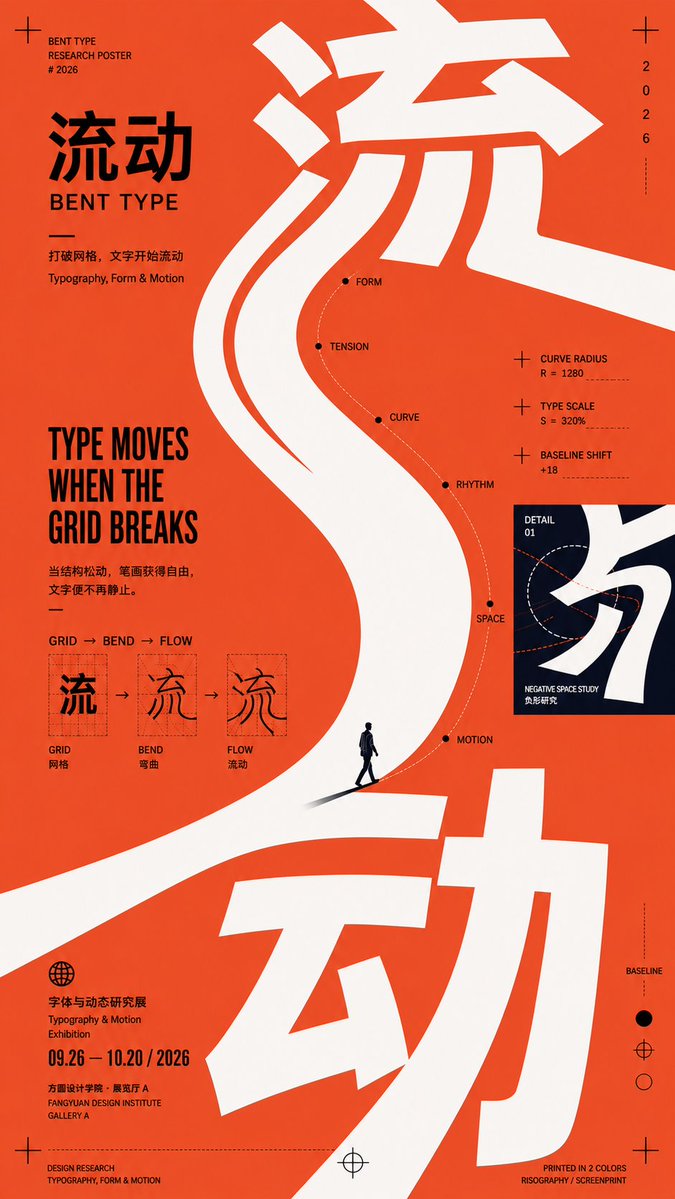
【Theme】: ____ 【Chinese title】: ____ 【English title】: ____ 【Main visual】: ____ 【Curved composition method】: large curved lettering / folded surface / spiral collage / curve linkage / other 【Auxiliary materials】: ____ 【Main color】: ____ 【Secondary color】: ____ 【Accent color】: ____ 【Aspect ratio】: 9:16 Generate a strongly design-driven curved-composition poster, using the visual language of Contemporary Editorial Poster × Postmodern Graphic Design × Cultural Exhibition Poster. First establish the single most important master curve, then organize the subject, typography, images, information, and white space around it. The curve is not decoration but the visual skeleton and reading path of the entire poster. Choose one primary curve method based on the content: Large curved lettering: let the large typography itself stretch, bend, be cropped, and break out of the frame, so the letterforms become the curved main visual. Folded surface: let paper, fabric, an architectural plane, or other bendable bodies form a huge curved surface, placing text, images, and information directly on it, curving naturally with the perspective. Spiral collage: use an open spiral path to link photos, tickets, text, figures, and small visual nodes, gradually guiding from the periphery to the core. Curve linkage: use a continuous S-shaped or arc-shaped master line running through several visual nodes of different scales, uniting scattered images, figures, and text into a complete narrative. Keep only one strongest curve direction across the whole poster; all other lines and elements may only follow or balance the master curve, creating no new visual competition. The main title must participate in the composition — it can be offset along the curve, cross zones, be cropped, partially covered, or change scale, rather than just sitting neatly at the top. The image may let 2–3 visual languages collide — photography, illustration, handwriting, color blocks, paper, tickets — but all materials must be organized around the same curved path, avoiding random sticker-style collage. Control a clear visual hierarchy: first the eye sees the master curve and main visual; second the large title; third it reads images and information along the curve path; last the date, location, and tiny auxiliary text. Keep large areas of effective white space, allowing asymmetry, cropping, scale imbalance, partial breaking out of the frame, and slight color-registration offset, giving the layout a loose yet orderly postmodern editorial design feel. Keep colors to 3–5 tones, using one large-area main color, one high-contrast color, and a few accent colors to build recognizability. Overall requirements: clear curve, eye-catching visuals, rich but not cluttered information, a hand-crafted typesetting feel, with the air of a design school and art publication.