
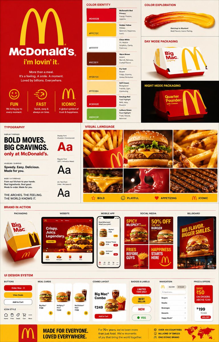
Create a premium creative-agency brand identity showcase poster for McDonald’s. Transform the brand’s unmistakable visual identity into a complete, polished brand system that feels vibrant, recognizable, energetic, playful, and globally iconic. Every visual decision in the poster — including colors, typography, shapes, lighting, textures, layouts, photography, packaging, and UI components — should clearly originate from McDonald’s visual language, especially its signature red and golden yellow palette, Golden Arches, playful fast-food culture, and appetite-driven aesthetic. Avoid generic corporate branding. The final composition should instantly feel like McDonald’s. Use a vertical 4:5 format with a dense editorial multi-grid composition. Make the poster feel layered, sophisticated, high-energy, and professionally art-directed, similar to a premium creative agency case-study presentation. Start with a strong brand introduction section featuring the McDonald’s logo and Golden Arches prominently. Include the recognizable “I’m Lovin’ It” slogan and communicate three core brand traits: Fun, Fast, and Iconic. Create a detailed color identity section showing the McDonald’s red, golden yellow, and white as the primary palette, supported by warm brown, fry-gold, soft cream, ketchup-inspired red, and food-highlight tones. Display large, modern color swatches with clear HEX codes and small labels identifying each color’s role, such as Primary, Accent, UI, or Food Highlight. Include visual explorations such as ketchup-to-mustard gradients, high-contrast food pairings, and conceptual day-mode and night-mode packaging treatments. Develop a typography section that demonstrates a bold, rounded commercial display style for headlines, a clean modern sans-serif for subheadings, and a friendly, highly readable typeface for body and UI text. The hierarchy should feel youthful, approachable, global, and instantly commercial. Create a visual-language mood board built around premium fast-food photography. Feature crispy golden fries, juicy burgers, melted cheese, toasted buns, grill marks, ketchup drips, and other crave-inducing food details. Use warm cinematic lighting, glossy highlights, subtle food textures, and rich close-up photography. Include approximately 4–6 visual tiles that feel like premium McDonald’s campaign imagery. Show how the identity translates across real-world brand touchpoints. Include realistic McDonald’s burger-box packaging with playful graphics, a desktop website hero featuring a large appetizing burger, a modern mobile ordering interface with combo meals, social-media campaign posts featuring promotions and limited-time offers, a minimal red-and-yellow business card, and a large outdoor billboard with an oversized burger and bold commercial typography. Finish with a UI design-system section demonstrating branded digital components such as “Order Now” and “View Deals” CTA buttons, meal cards, combo-meal layouts, promotional badges, pricing elements, navigation components, and food-ordering interface elements. Keep the UI bold, simple, friendly, and unmistakably connected to McDonald’s. Use strong grid alignment, clear visual hierarchy, layered panels, subtle shadows, realistic mockup presentation, premium editorial spacing, and polished art direction throughout. The final poster should look like a professionally designed creative-agency brand identity case study, energetic and contemporary while remaining unmistakably McDonald’s.