
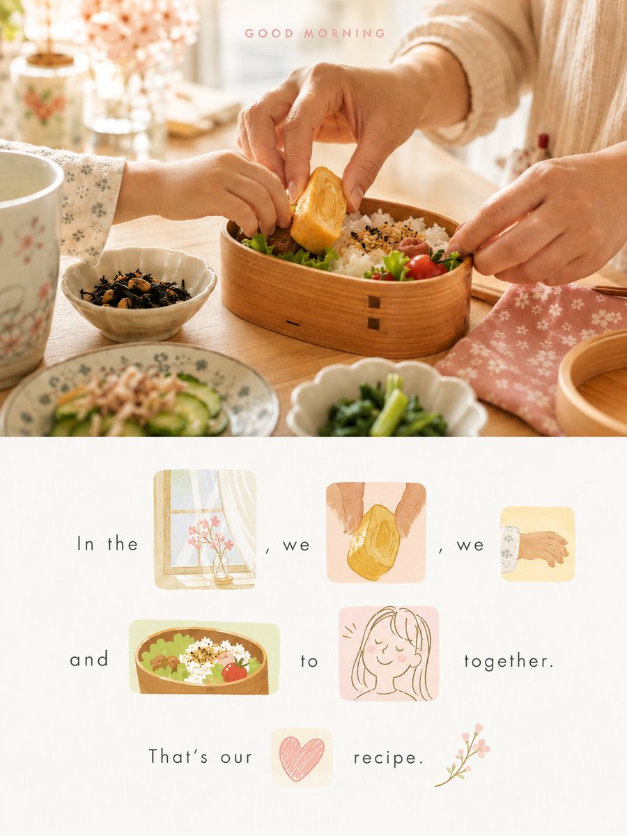
Turn each photo I upload into a separate, high-end design poster, no multi-image collage; output each photo individually. Use an overall 3:4 vertical composition, with the top and bottom areas strictly 1:1 in height, each occupying 50% of the frame. The top half keeps the original photo, preserving the subject's identity, structure, pose, real texture, natural light and shadow, and original color atmosphere, with only a slight high-end color grading, giving it the texture of an art magazine, independent publication, and exhibition image. To fit the frame, the environmental background can be naturally extended, but the subject must not be stretched, distorted, or altered. In the bottom half, do not fully replicate the photo, nor simply shrink the photo and redraw it; instead, extract from the original image the most memorable subject, actions, partial contours, objects, plants, architectural fragments, color relationships, and symbolic details, refining them into several visual elements with unified style conversion, which together with text form a rebus-style visual sentence. These images are not decorative illustrations but must truly replace words in the sentence; once a word is replaced by an image, that word must not be written again in the text. The full sentence can only be fully understood with "text + image" together. First, freely generate a short, imaginative sentence with slight poetry or an editorial feel, based on the emotion, action, relationship, place, memory, or metaphor of the photo itself; then select several nouns, action words, imagery words, or emotion words from the sentence most suitable for visualization and replace them directly with corresponding image elements. For example, flower, window, bird, tree, cup, sea, wind, lamp, road, waiting, passing, returning, dawn, etc., can all be carried by visual elements from the original image. The images must occupy the original position of the words, forming a truly continuous reading logic of "text → image-word → text → image-word → text", rather than a few small pictures beside a complete sentence. Each replaced "visual word" is placed within an independent small color block background, like a small clip cut from the memory of the original photo. Each color block can have different size, aspect ratio, and cropping method, and can be nearly square, a narrow horizontal strip, a tall vertical block, or a small irregular crop block; the blocks do not need uniform size but must have clear rhythm and hierarchy variation. The image in the block is not a screenshot of the original photo, but an artistic fragment redrawn in a unified language, retaining only the most recognizable contour, action, structure, and spirit, allowing parts to be cropped, showing only a portion, or naturally extending beyond the block's edge, making it more like a meaningful visual word than an ordinary small illustration. These visual elements are converted with a unified modern hand-drawn editorial illustration language: reconstructing the original image elements with simplified contours, summarized forms, a small amount of flat color blocks, and a slight handmade feel, avoiding excessive realism, complex volume, photographic texture, and mechanical copying. The images should retain the soul and recognizability of the original object but not pursue complete depiction, being more like a refined visual memory. The style can be light, clever, with a touch of design and art publication temperament, unifying and harmonizing all image-words. The color block background behind each visual word should come from the same set of soft color logic that is "fresh, bright, and pleasing to the eyes", but each block can have a different color. The colors are remixed from the brightest, most vivid, and most vital colors extracted from the photo above, not an average of colors. Overall increase the brightness and color purity, forming a softer, lighter, more approachable comprehensive color relationship, which can naturally be expressed as milk blue, lake teal, mint green, sprout green, cream yellow, peach pink, cherry-blossom pink, apricot orange, lavender purple, and other light, soft, bright hues. There can be slight jumps between blocks, but the whole must be unified, comfortable, translucent, and clean, giving a relaxed, pleasant, healing feel with a touch of girlish and Instagram aesthetic. Avoid dirty gray, dim, aged, heavy Morandi, fluorescent colors, cheap candy feel, and excessive contrast. The composition is organized around the "reading path of the sentence", and the bottom half overall should look like a page of visual poetry that can be read. Text and image-words can freely unfold in 2–4 lines, not requiring absolute alignment, but must have a clear, elegant, and natural reading rhythm. The size of image-words should vary according to semantic importance: some close to the size of an ordinary word, some moderately enlarged as visual pause points. Text, image-words, and color blocks should form an asymmetrical but stable editorial layout relationship through height staggering, density variation, slight misalignment, whitespace spacing, and baseline rhythm. Do not turn it into a sticker wall, card list, regular grid, or messy collage. The bottom half retains plenty of reasonable whitespace, letting the whitespace itself become an important part of breathing, rhythm, and refinement. The background uses near-white, off-white, or an extremely light pale base intelligently coordinated with the original image's overall color temperature, overall clean, quiet, and translucent. All image-words, text, and color blocks should float in ample whitespace, making the layout look like an art magazine, independent publication, visual poetry page, or experimental image-text work, rather than a commercial poster template. The text is not limited to one language; depending on the temperament of the original photo, you can freely choose Chinese, English, bilingual, or another language more suitable to the image context, but overall it should be concise, natural, and imaginative. The font should not use ordinary commercial title styles, but light, fresh, delicate thin text with a modern editorial feel and slight humanistic touch, with naturally relaxed letter spacing, ample whitespace, and restrained yet agile layout. Slight misalignment, line breaks, and rhythm variation can be allowed, making text and image-words coexist equally, together composing the image, without one side overpowering the other. The overall visual effect should present as: the top half is a real image, and the bottom half is a visual sentence composed of "text + image-words + colored blocks". It should look like an emotional short poem, memory fragment, and visual metaphor refined from the original photo, reorganized into a page of light, clever, fresh, healing, modern, design-rich artwork. The focus is not to explain what is in the photo, but to translate the most touching content of the original photo into an image-text language that can be read and also viewed. Avoid: using cropped original image directly as visual words, treating images merely as decorative illustrations beside text, keeping the full sentence without removing words but still adding images, sticker-wall feel, card-grid feel, commercial-template feel, feed layout, e-commerce feel, childish collage feel, messiness and disorder, dirty gray colors, cheap candy colors, excessive realism, complex backgrounds, mechanical fonts, and crowded layouts without whitespace.