
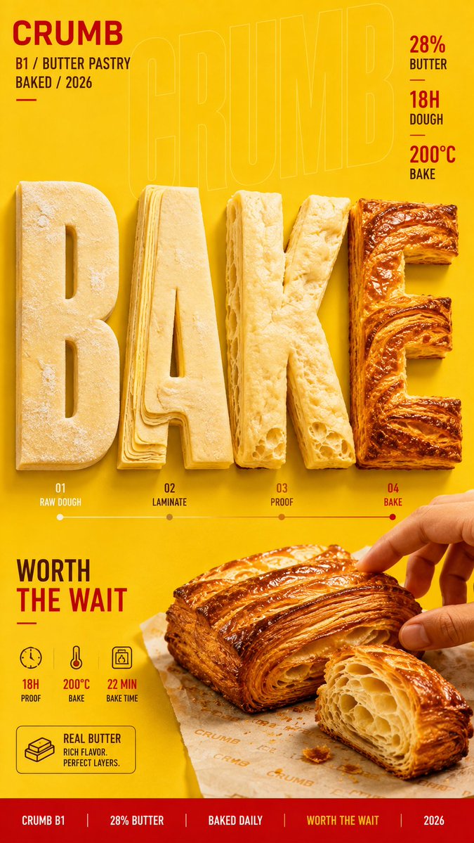
Brand: [BRAND NAME] Product / Campaign: [PRODUCT OR CAMPAIGN] Main Word: [SHORT WORD] Process: [RAW → STAGE 2 → STAGE 3 → FINISHED] Material / Subject: [DOUGH / CLAY / GLASS / PIGMENT / OTHER] Main Color: [COLOR] Accent Color: [COLOR] Campaign Details: [SLOGAN / SPECS / DATE] Aspect Ratio: [9:16] Create a bold editorial campaign poster where oversized typography becomes the process itself, showing how a material or product transforms from its raw state into the finished result. Make the main word extremely large, filling roughly 60–80% of the frame. Each part of the word should represent a different stage of the same continuous process. Keep the material consistent throughout the typography. Only its physical state, color, texture, volume, transparency, surface finish, or structure should change as the process progresses. For example, dough can move from raw to laminated, proofed, and baked; clay can move from wet material to shaping, trimming, and glazing; pigments can move from powder to mixing and final color. The transformation should feel visually clear and physically believable without turning the poster into a step-by-step infographic. Use only a small amount of meaningful labels, specifications, temperature, time, or material information where relevant. Connect the final stage of the typography directly to the featured product or finished result so the process feels complete. Use realistic commercial photography, bold high-contrast colors, strong material detail, clean editorial composition, and a clear visual hierarchy. The final image should feel like a finished commercial campaign key visual — colorful, tactile, process-driven, and visually complete.