
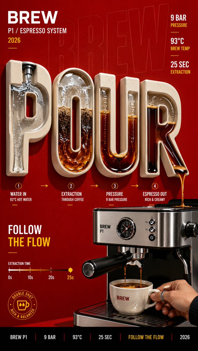
Brand: [BRAND NAME] Product / Campaign: [PRODUCT OR CAMPAIGN] Main Word: [SHORT WORD] Mechanism: [FLUID FLOW / POWER TRANSMISSION / OPTICAL PATH / MECHANICAL MOVEMENT / OTHER] Subject / Product: [PERSON / PRODUCT / BOTH] Main Color: [COLOR] Accent Color: [COLOR] Campaign Details: [SLOGAN / SPECS / DATE] Aspect Ratio: [9:16] Create a bold editorial campaign poster where oversized typography becomes a functional mechanism inside the composition. Make the main word extremely large, filling around 60–80% of the frame. Keep the typography clearly readable, but integrate a real working system inside or through the letters. The mechanism should follow one continuous and understandable path across the word. For example, liquid can flow through the letters, gears can transfer movement, chains can transmit power, or light can pass through lenses and prisms. Each part of the typography should have a clear function instead of using random mechanical details. Show realistic connections, materials, pressure, movement, reflections, shadows, and physical interaction so the system feels believable. Connect the typography directly to the featured product. The product should act as the source, input, output, or final result of the mechanism rather than sitting separately beside the text. Use realistic commercial photography, bold high-contrast colors, clean editorial composition, and a small amount of meaningful product information such as specs, callouts, labels, or a slogan. Keep the information organized and secondary to the main typography and product. The final image should feel like a finished commercial campaign key visual — bold, functional, colorful, precise, and visually complete.