
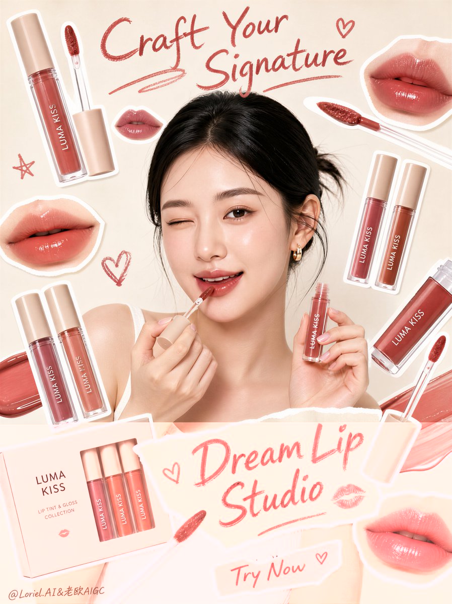
Create a premium beauty advertising poster for an original lip cosmetics brand named "LUMA KISS". Use a hybrid style that combines ultra-realistic beauty photography with clean scrapbook-style collage graphics and sticker-cut product composition. Preserve the exact structural logic of the image: a tall vertical social-media poster on a soft warm ivory background, one central young woman in a sleeveless white top as the main human figure, shown from the waist up, facing front, winking playfully while applying lip color with a doe-foot applicator to her lower lip and holding a small lip gloss tube in the other hand. Keep her as the emotional center, but make the lip products remain the primary commercial focus through quantity, placement, and clarity. Style lock: premium cosmetic social poster, beauty campaign collage, realistic model photography mixed with product cutout stickers, playful feminine scrapbook layout, soft neutral studio lighting, clean product-led composition, no 3D fantasy rendering, no painterly look, no style drift. Orbit logic: arrange every surrounding product and lip sticker so the eye circulates in a tight loop around the central lip-application moment. The path should move from the top handwritten title into the model’s wink, down to the applicator touching the lips, across the gloss tube in her raised hand, outward through the floating lip products and lip swatch stickers, then return inward toward the mouth again. All applicator tips, sticker angles, and product tilts must point back toward the lips as the core action center. Port logic: make the brand super-symbol the combination of a winking beauty muse applying lip color in the center while surrounded by floating lip-product stickers and lip swatches like a curated orbit. This central apply-and-surround composition must feel instantly ownable, playful, and recognizable across future campaigns, with the lips and applicator moment acting as the unmistakable identity anchor. Core composition: place the model in the center, surrounded by multiple cutout-style lip products and lip swatches arranged like sticker elements around her head, shoulders, and torso. Include oversized lip-shaped swatch stickers, several lip gloss tubes, several applicator wands, and one or two closed product packs distributed in a balanced radial layout around the central figure. Keep one handwritten headline area near the top, one torn-paper style title strip across the lower middle, and one very short CTA near the bottom only. Product design: design an original lip tint and gloss collection with soft beige or nude caps, transparent tubes, and warm rosy-brown, peach, coral, and cocoa shades. The products should look sleek, youthful, and premium but still approachable. Make the applicator tips visible and realistic, with creamy glossy pigment. The lip swatch stickers should show plump, softly glossy lips in flattering warm neutral tones. Model styling: adult female with natural anatomy, realistic skin, subtle pores, soft natural lips, clean brows, minimal fresh makeup, black hair center-parted and tied back neatly. Expression should feel playful, cute, and confident. One eye winks, the other looks toward camera. Hands and fingers must be anatomically correct, elegant, and natural. Lighting: soft frontal studio beauty light with gentle shadow falloff, bright even illumination, no harsh contrast, no muddy tones. Keep the background clean and matte, with enough depth to separate the model from the cutout stickers. Product tubes and gloss texture should catch clean soft highlights. Materials and realism: realistic glossy lip texture, transparent cosmetic tubes, creamy pigment on applicators, soft matte paper-like sticker borders, subtle torn paper texture on the title strip, natural skin detail, clean hair strands, and believable cosmetic packaging reflections. Keep all product edges crisp and ad-ready. Typography and graphic language: use playful handwritten lipstick-like lettering near the top and on the torn-paper strip, plus one ultra-short CTA near the bottom. Suggested original copy structure: top handwritten line: "Craft Your Signature" middle torn-paper title: "Dream Lip Studio" bottom CTA: "Try Now" All text must be original, stylish, feminine, and integrated into the same casual collage layout. Keep the bottom copy extremely short and light. Color strategy: dominant palette of warm ivory, blush pink, nude beige, soft coral, muted rose, cocoa brown, and a few lipstick-red handwritten accents. Keep the overall feeling clean, feminine, youthful, and commercially appealing. Art direction goals: product-first hierarchy, strong orbit flow, clear brand super-symbol, social-friendly beauty branding, playful cutout collage energy, premium but approachable cosmetics identity, clean layout, strong shelf appeal, no clutter, no copied text, no watermark, no black blotches. Negative prompt: copied headline, copied product text, messy layout, weak product focus, weak central lip action, distorted hands, extra fingers, malformed applicators, plastic skin, waxy lips, muddy nude colors, low-resolution packaging, unreadable labels, random props, heavy shadows, dirty background, poor sticker edges, messy typography, long bottom copy, cheap e-commerce look, AI artifacts.