
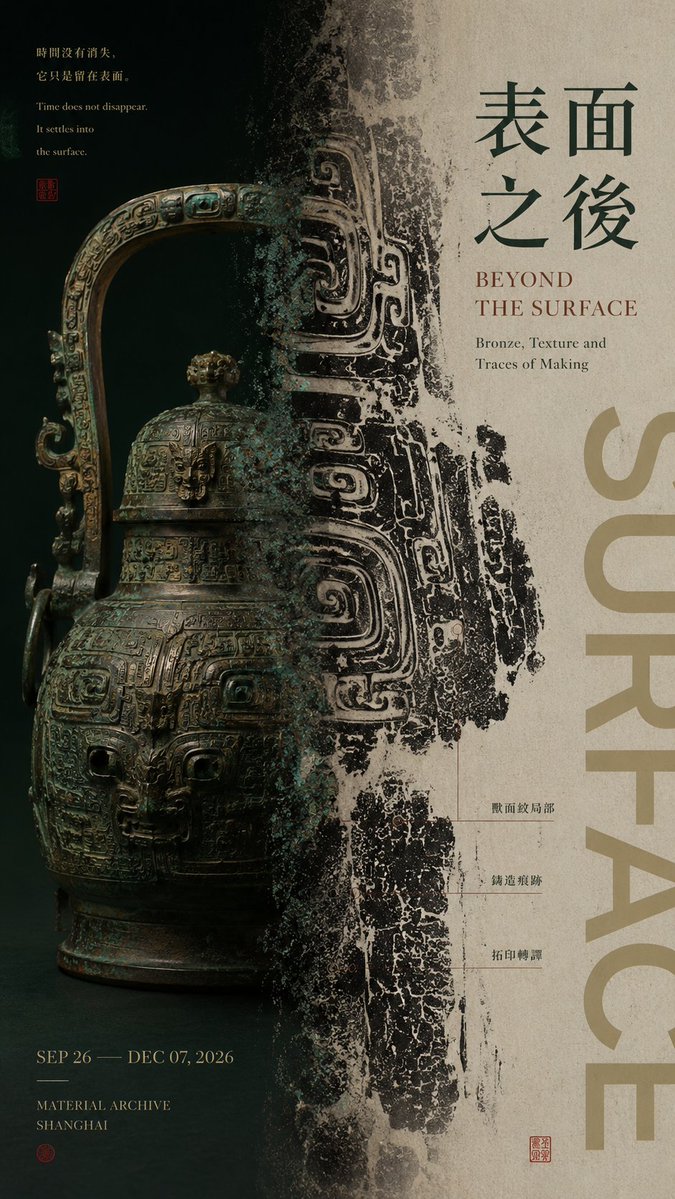
【Theme / Work title】:____ 【Left-side content】:____ 【Right-side content】:____ 【Left-right relationship】:whole and part / original and result / instant and extension / density and negative space / other 【Cross-zone connection method】:subject crossing the boundary / material translation / color extension / mist transition / motion trajectory / other 【Chinese title】:____ 【English title】:____ 【Main color】:____ 【Accent color】:____ 【Image ratio】:9:16 Generate a left-right composition poster with the quality of mature Editorial Graphic Design and exhibition visuals. The core is not to mechanically split the image into two equal halves, but to build two visual zones with different functions and different visual weights, yet with a clear relationship to each other. The left-right ratio should not be fixed at 50:50; depending on content, use unequal ratios such as 35:65, 40:60, 45:55, 60:40, balancing visual weight through subject size, color depth, information density, and negative space. The left and right sides should carry different visual tasks, for example: one side shows the complete subject while the other enlarges a partial texture; one side presents the raw material while the other shows its transformed visual result; one side freezes a figure or object while the other extends the motion, trajectory, or energy; one side keeps a high-density image while the other balances with large negative space and Typography. Most important is the "central boundary." Do not use a rigid vertical line to split into columns; let at least one core element cross both zones so the two sides are truly connected: part of the subject naturally crosses the boundary; the material gradually shifts from a physical object to a flat image; color, ink, or texture extends across the zones; the motion trajectory reaches from one side to the other; mist, light and shadow, or spatial structure dissolves naturally at the boundary. Make the central axis the "place where the relationship occurs," not a simple divider. Typography is organized according to the work's content. The main title, work phrase, and auxiliary information must all relate to the theme itself, without template placeholder text such as "left-right composition," "design case study," or "visual research." Text can participate in the left-right balance: reduce text on the side with the heavier image, and add title or information on the side with more negative space; the title can also cross the boundary and interweave with the subject. Control color within 2–4 main color systems. The two sides may have obvious contrast in temperature, brightness, or material, but at least one color, texture, or typographic system is needed as a visual connection to avoid looking like two images forcibly pasted together. Keep enough breathing space, and build a design-conscious left-right relationship through: unequal ratios, visual weighting, subject boundary-crossing, material translation, density variation, and Typography interweaving. The final reading order should be clear: at first glance, feel the visual contrast between the two sides; at second glance, discover the connection or change at the central axis; at third glance, understand the content relationship between the two zones; finally, read the title and work information. Overall requirement: a left-right relationship that is clear but not rigid, with the two zones each serving a purpose yet belonging to the same work, with visual hierarchy, content logic, and the quality of a mature Editorial Poster.