
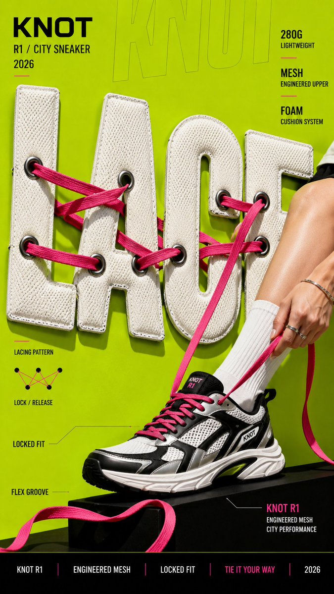
Create a bold editorial campaign poster where oversized typography is made from a real physical material and behaves like that material. Brand: [BRAND NAME] Product / Campaign: [PRODUCT OR CAMPAIGN] Main Word: [SHORT WORD] Material: [PUFFER FABRIC / DENIM / MESH / CREAM / OTHER] Material Behavior: [COMPRESS / TEAR / WEAVE / MELT / OTHER] Subject / Product: [PERSON / PRODUCT / BOTH] Main Color: [COLOR] Accent Color: [COLOR] Campaign Details: [SLOGAN / SPECS / DATE] Aspect Ratio: [9:16] Use realistic commercial photography, oversized typography, bold high-contrast colors, and contemporary editorial design. Make the main word extremely large, filling roughly 50–75% of the frame. Construct the letters from the chosen material with believable texture, thickness, seams, fibers, surface details, and lighting. Most importantly, make the typography behave physically like the material. Fabric can compress and wrinkle, denim can tear and expose fibers, mesh can be threaded through eyelets, and frozen cream can soften and melt. Let the subject or product interact directly with the material typography. Use realistic contact, pressure, tension, shadows, folds, tearing, or other material reactions so the effect feels physically connected rather than decorative. Keep the main word readable even after the material transformation. Distort only the areas affected by the chosen behavior. Use one dominant color system with a few contrasting accents. Add a small amount of meaningful campaign information such as the brand name, product name, slogan, specifications, labels, or callouts. The final image should feel like a finished commercial campaign key visual — bold, tactile, colorful, concept-driven, and visually complete. Avoid generic "subject + big text" layouts, plastic-looking materials, random distortion, meaningless filler text, excessive UI graphics, heavy CGI styling, clutter, and effects that do not match the chosen material.