
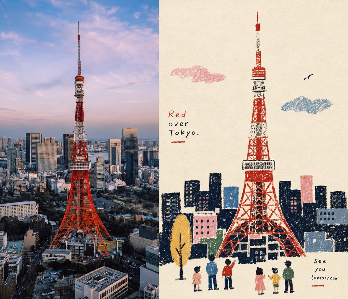
Turn each photo I upload into an independent, high-end design poster—no multi-image collage; output each photo separately. Use an overall side-by-side layout at a 7:6 ratio, with the left and right areas strictly 1:1 in width, each occupying 50% of the frame. One side keeps the original photo, preserving the subject's identity, structure, pose, real texture, natural light and shadow, and original color atmosphere, applying only a slight high-end color grade to give it the texture of an art magazine, independent publication, and exhibition image. To fit the frame, the environmental background may be naturally extended, but the subject must not be stretched, distorted, or altered. The other side extracts the most recognizable **subject, contour, pose, and narrative relationship** from the photo, reconstructing them into a **Naïve folk-inspired narrative illustration / a textured flat narrative illustration with a rustic folk-art feel**. Don't fully trace the photo; instead, actively cut details, retelling the original scene with silhouettes, primitivized forms, a few color blocks, and iconic elements, keeping only the visual cues that maintain the subject's identity and the story's relationship, so it's recognizable at a glance while feeling rustic, humorous, and lived-in. The subject's form is centered on **simplified silhouettes and large primitive forms**; people, animals, buildings, plants, objects, or vehicles may all have moderately compressed proportions, generalized structures, and exaggerated features, without pursuing strict perspective or anatomy. The space uses flattened perspective, building the narrative through relationships of height, occlusion, size, and color blocks; auxiliary objects are distributed rhythmically like visual symbols, complex backgrounds are actively removed, letting one core action, relationship, or scene carry the main story. The image uses **a grainy texture like crayon, oil pastel, thick pencil, and dry materials**. Black or dark areas should not be filled evenly but should retain traces of wiping, friction, overlaying, breaking, and the paper showing through; the contours carry slight handmade error and clumsiness, and the edges need not be perfectly neat. Keep everything flat, without realistic light and shadow, metallic materials, complex volume, or smooth digital vectors. The colors are reorganized by selecting from the photo **the most vivid, memorable colors that best represent the subject's spirit**, forming a simple and bright limited color palette. Increase the cleanliness and vitality of the colors overall, using warm white paper and dark silhouettes as a stable base, then naturally extracting a few spot-color accents like blue, red, yellow, green, pink, and orange from the original for clothing, plants, food, parts of buildings, or narrative focal points. The colors are vivid but not oversaturated, creating rhythm through large-area light-dark contrast and small-area pops of color, avoiding dirty gray, dullness, Morandi-fication, fluorescent colors, and a cheap candy feel. The composition values **the narrative center, visual center of gravity, positive and negative shapes, size rhythm, and white-space relationships**. The subject need not be centered; it can be offset, partially cropped, or form a loose triangular relationship with auxiliary elements; keep enough white space so the rough silhouettes and small colored elements have room to breathe. From afar the structure is clear; up close you can see the handmade grain and slightly naive formal charm, rather than all elements evenly filling the frame. Text intervenes sparingly, without presetting a fixed title, location, number, or language; freely distill a small amount of meaningful text based on the photo's subject, action, life state, emotion, or cultural context. **Use a light, plain folk-art editorial typeface with slight handmade printing deviations and irregular letter spacing**, which may be paired with a little handwriting, so the text exists naturally like signs, menus, notes, or publication annotations within the image. The text may be scattered along the subject, tabletop, wall, white space, or scene structure, participating in the narrative together with the graphics, but should not form a neat commercial title bar. The overall result presents a visual character composed of **naive silhouettes, flat space, crayon grain, limited color, folk-art symbols, and editorial narrative**: warm, humorous, plain, clever, and lived-in, while maintaining mature compositional and design awareness. Avoid children's cartoons, cute stickers, realistic illustration, smooth vectors, complex perspective, fine facial features, excessive detail, 3D rendering, an e-commerce illustration feel, and templated effects.