
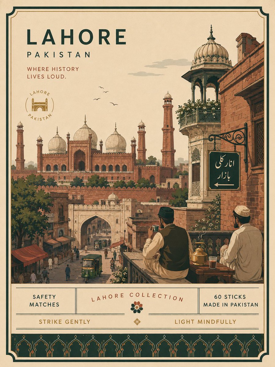
Premium minimalist flat-vector collectible matchbox poster for ISTANBUL, TURKEY, 3:4 vertical format. Design an original, sophisticated matchbox-inspired artwork that captures the authentic visual personality of ISTANBUL, TURKEY. The composition must feel purpose-built for this city rather than following a reusable template. CITY IDENTITY First interpret the unique visual character of ISTANBUL and build the scene around these five elements: 1. A recognizable landmark, architectural feature, or skyline element. 2. A distinctive local way of moving through the city. 3. One subtle everyday lifestyle moment. 4. A native plant, landscape, or environmental characteristic. 5. A composition and viewpoint that naturally belongs to the city. For Istanbul, naturally prioritize the Bosphorus, Ottoman architectural silhouettes, Istanbul ferries, Turkish tea culture, cypress trees, waterfront life, and the visual relationship between the city’s European and Asian sides. The overall scene structure must change from city to city. Do not repeatedly use the same object positions or visual formula. Possible compositions include: ferry deck overlooking the Bosphorus, historic waterfront, elevated hillside viewpoint, narrow neighborhood street, tea garden beside the water, Galata-area slope, harbor passage, historic square, seaside promenade, or architectural terrace. Choose whichever composition best represents ISTANBUL. TYPOGRAPHY Place “ISTANBUL” in the upper-left area with generous clean negative space. Add one short, sophisticated English tagline inspired by the atmosphere of the city. Typography should feel understated, editorial, spacious, and premium, while subtly referencing classic matchbox packaging typography. Never allow text to dominate the artwork. VISUAL HIERARCHY Use one iconic landmark or architectural feature as the main focal point. Support it with only 2–4 carefully selected local elements. Every added detail should strengthen the sense of place. Avoid landmark collections or postcard-style collages. Keep the scene visually quiet and intentional. The composition should feel like a beautifully designed collectible matchbox label rather than a conventional tourist poster. PEOPLE Include only 3–6 small-scale figures. Give each person a believable activity connected to local life, such as: boarding an Istanbul ferry, drinking Turkish tea, walking beside the Bosphorus, photographing the skyline, commuting through a historic neighborhood, sitting in a waterfront tea garden, or watching boats cross the water. Avoid crowds and avoid making any single person the main character. Figures should integrate naturally into the environment. LOCAL CHARACTER Use city-specific elements only when they genuinely fit ISTANBUL: * Istanbul ferry * Bosphorus waterfront * Ottoman architectural details * mosque domes and minarets * Turkish tea glass * cypress trees * historic street architecture * subtle Turkish wayfinding * waterfront railings * small boats * European and Asian shoreline relationship * local pavement and street details Transport and signage should remain subtle. Instead of always using a large signboard, incorporate details naturally through a small ferry marker, transit symbol, waterfront sign, station detail, painted road marking, or understated architectural element. MATCHBOX CHARACTER Integrate the visual language of a premium collectible matchbox naturally into the artwork. Use a restrained illustrated label frame, subtle packaging-inspired borders, compact edition details, and small decorative elements that feel purpose-built for ISTANBUL. The artwork should feel like an original contemporary matchbox design inspired by collectible packaging, not an imitation of an existing matchbox brand or historical label. ART DIRECTION Japanese stationery-inspired aesthetic, luxury collectible packaging illustration, premium commercial vector artwork, modern editorial travel branding, contemporary matchbox label design, clean delicate outlines, uniform line weight, simple geometric forms, flat-color illustration, soft shapes, balanced visual rhythm, high-end minimalist collectible design. COLOR SYSTEM Build the atmosphere primarily with: deep Bosphorus blue, soft turquoise, warm ivory, cream, muted terracotta, and cool architectural blues. Balance these with: cypress green, warm beige, muted brick red, and understated architectural neutrals. Use muted brass or dusty rose only for tiny visual accents such as typography details, flowers, clothing details, small signs, or decorative packaging elements. Colors should remain soft, sophisticated, slightly desaturated, and cohesive. MOOD Fresh, atmospheric, nostalgic, refined, contemporary, elegant. The final artwork should feel like a premium boutique matchbox collectible or luxury lifestyle-brand illustration, with generous breathing room and a relaxed sense of Istanbul. IMPORTANT QUALITY RULES Every city must have its own visual identity. Change the camera angle, scene structure, landmark placement, foreground treatment, and supporting details according to the city’s character. Do not simply replace ISTANBUL inside an existing composition. The matchbox concept must influence the visual language, but the artwork must remain primarily an authentic representation of Istanbul. Do not reproduce any existing matchbox brand, historical matchbox label, trademark, or specific vintage artwork. NEGATIVE PROMPT No photorealism. No realism. No watercolor. No painterly brushwork. No gradients. No heavy shadows. No dramatic cinematic lighting. No paper texture. No excessive detail. No cluttered background. No landmark collage. No crowded streets. No oversized characters. No dominant hero character. No repetitive café composition. No fixed signboard position. No identical foreground treatment. No generic tourist-poster formula. No copied matchbox artwork. No fake excessive aging. No excessive Ottoman ornament. No random Turkish symbols. No unnecessary decorative elements.