
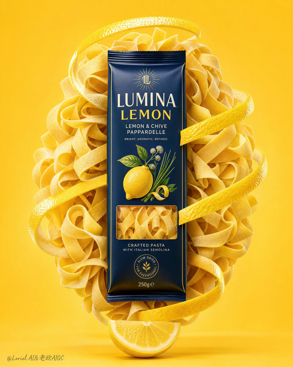
Create a premium commercial poster for an original pasta brand named "ROSSO BASILICO". Use an ultra-realistic food advertising style with a clean, minimal, high-end studio composition. Preserve the exact structural logic: a tall vertical poster, a monochrome warm tomato-orange background, one hero pasta pack floating upright in the exact center, the pack embedded inside a sculptural oval mass of dry rigatoni pasta, glossy red tomato peel ribbons spiraling around the product from top to bottom, fresh basil leaves attached near the lower-left side of the pack, a fresh tomato wedge resting directly beneath the floating object as a visual anchor, and only a few tiny scattered salt and pepper grains near the base. The product must remain the absolute visual hero and dominate the frame. Style lock: Premium FMCG food poster, ultra-clean studio still life, luxury supermarket campaign aesthetic, minimal clutter, product-first hierarchy, polished packaging realism, bright culinary freshness, flagship print advertising finish. Core composition: Place one upright pasta package exactly in the center, front-facing and enlarged for strong retail readability. Wrap the product in a dense oval nest of pale orange-tinted rigatoni that feels sculptural, airy, and controlled. Use three to four long glossy tomato peel ribbons twisting around the pasta mass in one continuous vertical spiral, clearly wrapping the product from the upper crown, across the midsection, and down toward the lower base. Add one fresh basil cluster on the lower-left side and one juicy tomato wedge at the bottom center touching the ground plane directly under the hero object. Keep the background pure and spacious. Orbit motion logic: Make the tomato peels form one unmistakable looping path around the package. The eye should begin at the upper peel arc, descend along the package edge into the rigatoni core, continue through the lower peel curl and tomato wedge, then rise again along the opposite peel ribbon back to the top. The spiral must feel elegant, aromatic, and controlled, like a scent trail turned into form. Use the rigatoni openings, tomato peel curves, basil leaf angles, and package edges to reinforce this circular visual flow. Product design: Design one premium pasta package for "ROSSO BASILICO", with a deep navy label, elegant cream and warm red typography, and refined tomato-basil illustration details. The packaging should feel original, shelf-ready, globally marketable, and sharply printed. The product flavor should read as tomato and basil pasta. Lighting: Use bright premium studio lighting from upper-left with soft frontal fill. Create smooth highlights on the tomato peel skin, subtle sheen on the package surface, delicate shadows within the rigatoni nest, and soft moist highlights on the tomato wedge. Keep the lighting soft, clean, and appetizing, with no muddy shadows and no harsh overexposure. Materials and realism: Render the dry rigatoni pasta with realistic matte flour texture, tubular cut edges, subtle ridging, slight color variation, and believable layering. Render the tomato peel ribbons with glossy fresh skin, visible moisture, translucent inner pith, natural curl tension, and rich tomato-red gradients. Render the basil leaves with subtle vein detail, soft matte sheen, realistic thickness, and fresh green vitality. Render the tomato wedge with translucent pulp, juicy seed pockets, moist cut flesh, and natural gloss. Render the packaging with crisp folds, printed texture, realistic thickness, and premium material finish. Color strategy: Dominant palette: warm tomato orange, rich tomato red, pale pasta coral, fresh basil green. Secondary palette: deep navy on the package, muted cream highlights, and tiny black pepper accents. Keep the entire poster bright, fresh, modern, and elegant, with warm culinary harmony and strong contrast centered on the pack. Typography and layout: Do not add any extra poster headline or floating promotional text outside the product packaging. Only the packaging itself may contain original readable product branding and flavor text. Keep the overall poster text-free beyond the pack design. Concept atmosphere: The image should communicate freshness, Mediterranean brightness, culinary creativity, and refined everyday pleasure. The spiral tomato peels must feel like a fragrant red orbit wrapping the pasta product, turning the package into a vivid iconic centerpiece. Quality target: Hyper-detailed, high-resolution commercial finish, pristine packshot sharpness, appetizing food realism, elegant negative space, strong silhouette readability, no clutter, no cheap supermarket flyer look. Negative prompt: copied branding, copied slogan, extra poster text, blurry packaging, weak product hierarchy, unrealistic pasta texture, dull tomato peel, muddy orange background, messy garnish, low-resolution label, warped package perspective, greasy food look, black blotches, cluttered composition