
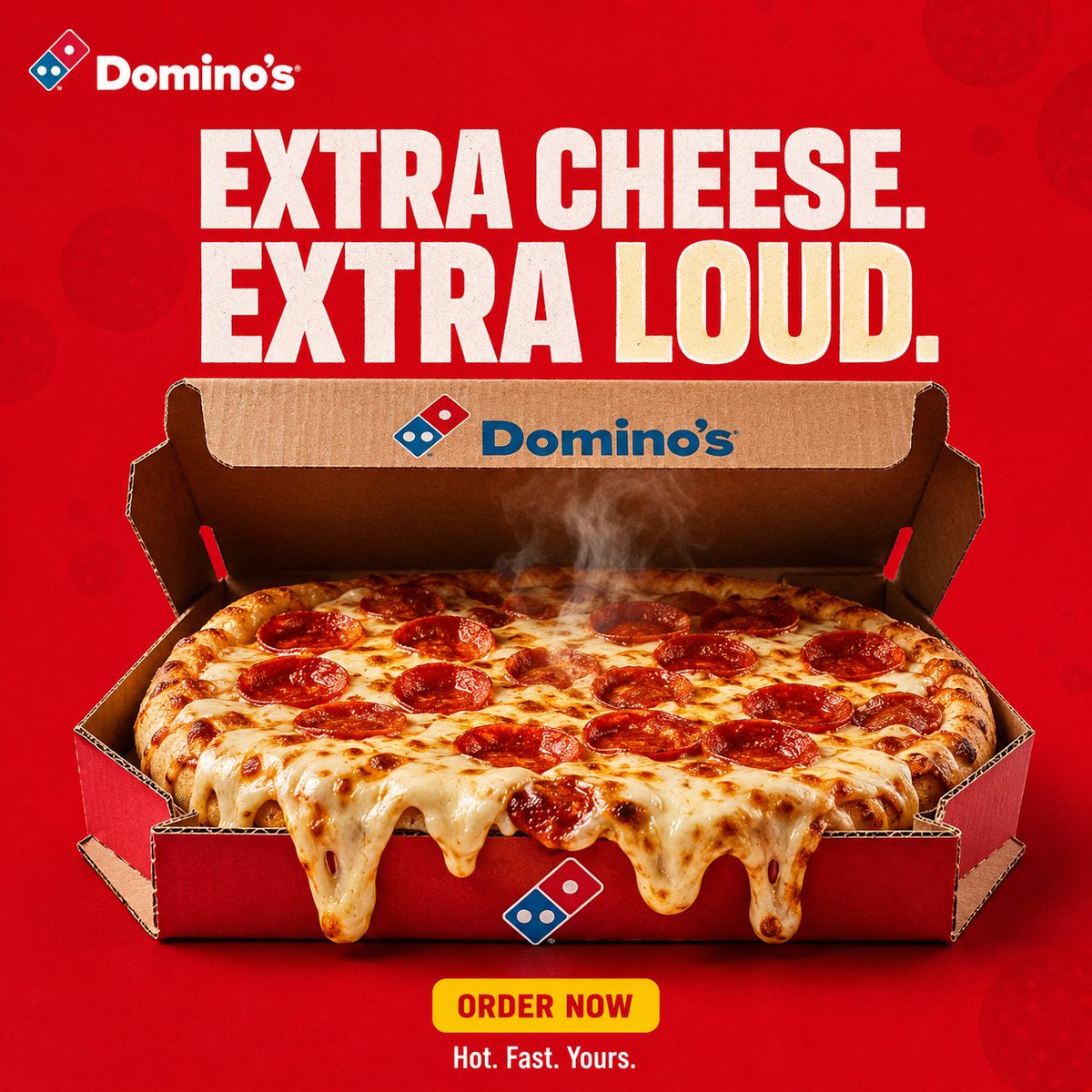
CREATIVE DIRECTION Create a premium, agency-level DOMINO'S advertising poster inspired by the visual language of bold QSR / FMCG social campaigns: strong graphic composition, one instantly readable visual metaphor, controlled product photography, saturated brand colour as the entire world, clean negative space, tactile food realism, short stacked typography and carousel-system consistency. Do not copy any specific reference composition. Extract the common principles and build an original DOMINO'S execution. The poster must feel like a real global pizza campaign art-directed for Instagram, photographed by a commercial food photographer, not a generic AI food poster. The visual must communicate the idea before the viewer reads the copy. CAMPAIGN DNA Brand: DOMINO'S Hero product: signature pepperoni / cheese pizza in authentic Domino's packaging language Campaign territory: craving + delivery win Concept: THE BOX IS THE WIN Personality: hungry, playful, confident, fast, slightly cheeky Colour system - Dominant Domino's red (#E31837) - Domino's blue (#006491) used only as logo, box accent, small graphic punctuation - White - Soft cream / mozzarella highlight - Restrained dark red shadow The red must own the frame immediately. It should not look like generic ketchup advertising. CREATIVE EXECUTION Graphic visual metaphor + premium pizza hero + QSR social poster Use: - oversized short typography - product scale - repetition of brand red - negative space - one gag / one object relationship - controlled steam and cheese gloss - strong alignment Avoid environmental documentary. This is not a street-lifestyle film still unless the specific frame requires hands/tray. BACKGROUND A completely controlled advertising field. Rich saturated Domino's red with subtle tonal depth. Allowed: - extremely subtle blob / pepperoni-dot pattern at very low contrast - restrained radial falloff - soft dimensional shadowing Forbidden: - random restaurant interior as default - dirty kitchen - city street - collage clutter - extra brands HERO PRODUCT Photoreal Domino's pizza as the most important physical object. Preserve recognizable Domino's box / logo geometry. Do not invent a new logo. Do not redesign the wordmark. Show: - molten mozzarella - pepperoni oil - realistic crust blistering - visible steam, restrained - authentic corrugated pizza box when the box is in frame - believable grease sheen, not plastic CGI Product occupies roughly 50–65% of the frame width unless the idea needs scale contrast. TYPOGRAPHIC SYSTEM Headline: short, 3–6 words, bold contemporary grotesk / heavy sans. Primary line in white. One hook word may be cream-yellow. Secondary line smaller, quieter. Optional bottom lockup: ORDER NOW as a small yellow pill. Optional footer: Hot. Fast. Yours. Typography is hierarchy, not decoration. Do not flood the frame with copy. Do not use fake legal paragraphs. COMPOSITION Format: 1:1 square, Instagram carousel advertising frame Structure: TOP — small Domino's logo lockup, consistent position top-left UPPER THIRD — headline CENTRE — product + the single visual idea BOTTOM — small CTA pill + tiny footer, clean Keep identical padding logic across the whole campaign so nine frames feel like one system. VISUAL HIERARCHY Eye order: 1. pizza / box 2. the metaphor 3. headline 4. CTA Product stays readable at thumbnail size. LIGHTING Premium QSR product photography. Large soft key from above-front. Subtle rim to separate cheese and crust from the red field. Soft contact shadow under box / pizza. Controlled specular highlights on oil and mozzarella. No cinematic teal-orange grade. No heavy bloom. No anamorphic flares. CAMERA / QUALITY Simulate high-end commercial food photography. Approx 80–90mm product feel, f/5.6–f/8. Critical focus on cheese and box logo. High micro-detail. Natural perspective. Edible texture. Looks photographed, then art-directed, not generated and decorated. BRANDING Packaging and one small Domino's logo only. No scattered badges. No competitor marks. No watermark. No extra app UI unless the frame idea is delivery. NEGATIVE DIRECTION NO dark cinematic alley. NO lifestyle party crowd. NO unbranded generic pizza. NO warped logo. NO extra fingers / melted anatomy. NO chocolate-style splash logic. NO multiple concepts in one frame. NO Canva template look. NO tiny unreadable paragraphs. NO fake HDR plastic food. NO changing the red world between frames. FINAL CREATIVE TESTS 1. Thumbnail test: pizza + idea readable at IG grid size. 2. One-sentence test: the frame idea can be said in one line. 3. System test: this frame could sit next to eight siblings and still look like Domino's.