
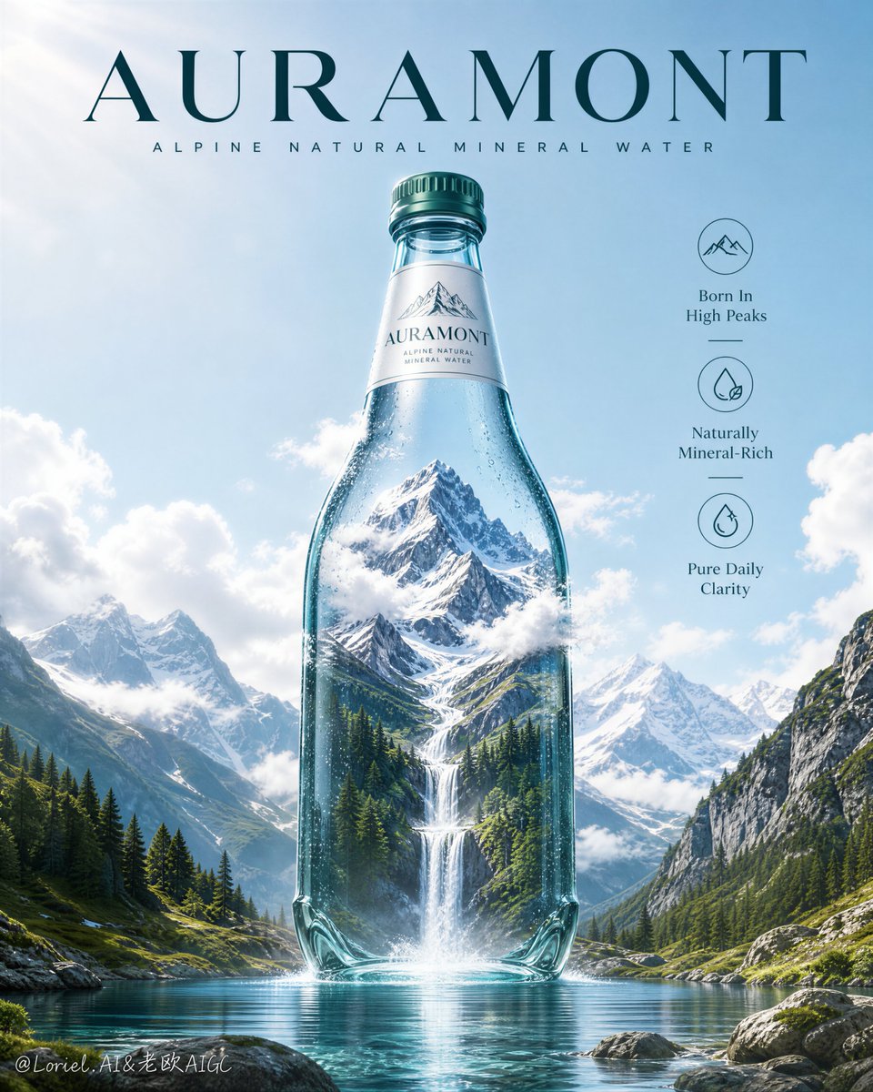
Create a flagship advertising poster for an original natural mineral water brand named "AURAMONT". Use a hyper-real premium beverage campaign style fused with surreal alpine landscape storytelling. Preserve the exact core structure: a tall vertical poster, a pale glacier-blue sky background, one monumental transparent glass water bottle standing perfectly centered, a large original English brand title at the top, a slim descriptor line beneath it, a vertical right-side information column with three refined icon-led benefit points, and one epic mountain-source landscape visually contained inside the bottle and flowing outward into the real foreground environment. The bottle must remain the absolute visual hero and dominate the entire composition. Style lock: Luxury bottled-water campaign, ultra-real product photography, surreal environmental integration, clean flagship poster design, high-end FMCG key visual, strong silhouette readability, minimal clutter, global launch-ready advertising. Core composition: Place one oversized mineral water bottle in the exact center of the frame, vertically aligned and monumental in scale. Inside the bottle, create a majestic alpine source world: sharp snow-capped peaks near the upper interior, dense evergreen forest in the lower interior, drifting white clouds wrapping the shoulder area, and one luminous waterfall descending from the inner mountain core down through the lower bottle into the real foreground lake. Keep the transition between inner world and outer world elegant and believable. Frame the lower scene with rocky green slopes on both sides and a calm reflective lake in the foreground. The bottle silhouette must stay pristine and unmistakable from a distance. Port super-symbol logic: Turn the image of one glass bottle containing an entire mountain source into the brand’s unmistakable super-symbol. The combination of alpine peak, forest basin, and waterfall captured inside one upright bottle must feel ownable, iconic, and instantly memorable even at thumbnail scale. The bottle should read not merely as packaging, but as the living vessel of the source itself. The visual code must be simple and powerful: one bottle, one mountain, one descending stream of purity. Orbit motion logic: Create a clean vertical-circular reading path around the hero bottle. The eye should begin at the top brand title, descend into the mountain peak inside the bottle, travel down along the cloud-wrapped shoulder and bright glass edges, follow the waterfall through the bottle body into the misty impact point at the lake, spread outward across the reflective water surface, and then be pulled back upward by the bottle contour and surrounding clouds. Use cloud curvature, bottle highlights, waterfall energy, mist bloom, and lake reflections to build one elegant closed circulation that keeps drawing attention back to the center bottle. Product design: Design a premium mineral water bottle with transparent green-tinted glass, crisp reflections, a refined emerald cap, and an elegant white neck label carrying original brand text "AURAMONT". The bottle body should feel pristine, cold, and premium, with subtle condensation and immaculate glass thickness. The label system must be simple, upscale, and globally marketable. Lighting: Use bright natural daylight with soft atmospheric diffusion. Let the sky glow gently from upper-left, with crisp highlights on the bottle shoulders and clean rim light along the glass edges. The mountain interior should receive cool high-altitude sunlight, while the forest basin and waterfall carry richer contrast and depth. Keep the lake luminous and reflective, with a fine mist halo where the waterfall meets the water. No muddy shadows, no dead black areas. Materials and realism: Render the bottle with physically accurate glass refraction, subtle internal reflection, realistic edge thickness, fine condensation beads, and crystal-clear transparency. Render the mountain with believable rock texture, snow layering, and atmospheric depth. Render the forest with realistic tree density and varied alpine green tones. Render the waterfall with photoreal fluid behavior, white aeration, soft mist bloom, and physically coherent splash. Render the foreground lake as calm, glacial, clean, and highly reflective. Color strategy: Dominant palette: pale sky blue, icy aqua, glacier white, alpine green, and cool emerald-glass tones. Secondary tones: deep forest green, soft stone gray, silver highlights. Keep the mood pure, oxygen-rich, elevated, and premium. The entire poster should feel like cold mountain air turned into a visual brand language. Typography and layout: At the top center, use a large original English brand name "AURAMONT" in bold elegant uppercase. Below it, place a smaller descriptor line such as "ALPINE NATURAL MINERAL WATER". On the right side, add three vertically stacked icon-led benefit points with concise original copy, such as: "Born In High Peaks" "Naturally Mineral-Rich" "Pure Daily Clarity" Keep typography minimal, airy, and premium. Do not copy any existing brand name, slogan, or wording. Concept logic: The bottle is the source. The mountain, forest, clouds, and waterfall must feel like the bottled origin made visible. The image should communicate purity, elevation, freshness, and the idea that untouched nature is held intact inside the product. Quality target: Hyper-detailed, high-resolution commercial finish, pristine glass realism, elegant surreal integration, premium typography balance, strong symbolic readability, clean sky gradients, physically coherent water behavior, no clutter. Negative prompt: copied branding, copied slogan, weak bottle silhouette, blurry label, muddy sky, unrealistic waterfall, dirty water, low-detail mountains, fake forest texture, distorted bottle glass, excessive props, cluttered layout, unreadable icon column, black blotches, cheap travel-poster look, oversaturated colors, low-resolution rendering