
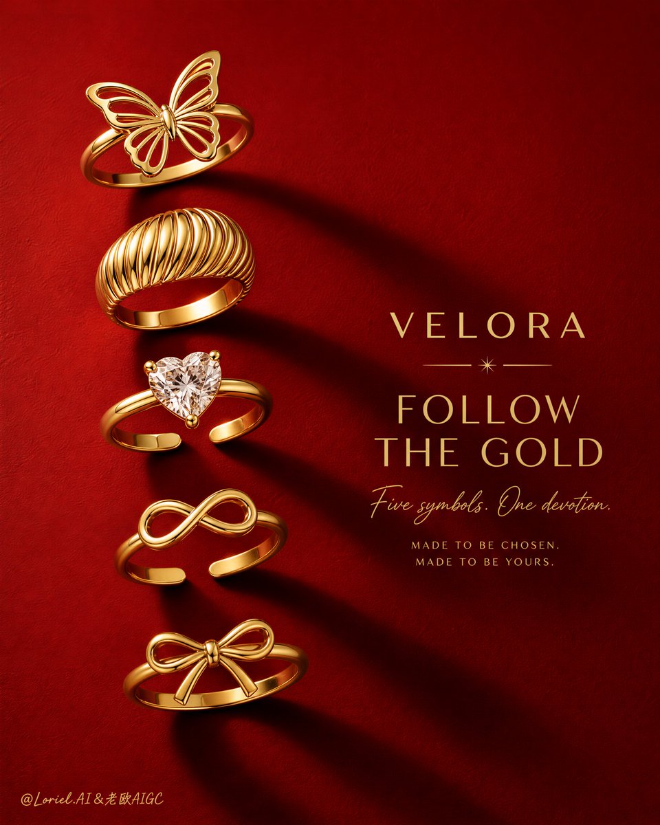
Create a luxury flagship jewelry campaign poster for an original fine-jewelry brand named "VELORA". Preserve the same bold editorial structure: a tall vertical poster, a rich matte crimson-red background, five distinct gold rings arranged in a disciplined descending vertical column on the left half of the frame, and a refined right-side typography block positioned around the middle-right. The final image must feel like a Cannes-level luxury ad: graphic, flirtatious, premium, sharply memorable, and product-led, with the rings remaining the absolute visual heroes. Style lock: Ultra-realistic luxury jewelry photography, minimalist editorial poster design, premium macro product styling, bold negative space, high-fashion campaign clarity, clean silhouette readability, refined commercial polish. Core composition: Place five original gold rings in one elegant descending sequence from upper-left to lower-left, each separated by consistent but slightly rhythmic spacing. Keep the jewelry column slim, tall, and highly legible. Each ring must face slightly differently while staying within one coherent design family. Reserve the right half for a strong headline block that balances the jewelry without overpowering it. The layout must feel calm, intentional, and premium, with a strong left-to-right tension between product and message. Hero product system: Design five collectible signature rings that function as one series: one butterfly openwork ring, one sculptural ribbed dome ring, one delicate heart-diamond solitaire ring, one minimalist infinity open ring, and one fine bow-knot ring. Each ring must feel highly crafted, feminine, luxurious, and instantly recognizable, while together forming a memorable collection code. Orbit motion logic: Use the vertical descent of the five rings and their long diagonal shadows to create one continuous visual orbit. The eye should begin at the top butterfly ring, travel downward through each ring in sequence, follow the expanding shadow rhythm toward the lower-right, enter the typography block, and then be pulled back to the jewelry column by the strongest central ring highlight. Shape the shadows so they sweep diagonally toward the right in a controlled flow, creating a clean cinematic reading path rather than random darkness. Port super-symbol logic: Turn the descending five-ring column into the campaign’s super-symbol. The lineup itself must feel iconic, like a signature emotional code or a luxury identity totem. The butterfly ring at the top and the heart-diamond ring near the middle should act as the two strongest symbolic anchors, while the full vertical sequence reads as one ownable brand mark. Even at thumbnail size, the viewer should immediately recognize the elegant gold descent against the crimson field. Lighting: Use hard directional studio light from upper-left to cast long, crisp, premium shadows toward the lower-right. Keep the shadow edges sharp near each ring and gently softened farther away. Add subtle controlled fill to preserve metal shape, highlight definition, and gemstone clarity without flattening the dramatic light direction. The lighting must feel graphic, luxurious, and physically coherent. Materials and realism: Render the rings in highly polished 18k yellow gold with flawless craftsmanship, realistic metal reflections, smooth curvature, crisp edge highlights, and premium surface finish. The heart-shaped solitaire must feature a clean, brilliant gemstone with believable faceting, subtle fire, and delicate prong detail. The matte crimson background should feel like luxury coated paper or fine textured card stock, with faint tactile grain visible under raking light. Color strategy: Dominant color: deep saturated crimson red. Secondary color: rich luminous yellow gold. Accent color: diamond-white sparkle on the solitaire only. Keep the palette restrained, seductive, and high-contrast, with the gold forms reading immediately against the red field. Typography and layout: Place an original all-English headline block in the middle-right using a refined mix of elegant sans serif and subtle script if desired. Suggested direction: "FOLLOW THE GOLD" with a softer secondary line beneath. All wording must be original, polished, and globally marketable. Do not copy any existing slogan, brand name, or campaign text. Quality target: Hyper-detailed, high-resolution luxury print finish, crisp macro jewelry sharpness, premium shadow control, flawless gold rendering, elegant material realism, strong product dominance, clean negative space, no clutter, no muddy areas. Negative prompt: copied slogan, copied brand name, weak jewelry hierarchy, cluttered layout, blurry ring edges, dull gold, plastic-looking metal, broken gemstone reflections, muddy red background, inconsistent ring scale, warped ring shapes, cheap catalog styling, unreadable typography, excessive decoration, black blotches, dirty texture, flat lighting, overexposed highlights, chaotic shadow direction