
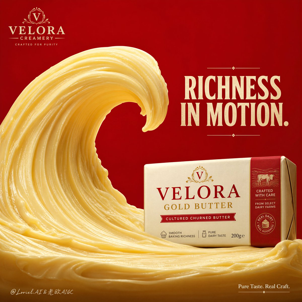
Create a flagship commercial advertising poster for an original dairy brand named "VELORA CREAMERY", combining Orbit energy with Port symbol power. Use ultra-realistic product photography with premium commercial compositing, not illustration, not cartoon, not low-end CGI. Keep the same bold full-frame crimson-red background and the same iconic minimal structure: one monumental sculptural butter wave rising from the lower-left and curling inward like a powerful crest, and one premium wrapped butter block placed at the lower-right edge of the wave as the absolute branded product anchor. The final image must feel like a Cannes-level FMCG dairy campaign: iconic, rich, clean, premium, and instantly memorable. Style lock: high-end food advertising, luxury butter packshot aesthetic, ultra-clean product-first composition, creamy material realism, bold monochrome background, minimal concept-driven layout, premium print-campaign polish. Core composition: one giant butter wave dominates the lower two-thirds of the frame, sculpted from glossy whipped butter with a long elegant curling crest and a strong central hollow. The wave must feel like a single unforgettable emblem rather than just a food splash. The butter block package sits at the lower-right, touching and visually born from the butter flow, clearly readable and sharply lit. The wave should be dramatically larger than the pack, but the pack must remain the clearest branded object. Preserve strong negative space above for headline impact. Port logic: make the combination of "butter wave + butter block" the brand’s super-symbol. The viewer should remember the image as the butter that creates its own crest. The wave silhouette must feel ownable, distinctive, and repeatable as a brand asset, not just a one-off visual effect. Orbit logic: stretch the butter wave’s main curl so the eye begins at the heavy butter base in the lower-left, rises through the creamy ridge flow, reaches the crest, then naturally sweeps back down toward the butter block at the lower-right. The visual motion must feel smooth, rich, hypnotic, and appetite-driven, like the product is generating its own momentum. Product concept: redesign the product as an original premium butter named "VELORA GOLD BUTTER". The packaging should feel shelf-ready, globally marketable, and elegant, with a cream-and-red identity, refined serif product naming, subtle dairy cues, and small original pack descriptors such as "cultured churned butter", "smooth baking richness", and "pure dairy taste". All text must be original. Lighting: use soft controlled studio key light from upper-left front, with subtle warm highlights across the butter wave ridges and package edges. The butter surface must show creamy gloss, dense smoothness, and premium thickness. Shadows should remain soft, rich, and grounded. No muddy darks, no harsh blown highlights. Materials and realism: hyper-real butter texture with silky folds, smooth churned ridges, delicate spatula-like shaping, subtle creamy sheen, realistic density, and fine tonal variation from pale cream to warm buttery gold. The pack should have crisp printed surfaces, believable carton or foil-wrapped structure, clean edges, and realistic reflection control. Every material must obey premium food-light physics. Typography and layout: use original English text only, never copy any existing wording. Place a bold upper headline such as "RICHNESS CRESTS." or "THE WAVE OF BUTTER." Add one very short purity line only if needed, such as "Pure dairy. Pure motion." Typography should feel strong, minimal, and premium, always secondary to the butter wave and pack. Color strategy: dominant crimson red background, pale butter cream, warm golden butter tones, soft ivory package surfaces, and restrained red brand accents. Keep the palette bold, disciplined, and highly memorable. Quality and physical rules: extremely sharp butter ridges, believable creamy viscosity, clean package silhouette, readable label, no clutter, no fake cream texture, no excessive garnish, no messy layout, no cheap flyer aesthetic. The butter wave and butter pack must together form the strongest visual sales trigger and memory anchor. Negative prompt: copied branding, copied slogan, weak product hierarchy, blurry pack, unreadable label, fake butter texture, oily or watery spread, muddy red background, warped wave shape, cluttered layout, excessive props, cartoon rendering, cheap CGI, low-resolution food detail, product losing dominance.