
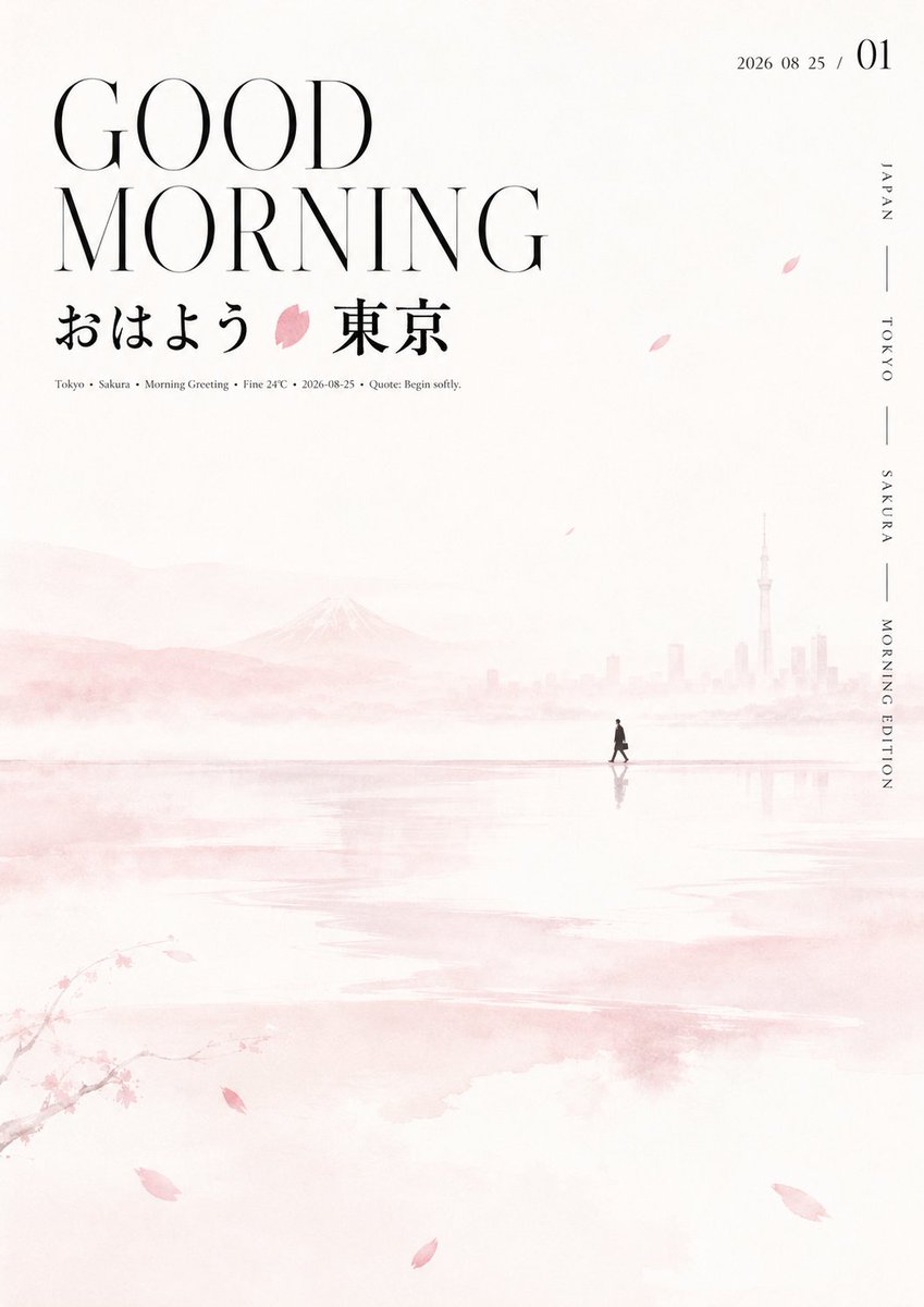
Build a clear, quiet visual with an Oriental seasonal feel around any thematic subject: let a large area of high-brightness white space be the main environment, with several horizontally extended semi-transparent soft color bands stretching from the middle of the frame downward, their edges feathered like water vapor, wet bleeding, and out-of-focus light, uneven in width, density, and spacing, locally forming slight ripples, reflections, and layers of depth; deep in the white space, place a small silhouette symbol distilled from the theme's meaning, at a restrained scale, close to a thin color band or horizontal line, with a blurred faint shadow, creating a strong scale contrast between the tiny narrative element and the vast white mist. Scatter a few elongated fragments or light leaf-like brush strokes derived from the theme, with random direction and density, to guide the eye without filling the space. Information concentrates on one upper side: the English main title uses an extra-large, tall and slender modern serif with strong stroke-weight contrast, split into short lines, with generous letter spacing, forming a clear and calm black skeleton; the Chinese theme title sits below it, using a more condensed and heavy letterform with slight calligraphic sharpness and ink undulation, contrasting in scale and stroke density with the English, and embedding a simple color block extracted from the theme's core symbol between the words. Below, tiny-sized explanatory text; on the other side, a small date or numbering combination, with slightly larger numerals and compact fine text around it; along the edge, a sparse column of vertical micro-text interspersed with short lines, keeping an asymmetric balance. Colors do not copy fixed hues but derive from the theme's mood, cultural associations, and core object: use a very light, low-saturation, near-white thematic base tone covering most of the space, a slightly darker yet still soft color of the same family for the misty color bands and distant layers, and a small amount of medium-saturation thematic accent color to mark the symbol, local strokes, and graphic nodes within the text, keeping body text near black; overall maintain a high-brightness, low-contrast, airy, bright and clean color mood, with the accent color used only as small focus. Surface treatment keeps a smooth digital ink and thin paper feel, with subtle diffusion and weak grain in the misted areas, relatively crisp text edges and moderately bleeding graphic edges, without heavy grime, strong shadows, or crowded decoration. The final reading order should first see the striking bilingual title, then fall to the Chinese theme and colored symbol, then follow the horizontal mist band in search of the tiny narrative silhouette, and finally discover the date and fine edge text; the tension between "giant text and vast white space, tiny silhouette and flowing color bands" must be preserved. Theme: good morning + greeting + GOOD MORNING + city + inspiring quote + weather + 2026-08-25 A display of 10 classic flowers from 10 countries 10 images Each image has a completely different hue logic Each country uses the writing logic of the corresponding country Each country uses its corresponding favorite color Create images with a fresh Japanese and Korean color palette