
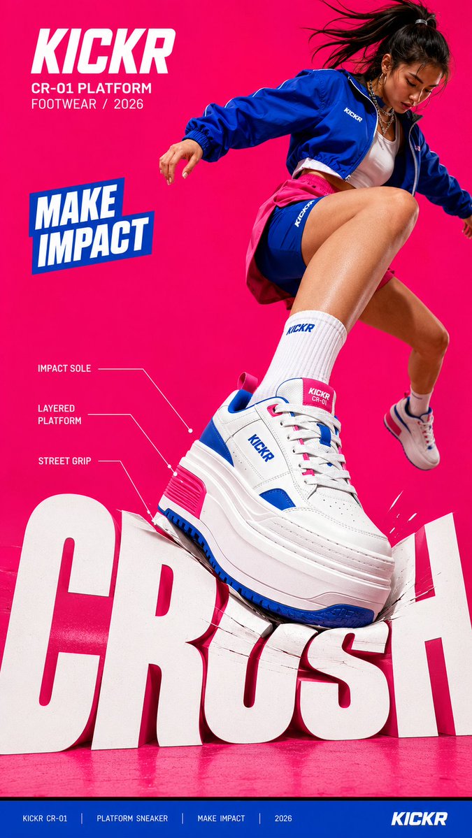
Create a bold editorial campaign poster where oversized typography reacts to a physical force created by the subject or product. Brand: [BRAND NAME] Product / Campaign: [PRODUCT OR CAMPAIGN] Main Word: [SHORT WORD] Subject: [PERSON / PRODUCT / BOTH] Action: [STEP / JUMP / PULL / SKATE / ETC.] Force: [PRESS / PUSH / WRAP / SLIDE / OTHER] Force Direction: [DOWN / UP / ROTATE / DIAGONAL / OTHER] Main Color: [COLOR] Accent Color: [COLOR] Aspect Ratio: [9:16] Use realistic commercial photography, oversized typography, high-contrast colors, and contemporary editorial design. Make the main word extremely large, filling roughly 50–75% of the frame. The typography should visibly respond to the chosen force instead of remaining static. For example: PRESS: compress, bend, or shift the letters at the point of impact. PUSH: stretch the typography along an upward or forward direction. WRAP: let large letterforms pass behind and in front of the subject to create an enclosing motion. SLIDE: offset and shift the letters along one strong directional axis. The deformation must follow the subject’s actual movement and force direction. Keep the typography graphic and readable — avoid turning it into soft 3D, liquid, or cartoon lettering. Create clear foreground–subject–background interaction so the person or product feels physically connected to the type. Use one dominant high-impact color with black, white, and a contrasting accent color. Add only a few meaningful campaign details such as the brand name, product name, slogan, specifications, labels, or small editorial text. Keep people and products realistic, with believable proportions, materials, lighting, shadows, and dynamic movement. The final image should feel like a finished campaign key visual where force, subject, typography, and composition all move together.