
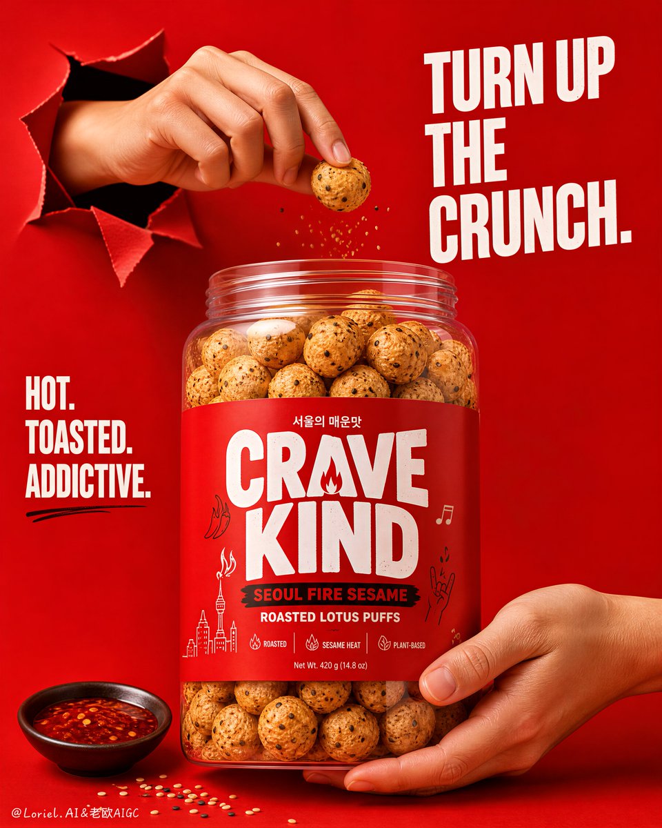
Create a flagship commercial advertising poster for an original roasted puff snack brand named "CRAVE KIND", combining Transit restraint with Orbit directional energy. Use ultra-realistic premium packaging photography, not illustration, not 3D render. Keep the same structural logic: a saturated red full-background poster, one oversized transparent snack jar as the absolute visual hero in the center-lower area, one realistic hand emerging from a torn paper opening in the upper-left quadrant to pinch a single puff above the jar mouth, one supporting hand in the lower-right quadrant holding the jar base, a bold headline block in the upper-right, a secondary stacked attitude statement on the left side, and only a minimal number of ingredient props near the bottom edge. The final image must feel like a Cannes-level FMCG campaign: bold, graphic, youthful, clean, premium, and instantly memorable. Style lock: high-end commercial snack advertising, strong product-first hierarchy, bright studio realism, disciplined poster layout, minimal clutter, bold monochrome red field, premium shelf-ready packaging, social-campaign hero visual. Core composition: one giant clear cylindrical jar dominates the frame, front-facing and fully legible, filled with toasted round puff snacks. The jar sits low enough to create strong typography space above, but remains the dominant focal point. A realistic hand breaks through a clean torn-paper opening in the upper-left zone and delicately pinches one puff slightly above the jar opening. A second cropped hand supports the lower-right base of the jar, stabilizing the composition diagonally. Keep generous negative space around the jar and between the text blocks so the layout feels architectural and premium. Transit logic: reduce all non-essential ingredients, simplify the left-side attitude text, keep the torn opening clean, shorten supporting copy, and let scale, contrast, and spacing carry the impact. Avoid a crowded retail-poster feel. The product, gesture, and red field should do most of the work. Orbit logic: shape the motion through one precise vertical-to-diagonal eye path: torn opening, pinched puff, jar mouth, brand label, then down to the supporting hand. Add only a very restrained lift of a few sesame specks or tiny crumbs near the pinched puff to suggest motion and craving. The energy must feel focused, elegant, and directional, not noisy. Product concept: redesign the product as a premium Korean-inspired spicy sesame roasted puff snack in a large transparent jar with a vivid red wrap label. Brand name: "CRAVE KIND". Flavor name: "Seoul Fire Sesame". Descriptor: "roasted lotus puffs". The label should feel youthful, modern, bold, and globally stylish, with oversized brand lettering, minimal descriptors, and a few tiny line-art accents inspired by spice, music, and urban snack culture. All text must be original. Lighting: bright soft frontal studio key light for crystal-clear packaging legibility and realistic skin rendering, plus subtle side highlights to define the transparent jar edge, glossy label finish, and rounded puff texture. Maintain smooth red background illumination, soft grounded shadows, and crisp separation between hands, jar, and backdrop. No muddy gradients, no dirty dark patches. Materials and food realism: clear PET or acrylic jar with believable wall thickness and clean reflections, premium matte-gloss printed wrap label, toasted puff snacks with airy porous surfaces and black sesame specks, slight roasted dryness, realistic variation in roundness, and zero artificial plastic look. Hands must look photographic and natural, with correct five-finger anatomy, clean nails, visible joints, and gentle believable pressure. Bottom props should be extremely restrained: one small dark bowl of glossy chili sauce and a light sprinkle of sesame seeds only. Typography and layout: use original English copy only, never copy any existing wording. Place a bold upper-right headline such as "TURN UP THE CRUNCH." Use a shorter left-side stacked statement such as "HOT. TOASTED. ADDICTIVE." Keep all typography bold, graphic, and secondary to the jar. Label micro-copy can include concise tags like "roasted", "sesame heat", and "plant-based", but remain minimal. Color strategy: dominant saturated campaign red across background and label system, balanced with warm natural skin tones, toasted beige puff tones, black sesame flecks, deep chili accents, and small off-white text highlights. Keep the palette tightly controlled, premium, and high-contrast. Atmosphere: spicy, playful, modern, global, highly shareable, product-led, clean but energetic. Quality and physical rules: extremely sharp jar detail, readable label hierarchy, realistic transparent packaging physics, anatomically correct hands, correct pinch gesture, clean torn-paper edges, no clutter, no extra props, no warped jar, no deformed snacks, no muddy shadows, no dead black patches, no weak hierarchy. The jar must remain the absolute visual hero. Negative prompt: copied branding, copied headline, cluttered layout, too many ingredients, weak product hierarchy, blurry jar, unreadable label, fake transparent plastic, distorted puff shapes, deformed hands, extra fingers, fused fingers, broken wrist anatomy, messy torn opening, muddy red background, dirty shadows, dead black areas, cheap flyer aesthetic, cartoon style, CGI render feel, illustration look, product losing dominance, random cultural clutter, low-resolution packaging.