
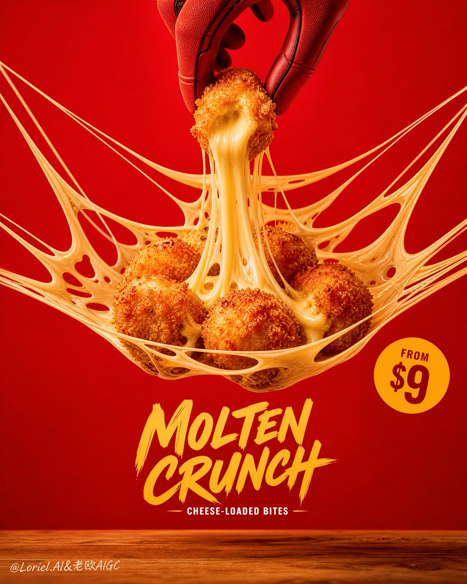
Create a flagship commercial food poster for an original snack brand named "MELT VAULT", merging Orbit energy with Transit restraint. Use ultra-realistic premium fast-food advertising photography, not illustration, not 3D render. Keep the same structural logic: a centered suspended cheese web occupying the middle of the frame, a tight cluster of 5 to 6 crispy fried cheese chicken bites resting inside the elastic cheese net, one top-center red action glove hand lifting a single bite upward, and an extreme molten cheese pull stretching between the lifted bite and the cluster below. Set everything against a bold saturated scarlet-red background with a narrow warm wooden tabletop at the bottom. The final image must feel like a Cannes-level hero campaign: iconic, craveable, graphic, playful, and highly controlled. Style lock: premium fast-food product photography, strong poster design, high-impact minimalist composition, product-first hierarchy, bold color blocking, extremely realistic cheese physics, clean social-campaign-ready execution. Core composition: centered vertical poster, one large cheese web spanning across the middle like a tensile edible net, the fried bites grouped compactly in the center with one hero bite being lifted from the top center. The cheese strands must create a refined radiating tension pattern that guides the eye from the lifted bite downward into the cluster, then outward along the net edges. Keep generous negative space around the structure so the image feels monumental and uncluttered. Place one bold handwritten-style product title in the lower-middle zone, a very short subtitle beneath it, and a compact circular price badge on the right. All typography must remain secondary to the food. Orbit logic: strengthen the directional pull of the composition by shaping the main cheese strands into elegant upward-and-outward arcs anchored at the lifted bite. Let the motion feel like the whole structure is being tensioned in real time. The dynamic must be clear and dramatic, but not messy. Every strand should support the central hero action and lead the eye back to the molten core. Transit logic: reduce all non-essential elements, keep the tabletop narrow, keep the background clean and uninterrupted, simplify the text block, minimize decorative accents, and preserve only the most necessary graphic elements. Let impact come from scale, contrast, negative space, and the singular power of the cheese-pull moment rather than visual clutter. Product concept: redesign the food as original crispy molten chicken cheese bites with irregular hand-formed roundness, thick golden breadcrumb coating, rich fried texture, and a luxurious creamy cheese core. The lifted bite must expose a dense, glossy, stretchy interior with realistic heat, weight, and elasticity. The cluster below should feel hot, crunchy, and freshly fried. Character element: use only one cropped red comic-inspired action glove entering from the top center, delicately pinching the lifted bite. The glove must feel clean, iconic, and graphic, with natural finger pressure and believable fabric tension, but no full character body, no face, and no copyrighted superhero identity cues. Lighting: strong soft frontal studio key light for clean readability, combined with subtle warm highlights that enhance the fried crust and illuminate the cheese strands. Keep the red background smooth and evenly controlled, with soft grounded shadows and crisp separation between food and backdrop. The cheese should glow slightly brighter than the crust to emphasize melt and freshness. Materials and food realism: ultra-detailed crunchy breadcrumb crust, porous golden fried surface, tiny oil sheen, creamy cheese with realistic viscosity, semi-translucent cheese strands of varied thickness, gravity-accurate tension points, smooth scarlet backdrop, and tactile natural wood grain below. The cheese web must feel physically believable, elastic, and premium, never rubbery or fake. Typography and layout: use original text only, never copy any existing wording. Place a hand-lettered lower-center title such as "MOLTEN CRUNCH" with a very short subtitle like "cheese-loaded bites". Add a compact circular badge on the right with concise pricing text such as "from $9". Keep typography bold, legible, and graphic, but always subordinate to the cheese structure and hero bite. Color strategy: tightly controlled palette of saturated scarlet red, deep golden-brown crust, creamy pale yellow cheese, warm natural oak wood, and a restrained yellow-orange badge accent. Keep contrast strong, colors rich, and the palette disciplined. Atmosphere: bold, playful, hot, stretchy, craveable, premium, modern, iconic, highly shareable, globally launch-ready. Quality and physical rules: extremely sharp food texture, realistic cheese stretch physics, clean gravity logic, no muddy shadows, no dead black patches, no clutter, no extra props, no malformed bites, no deformed hand, no extra fingers, no broken strands without support, no weak hierarchy. The product must remain the absolute visual hero. Negative prompt: copied branding, copied text, copyrighted superhero identity, full character body, cluttered layout, too many design elements, weak cheese pull, fake plastic cheese, blurry crust, low-resolution texture, deformed hand, extra fingers, fused fingers, distorted bites, messy background, muddy red tones, dead black areas, cheap fast-food flyer look, cartoon food, CGI render feel, illustration style, unreadable typography, product losing dominance.