
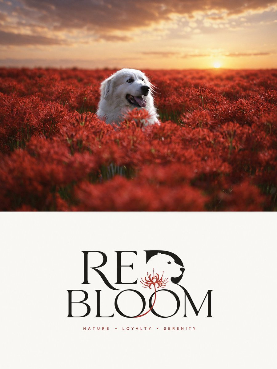
Turn each photo I upload into a separate high-end design poster—no multi-image collages; each photo is output individually. Use an overall 3:4 vertical composition, with the top and bottom areas strictly at a 1:1 height ratio, each occupying 50% of the frame. The top half keeps the original photo, preserving the subject's structure, real texture, natural light and shadow, and original color atmosphere, applying only a slight high-end photographic color grade to give it the quality of an art magazine, independent publication, and exhibition photography. To fit the frame, you may naturally extend the sky, ground, or environmental background, but you must not stretch, distort, or alter the subject. The bottom half extracts the most recognizable **subject, silhouette, posture, and narrative relationship** from the photo and reconstructs them into a **simple, professional, brand-recognizable custom wordmark / logo graphic**. Do not place the subject graphic separately next to the text; instead, cleverly integrate its most essential silhouette, structure, or feature into the letters themselves or the overall mark structure, so that graphic and text become a unified, complete, recognizable visual symbol. Whether the subject is a person, animal, plant, building, object, vehicle, or natural landscape, extract its core visual feature and transform it into a simple, geometric, graphic logo language, maintaining an at-a-glance recognizable identity with minimal information. The text is distilled from the photo's subject name, thematic attribute, location clue, action state, or symbolic meaning into a short English main text; if the original image has a clear proper name, it can be directly converted into the main mark name; if there is no clear name, distill a highly summarized, easily recognizable English word or phrase suitable as a brand wordmark. It may be accompanied by a minimal amount of small auxiliary text, such as category, region, state word, or a short slogan, but it must be highly restrained, serving only as a supplement to the identification hierarchy. Text and graphic must together form the mark, not the conventional "icon + title" collage. The overall style stays **minimal, modern, geometric, striking, elegant, with ample white space and balanced composition**. The background uses a light solid color or extremely pale neutral tone, staying clean and simple; the mark is presented in black and white or with minimal color, and the color can be extracted from the photo above, choosing the one with the most spirit for a slight translation, but restraint, professionalism, and branding remain the priority overall. The mark maintains a comfortable medium visual size in the bottom half, neither too large nor too small, with the finish of a mature brand identity, a cultural visual system, or a high-end design studio's work. Overall it emphasizes **the integration of graphic and text, subject recognizability, geometric order, refined letter spacing, professional layout, and high-end white space**, presenting the visual character of modern logo design combined with an art poster. Avoid a tourist-poster feel, simple icon-plus-text, cartoonization, decoration piling, e-commerce feel, cheap graphics, and a template feel.