
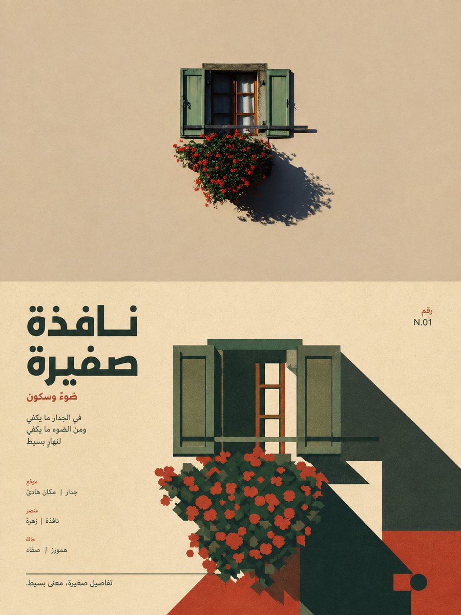
Turn each photo I upload into a separate, high-end design poster, no multi-image collages; each photo is output individually. Use an overall 3:4 vertical composition, with the top and bottom areas strictly 1:1 in height, each taking up 50% of the image. The top half preserves the original photo, keeping the subject's structure, real texture, natural light and shadow, and original color atmosphere, with only a slight high-end photographic color grade, giving it the quality of an art magazine, independent publication, and exhibition photography. To fit the frame, you may naturally extend the sky, ground, or environmental background, but must not stretch, distort, or alter the subject. The bottom half extracts the most recognizable **subject, outline, pose, and narrative relationship** from the photo and reconstructs them into a retro-modernist flat illustration. Don't mechanically trace the details; instead, summarize the subject into clear silhouettes, geometric color blocks, hard facets, and simple curves, preserving the most crucial proportions, outline, action, and structural features so it instantly corresponds to the original above. The composition emphasizes the visual center of gravity, scale contrast, front-to-back hierarchy, positive and negative shapes, and geometric rhythm; you may moderately enlarge, crop, offset, or overlap the subject, using a few auxiliary forms to build space, without complex realistic scenes. The color scheme extracts the most recognizable and spirited colors from the photo above and reorganizes them into a **3–5 color retro limited palette**, establishing a clear hierarchy with a main color, a dark structural color, a light background, and a few contrast colors. Colors may be moderately purified and artistically translated, presenting a warm, vivid, restrained character of old printing and modern graphic design, avoiding muddy tones, neon, multi-color clutter, complex gradients, and a cheap cartoon feel. The text establishes a **modernist editorial typography system**, with the language prioritizing the user's language preference and current input language, not fixed to English. Extract a short main title from the subject's identity, action, emotion, location, material, or metaphor in the photo, paired with 2–4 groups of tiny auxiliary text, which may use short phrases, location or object information, numbers, serial numbers, status words, direction words, category labels, or micro-notes, without using years. If necessary, you may lightly mix in another language as an editorial accent, but the main message always stays in the user's preferred language. The text may form relationships of alignment, cutting, interweaving, wrapping, corner-pressing, vertical setting, or crossing color blocks with the geometric shapes, establishing visual order through font-size contrast, weight, letter-spacing, and a strict grid, making the typography itself part of the illustration composition. The whole presents a visual character of **real photography × retro flat illustration × high-end editorial design**, clean, vivid, geometric, chic, restrained yet full of graphic tension, combining the visual force of a classic poster with a sense of contemporary design system. Avoid realistic illustration, complex textures, 3D rendering, a UI interface feel, a commercial stock look, and templated vector illustration.