
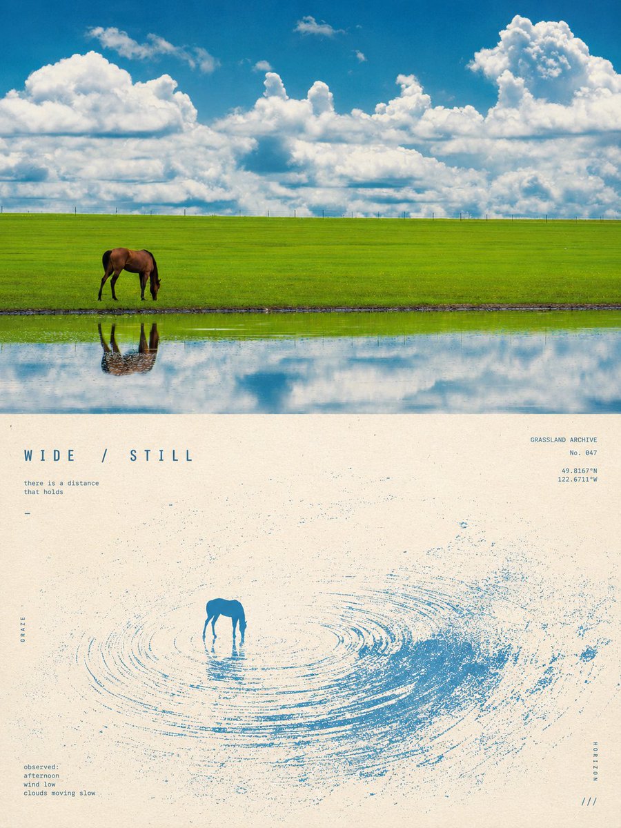
Turn each photo I upload into a separate high-end design poster, no multi-image collage; each photo is output individually. Use an overall 3:4 vertical composition, with the top and bottom areas strictly 1:1 in height, each occupying 50% of the frame. The top half keeps the original photo, preserving the subject's structure, real texture, natural light and shadow, and original color atmosphere, applying only a slight high-end photographic color grade so it has the quality of an art magazine, independent publication, and exhibition photography. To fit the format, you may naturally extend the sky, ground, or environmental background, but must not stretch, distort, or alter the subject. The bottom half extracts the most recognizable **subject, silhouette, pose, and narrative relationship** from the photo and reconstructs them into a surreal minimalist printmaking visual. Compress the subject into a clear and restrained visual anchor, usually placed at a small scale within vast negative space, retaining only the most essential contour and pose; do not replicate complex details, but let the original image's motion, direction, light, or spatial relationship transform into a **dynamic field** unfolding around the subject. The dynamic field naturally selects one primary motion logic based on the subject's own characteristics: it may fall from top to bottom, rise vertically, flow in one direction, spread outward from the core, or form irregular ripples and echoes. Use plentiful fine lines, broken trajectories, coarse halftone dots, and variations in grain density to express motion, denser and stronger near the core, gradually becoming sparser, fragmented, and vanishing into negative space toward the edges. Avoid stacking multiple effects at once; let **one subject, one motion, one enormous spatial relationship** be the core of the image. The palette extracts from the top photo **the single most recognizable and spirited main color**, combined with warm white, ivory white, or natural paper color and a little black, forming a strict 2–3 color system. The main color may be moderately purified and intensified, making it vivid and powerful but not overly digital; create depth through halftone density, ink overlay, and paper negative space, not ordinary gradients. Preserve silkscreen, Risograph, coarse grain, paper fibers, uneven ink coverage, and slight registration offsets, avoiding CG, 3D, realistic light effects, and the smooth feel of digital illustration. The text establishes a restrained **experimental art-book micro-typography system**. Extract a very short English title from the photo's motion, distance, state, emotion, or metaphor, paired with 2–4 groups of tiny texts, which may freely combine short phrases, state words, location or object info, serial numbers, coordinate-style numbers, direction words, archive labels, or observational notes. The text may be arranged along the horizon, the dynamic trajectory, the subject's axis, or the edge of the negative space, and may also be set vertically, rotated, with widened letter-spacing, embedded into the grain field, or lightly crossed by lines, making the typography itself participate in space and motion rather than being stuck onto the image independently. Overall pursue **a tiny subject, vast negative space, strong scale contrast, a single dynamic field, and coarse print texture**, presenting a quiet, lonely, mysterious, poetic, and slightly surreal experimental editorial visual. Whether the subject is a person, animal, plant, building, object, vehicle, or natural landscape, maintain a clear identity echo between the real photograph and the abstract field below, avoiding complex scenes, multiple focal points, ornament pileup, ordinary gradients, a commercial poster feel, and a template feel.