
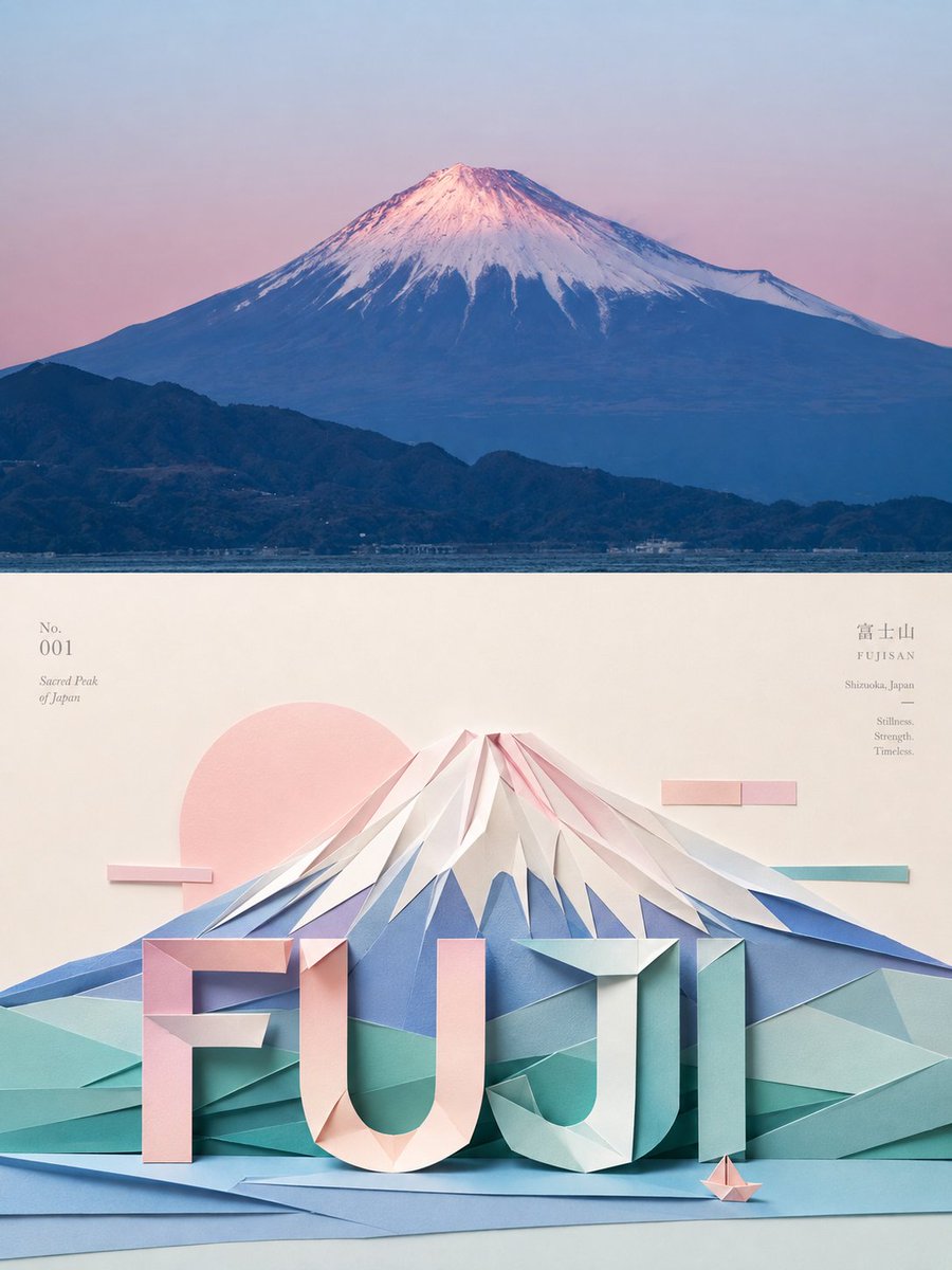
Turn each photo I upload into a separate high-end design poster, no multi-image collage; each photo is output individually. Use an overall 3:4 vertical composition, with the top and bottom areas strictly 1:1 in height, each taking up 50% of the frame. The upper half keeps the original photo, preserving the subject's structure, real texture, natural light and shadow, and original color mood, with only slight high-end photographic color grading, giving it the quality of an art magazine, independent publication, and exhibition photography. To fit the frame, you may naturally extend the sky, ground, or environmental background, but must not stretch, distort, or alter the subject. The lower half extracts the most recognizable subject, outline, pose, and narrative relationships from the photo and reconstructs them as an exquisite three-dimensional origami and paper-sculpture collage. Don't mechanically replicate photo details; instead summarize the subject through folding, faceting, layering, nesting, and joining paper pieces, keeping identity features recognizable at a glance while having clear geometric structure and a genuine handcrafted feel. Organize the composition according to the subject's own visual center of gravity, outline flow, volume proportions, and direction of movement, rather than fixed centering. Use primary/secondary hierarchy, scale contrast, axial relationships, triangular stability, diagonal tension, front/back occlusion, and positive/negative shapes to control the rhythm; the subject may be moderately off-center, partially cropped, or extended in one direction, with large white space creating breathing room, so the paper form has sculptural volume while keeping the restraint and balance of modern editorial design. Auxiliary paper pieces and geometric elements only support the subject and don't form a second visual center. Draw the most recognizable and vivid colors from the photo above and convert them into a harmonious yet vivid paper color set, using shades of the same color, adjacent colors, and a few contrasting colors to distinguish fold faces and spatial layers. The background uses cream white, light gray, soft pastels, or a light color that harmonizes with the original, with large white space and only a little paper texture and abstract geometric detail. Use soft diffused light to show paper fibers, creases, cut edges, thickness, and natural shadows; overall clean, real, and refined, avoiding plastic 3D, smooth CG, and cheap cardboard feel. Text is likewise transformed into part of the paper-art structure and composition. From the subject's identity, theme, action, emotion, or symbolic meaning, extract a short English word or title, paired with very little numbering, location, status word, or micro-annotation. The main text can be made of folded paper pieces, choosing—according to the subject's structure—to arch around, extend along the axis, follow the contour, support above and below, interweave and overlap, or hover in white space, so the text is readable while also becoming part of the image's spatial structure; auxiliary small type stays minimal, balancing the handcrafted warmth of paper art with restrained high-end editorial typography. The whole emphasizes paper materiality, geometric precision, spatial layering, compositional order, and handcrafted warmth, presenting the visual temperament of contemporary paper sculpture combined with high-end editorial design. Whether the subject is a person, animal, plant, building, object, vehicle, or natural landscape, it should maintain a clear and clever visual echo between real photography and paper-art reconstruction, avoiding cartoon origami, childish craft feel, uniform symmetry, complex piling, e-commerce display feel, and template feel.