
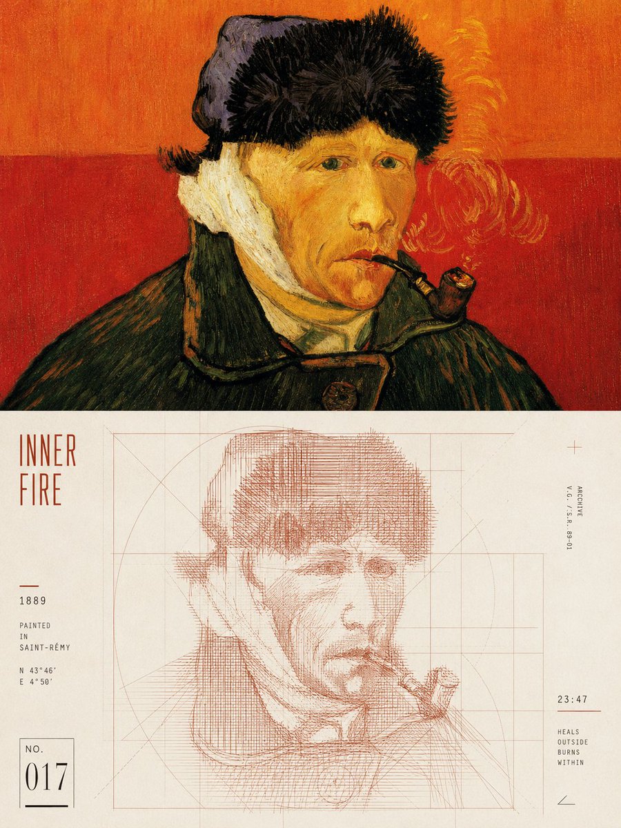
Turn each photo I upload into a separate high-end design poster—no multi-image collages; each photo is output individually. Use a 3:4 vertical composition, with the top and bottom zones strictly 1:1 in height, each occupying 50% of the frame. The top half keeps the original photo, preserving the subject's structure, real texture, natural light and shadow, and original color atmosphere; apply only a slight high-end photographic color grade, giving it the quality of an art magazine, independent publication, and exhibition photography. To fit the format, the sky, ground, or environmental background may be naturally extended, but the subject must not be stretched, distorted, or altered. The bottom half extracts the most recognizable **subject, contour, pose, and narrative relationships** from the photo, reconstructing them into a linear experimental poster with geometric order. The subject emerges from the aggregation of high-density repeated lines, misaligned strokes, short loops, and slight jittering trajectories, keeping clear recognizable edges while the interior stays unstable and flowing; around the periphery, use lines of the same origin but thinner, sparser, and lighter, diffusing outward, and establish a rational structure with horizontals, verticals, diagonals, arcs, tangents, or an implicit grid, forming a visual tension of **high density at the center, low density at the periphery, geometric order coexisting with free linearity**. Colors are extracted from the top photo, taking **the most vital, most recognizable color that best represents the subject's spirit** as the main line color, not area-averaged sampling nor deliberately aged/grayed; it may be moderately purified, brightened, and corrected to make the colors cleaner, brighter, and more modern. Use a clean light background, a single main line color, and black-gray micro-typography, creating layers through line density, thickness, and overlap, avoiding dirty colors, gray haze, fixed blue tones, multicolor mixing, and digital gradients. Text intervenes cleverly as part of the composition, distilling an extremely short English title from the photo's emotion, action, time, state, or metaphor, paired with a little numbering, a fitting philosophical maxim, state words, rulers, or micro-annotations. Text can be arranged along geometric axes, the subject's contour, or the line-field boundaries—horizontal, vertical, rotated, interwoven, or offset—creating a high-end editorial feel through tiny font sizes, thin weights, wide letter spacing, and precise alignment, so that rational typography restrains the restlessness of the free lines. Maintain large areas of white space, a single visual focal point, and clear geometric order, presenting a **clean, restrained, sharp, experimental, artistic, and vital** visual temperament. Avoid random doodles, directionless line tangles, dirty vintage, cyber-tech aesthetics, commercial promotional vibes, cartoonishness, and template feel.