
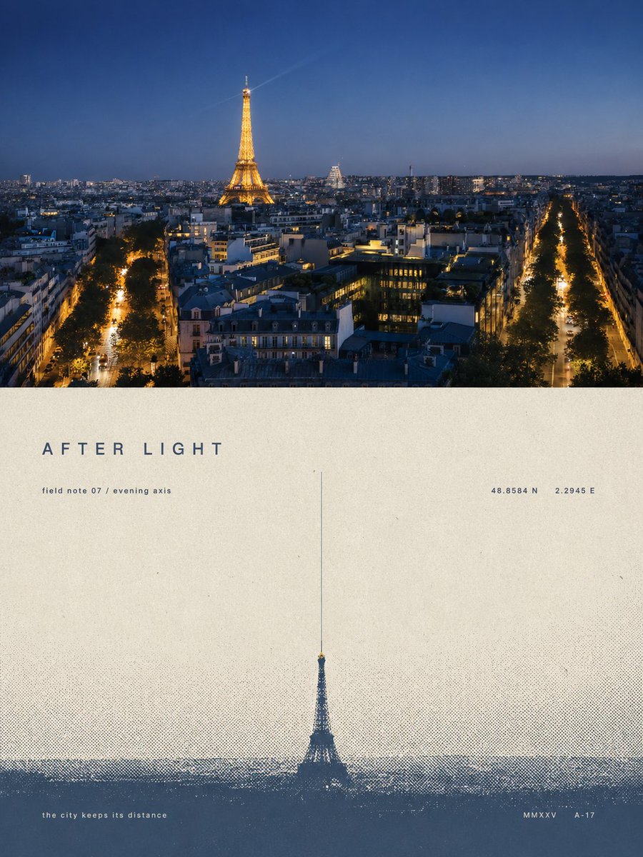
Turn each photo I upload into a separate, sophisticated design poster — no multi-image collage, each photo output individually. Use an overall 3:4 vertical composition, with the top and bottom regions strictly 1:1 in height, each occupying 50% of the frame. The top half keeps the original photo, preserving the subject's structure, real texture, natural light and shadow, and original color atmosphere, with only a light, high-end photographic grade, giving it the quality of an art magazine and exhibition photography. To fit the frame, you may naturally extend the sky, ground, or environmental background, but must not stretch, distort, or alter the subject. The bottom half extracts the most recognizable **subject, contour, pose, and narrative relationship** from the photo, compressing complex information into a single visual anchor, reconstructed as a minimalist silkscreen print and halftone-print poster. Do not trace the photo or add rich illustrative detail; keep only the single most essential shape, action, or spatial relationship, so the subject is still recognizable at a glance with minimal information. The composition follows “**one subject, one direction, one spatial relationship**.” The subject usually stays at a smaller scale, with large areas of white space creating a sense of distance and poetry; based on the original image's own relationships, choose only one most natural structure: horizontal extension, vertical elongation, isolated suspension, outward dissipation, or depth from light to deep — do not use multiple composition techniques at once. You may use a horizon line, boundary, shadow, or halftone band to establish space, letting the emptiness itself become the image's main component. The palette does not directly copy the photo but distills the overall color temperature, brightness, and mood from the original, reorganizing them into a limited spot-color system of **paper base color + main ink color + mist-layer color**. Use cream white, warm gray, or natural paper color for the large white areas, one calm and weighty synthesized color as the main ink, and a lighter, grayer color of the same family for air, distance, or layering. Keep it overall to 2–3 colors, building layers through color area, brightness, and halftone density, allowing a tiny area of accent color only when there is clear narrative meaning. All mist, distance, shadow, dissipation, and spatial transitions use **halftone dots naturally disappearing from dense to sparse** — no digital blur or ordinary gradient. Preserve paper grain, silkscreen ink, slight registration offset, and uneven inking, making the image look like a true art print actually printed on old paper. **Keep a small amount of decorative typography with a sophisticated editorial feel.** Not limited to place names, generate very short English titles from the photo's theme, mood, time, action, material, distance, or metaphor, paired with micro subtext, numbering, year, chapter number, coordinate-style numbers, archival marks, or a discreet English phrase. The copy can be somewhat abstract, literary, and curatorial in tone, without fully explaining the image — for example about concepts like “distance, stillness, passing, echo, boundary, time, light, trace” — so it reads like an editorial note in an art book, architecture journal, or independent exhibition. The text itself must participate in the composition, not be pasted onto the white space in post. Small type can **align along the horizon line, follow the subject's contour, become a vertical visual axis, cross the halftone boundary, hide in the negative form, or have relationships of occlusion, interweaving, breaking, and alignment with the subject**; you can also build rhythm with extremely thin vertical lines, short dashes, numbering, page-number-like symbols, and large white areas. A word may be split, set vertically, tracked out, or partly covered by a graphic, but always keep the reading order. Keep the text hierarchy restrained: **one very short main title + 1–3 groups of very small supporting text is enough**. Fonts reference high-end art publications and modernist editorial design, using restrained sans-serif, gentle serif, or minimalist condensed type, creating refinement through extreme size contrast, wide tracking, thin weight, super/subscript, small caps, and asymmetric layout. The text color unifies with the main ink or mist color, and may carry slight registration misalignment and ink grain, so text and graphics belong to the same print rather than a digital overlay layer. The whole pursues **very few elements, vast white space, a minimal subject, powerful order, and a subtle, clever textual intervention**, presenting something quiet, lonely, vast, understated, poetic, intellectual, and collectible. Avoid complex compositions, multiple focal points, meaningless ornament, large titles crushing the image, commercial ad copy, ordinary gradients, cheap retro filters, and a template feel.