
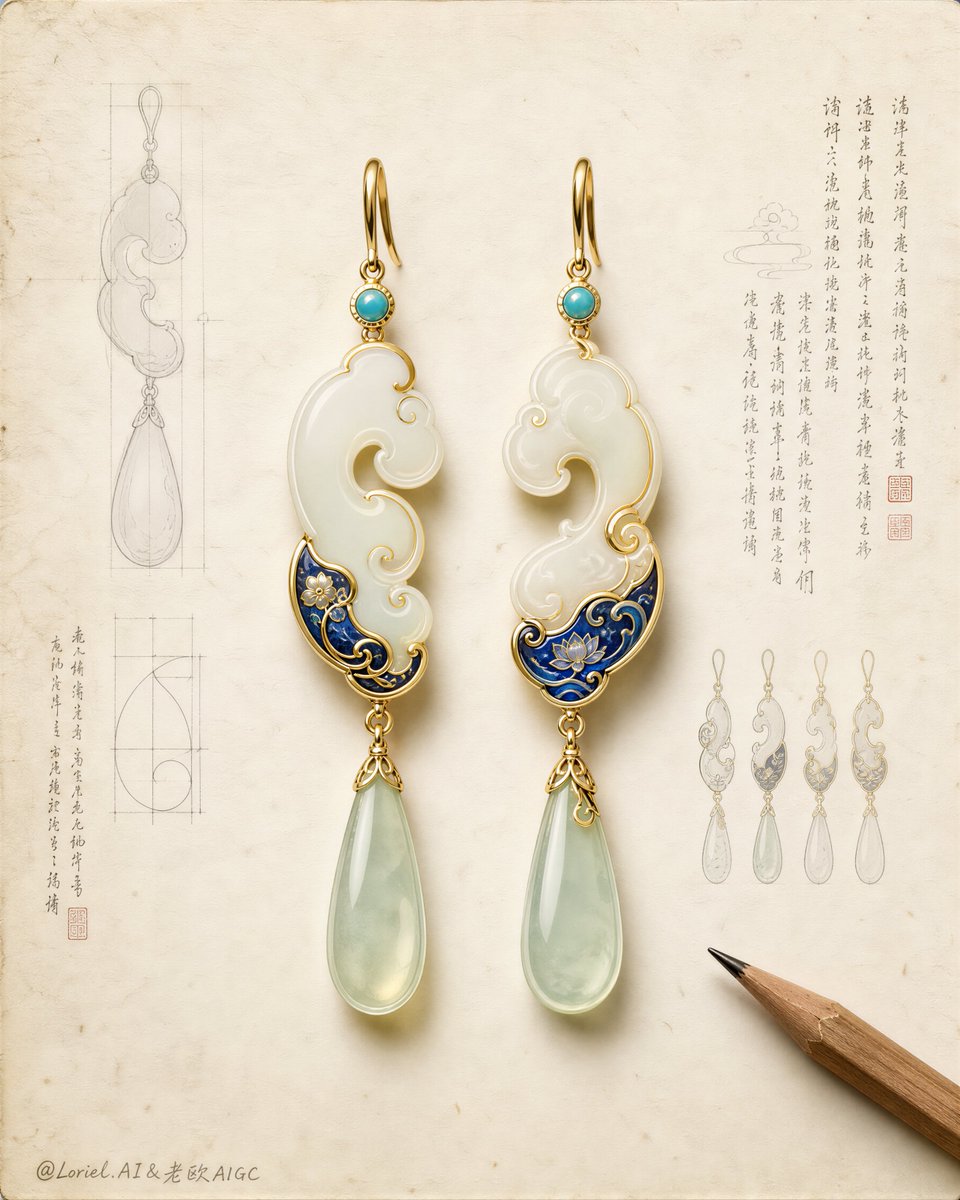
Create an ultra-premium jewelry archive poster that merges a world-class luxury brand design sheet with an East Asian heritage artifact study board. Keep the original structural logic but refine it toward a more international flagship presentation: one pair of exquisite hanging earrings placed at the visual center on a spacious warm-white aged paper ground, surrounded by only a small number of highly disciplined technical sketches, miniature variant studies, elegant manuscript note columns, and one sharpened wooden pencil entering from the lower right corner. The composition must feel calm, expensive, intelligent, and collectible, like a museum-grade design archive reinterpreted as a luxury campaign visual. Design a new pair of statement earrings inspired by traditional jade, archaic cloud-scroll language, and refined enamel ornament, without copying any existing shape. Each earring should feature a slim polished gold hook, a tiny turquoise connector stone, an elongated white-jade main body with graceful asymmetrical cloud curvature, a compact lower section enriched with deep cobalt-blue enamel floral or wave motifs, delicate gold contour filigree, and one long pale celadon translucent teardrop pendant suspended below. The pair should feel handcrafted and subtly varied, not mechanically mirrored, while still reading as a coherent luxury set. Make the earrings occupy roughly 60 percent of the visual attention and remain the absolute hero. Push the Transit direction strongly: the page should be cleaner, more spacious, and more elevated, with more controlled negative space, more disciplined object placement, fewer sketch fragments, and a stronger sense of premium restraint. The jewelry should look like it belongs to an international high-jewelry maison presenting a heritage capsule collection. Push the Port direction strongly: compress the image memory into three dominant symbols only, the central earring pair, the surrounding pale technical sketch aura, and the lower-right pencil. Remove unnecessary tiny distractions so the visual identity becomes sharper and more iconic. Lighting should be soft, refined, and highly controlled from the upper left, creating elegant shallow shadows on the paper, restrained luminous reflections on gold edges, subtle glow through semi-translucent jade, and delicate enamel sheen. Contrast should be gentle but precise, with enough dimensionality to make the jewelry feel tactile and precious while preserving the calm archival atmosphere. The paper background must be matte ivory-white with slight aging, faint fibers, tiny foxing marks, erased graphite residue, and subtle workshop traces, but remain pristine, rarefied, and premium. Supporting elements must be sparse and intentional: faint graphite contour studies, one or two orthographic geometry diagrams, a few miniature alternate earring thumbnails, one or two proportion grids, and several short vertical columns of newly invented decorative manuscript text with tiny seal-like red accents. These note elements must feel like antique jewelry research annotations, not modern readable branding, and they should remain light and secondary. No copied text, no dominant typography, no loud layout blocks. Material rendering must be extremely refined: creamy nephrite-like white jade with soft inner translucency, pale celadon pendants with smooth light transmission, polished gold with warm restrained reflections, cobalt enamel with slight depth and handcrafted surface precision, tiny gemstone bezels, elegant hook curvature, and believable jewelry engineering. The pencil should be natural cedar wood with a sharp graphite tip, rendered realistically but kept subordinate. Style: luxury jewelry campaign, museum archive sheet, heritage object study board, premium product photography fused with technical drawing aesthetics. Color palette: warm ivory paper, white jade, pale celadon, turquoise, cobalt blue, muted antique gold, graphite gray, tiny cinnabar-red seal accents. The overall mood should be noble, scholarly, modernized, and globally premium. No clutter, no extra jewelry piles, no excessive diagrams, no cheap craft feeling, no plastic texture, no oversaturated color, no loud branding, no modern graphic blocks, no messy stains, no dark dirty patches, no distorted metal hooks, no malformed symmetry, no chaotic text, no watermark, no logo.