
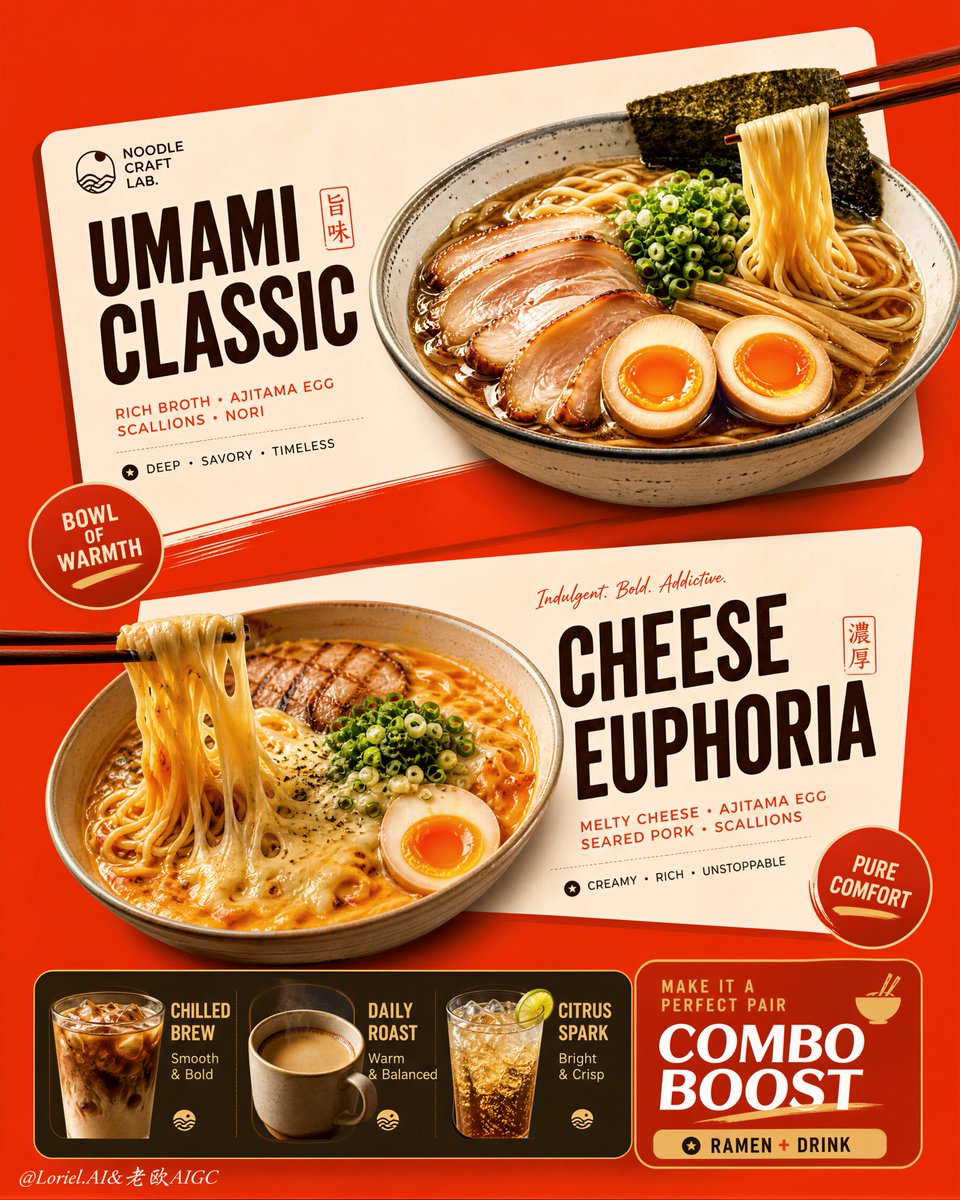
Create an ultra-premium vertical restaurant advertising poster that merges Orbit-style compositional force with Transit-style international polish, preserving the exact logic of a bold ramen combo menu while refining it into a cleaner, sharper, more globally premium flagship campaign. Use one dominant saturated orange-red background field and build the poster around two large cream-toned angled menu-card blocks floating through the center, each framing one ramen hero dish, with a compact drink-combo strip anchored along the bottom. The final image must feel graphic, hot, craveable, modern, and commercially irresistible, with the food and color-block geometry fused into one exact system. Do not copy any original text, logo, price, or wording. Core composition: Use a strict vertical poster architecture with three main beats: 1. a bold upper hero card featuring one ramen bowl, 2. a second slightly offset lower hero card featuring another ramen bowl, 3. a compact bottom combo strip featuring three drinks and one combo-offer zone. The orange-red field must act as the dominant visual stage, while the cream menu-card blocks slice across it with more deliberate angled placement. The whole poster must read instantly as a strong graphic food composition. Orbit enhancement: Push the card geometry harder. The two large cream cards should feel more decisively slanted and more dynamically offset, as if they are thrusting the food forward through the page. The bowls, price badges, and chopstick directions should align with these card angles so the entire poster feels driven by one aggressive compositional motion. The upper and lower ramen heroes should feel like two strong visual hits in a diagonal rhythm. Transit enhancement: Refine the whole image into a more international flagship restaurant-advertising language. Make the orange-red field cleaner and more premium, the cream cards softer and more elegant, the typography more disciplined, and the supporting elements more restrained. Reduce unnecessary icon clutter and decorative noise. The result should feel like a global fast-casual or modern Asian dining brand campaign with polished international art direction. Upper ramen hero: Show one premium ajitsuke tamago-style ramen bowl with rich glossy broth, springy noodles, a halved jammy egg, chopped scallions, and dark nori. The bowl should feel warm, comforting, and immediately craveable. Place it confidently within the upper cream card so the bowl, title zone, and price badge feel locked together. Lower ramen hero: Show one indulgent cheese-and-egg ramen variation with melted cheese stretching from lifted noodles, glossy broth, sliced meat or chashu, chopped scallions, and halved egg. The cheese pull should be clean, appetizing, and visually dramatic. Place the bowl so it balances the lower card while still feeling contained by its geometry. Drink combo strip: At the bottom, include a narrow premium combo strip with three compact drink modules: - iced coffee, - hot coffee, - cold soda or sparkling drink. These should feel like clean supporting products, each inside simple rounded or capsule-like graphic areas. Add one strong combo-value block to anchor the strip, but keep the entire bottom section tight, clean, and secondary to the two ramen heroes. Typography system: Use bold modern display typography with strong hierarchy and clean scanning logic. Dish names should be large and high-contrast. Price elements should sit in compact circular or capsule badges. Supporting lines should be short and minimal. All wording must be fully original and fictional. The typography must align tightly with the cream card structures and feel globally polished. Color-block integration: This is the most important feature. The food must feel inseparable from the color blocks. The orange-red background and cream cards must not behave like passive backgrounds; they must actively shape the poster, frame the dishes, direct the eye, and create rhythm. Bowls, chopsticks, price tags, and text must all appear intentionally positioned according to the card angles and color boundaries. Lighting: Use bright premium food-commercial lighting with warm directional clarity. Broths must glow with rich sheen, noodles must feel elastic, eggs must show soft yolk richness, and cheese must feel molten and luxurious. The drinks should show clean reflections and believable temperature cues. Keep lighting appetizing but controlled so the graphic structure remains dominant. Material rendering: Render ceramic bowls with subtle glaze reflections, broths with translucent depth, noodles with moist sheen, meats with caramelized texture, cheese with smooth melt physics, eggs with creamy yolks, and drinks with realistic ice, crema, or bubbles. The cream cards should feel matte and graphic, contrasting with the realism of the food. Background and cleanliness: Keep the poster tightly controlled and free of clutter. If any subtle texture appears in the orange-red field, keep it minimal and premium. Avoid unnecessary environmental storytelling. This must remain a graphic menu-poster composition first. Color system: Use a disciplined premium restaurant palette of orange-red, cream, warm beige, deep brown, black, noodle gold, broth mahogany, egg orange, scallion green, and coffee tones. The overall effect should be vivid, hot, and globally polished. Image finish: The final poster must feel like a world-class flagship ramen combo campaign: bold, graphic, product-led, appetizing, and commercially exact. Preserve sharp food detail, strong card geometry, clear typographic hierarchy, and immaculate commercial retouching. 8k, premium restaurant advertising quality. Negative prompt: copied brand names, copied pricing, copied slogan, cluttered menu text, weak card angles, weak color-block structure, muddy broth, limp noodles, fake cheese pull, greasy mess, random props, poor hierarchy, dirty background, black blotches, low-resolution food detail