
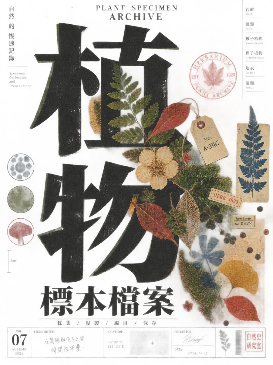
Let the future theme supply the central symbol or subject, but make the first-read event an oversized black letterform or abstract typographic structure pushed against the edge of the page, colliding with, masking, or being cut into by a vivid warm-color flat illustration. Typography and image must share the same physical print behavior: rough ink boundaries, slight registration drift, uneven coverage, and controlled hand-made irregularity, as if produced through tangible plate printing. Use a narrow vertical editorial composition with generous cream paper negative space, creating a clear reading path between the massive black form, the warm illustration, and dense narrow information columns. Let black carry weight; use vermilion, scarlet orange, pink, and a restrained blue accent as sharp visual interruptions, with the warm off-white stock providing air. Secondary text may run vertically or in compact columns, with scale, direction, and density creating rhythm rather than decoration. Build display glyphs with exaggerated proportions, heavy strokes, tight spacing, crisp or asymmetrical terminals, selective joins, and open counters or negative spaces; preserve topology, stroke contrast, rhythm, reading direction, marks, and orthographic recognition so the construction remains effective across structurally different writing systems. The illustration should use a limited palette of solid shapes, silhouettes, repeated motifs, and sparse linear detail, staying close to the type and functioning as part of the layout rather than as a realistic scene. Keep ink spread, uneven paper tone, minor misregistration, and localized fading, but avoid polished gradients, glossy effects, excessive symmetry, digital sharpening, or generic commercial beautification. The result should feel like an intellectually edited experimental cultural publication cover with tangible print residue and deliberate spatial tension. —————— Create a cultural publication cover about collecting the sounds of a city: use near-black violet as the dominant color, contrasted by vermilion orange, coral pink, and one cool cyan block; make an oversized black typographic structure enter horizontally from the upper-right edge, with concentric waveforms, a microphone silhouette, and broken signal lines packed into the lower-left. Let the negative space open diagonally toward the bottom information strip. Set the headline as a huge right-aligned form with selected counters reversed out, while small editorial labels run vertically along the left edge. Use a 3:4 portrait canvas.