
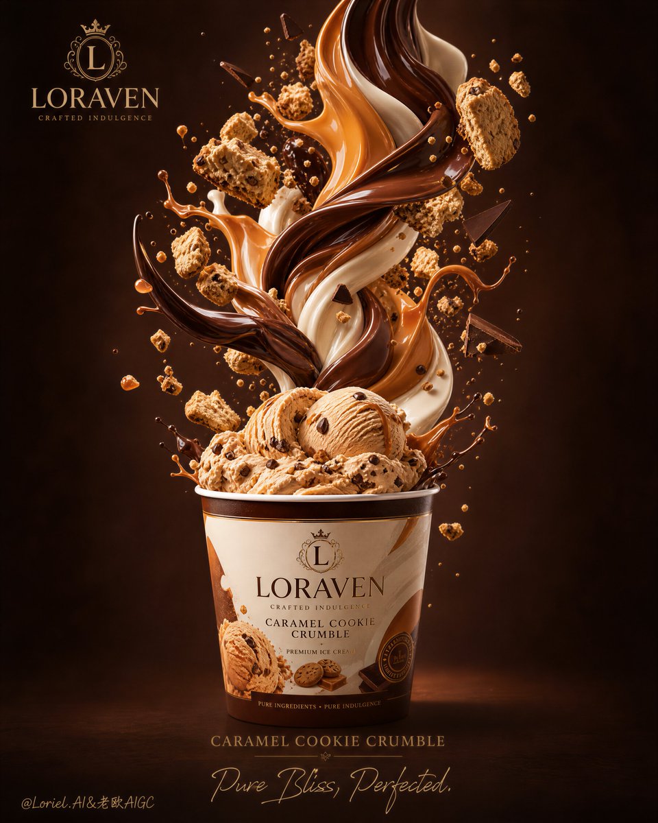
Create an ultra-premium global flagship dessert KV that preserves the reference image's slightly top-down commercial perspective while merging Port-style iconic product totem clarity with Orbit-style structural drama: one original branded dessert cup placed in the lower center of a tall vertical frame, viewed from a slightly elevated overhead angle, with a powerful sculptural vortex of silky vanilla cream erupting upward from the cup in one continuous central-axis motion and expanding into a bold premium cream crown in the upper half of the composition. Around this central cream structure, suspend glossy caramel rings, chocolate-coated wafer bites, crisp biscuit fragments, and fine crumb particles in a controlled orbital rhythm. The final image must feel like an international flagship dessert campaign: iconic, highly legible, premium, globally marketable, physically believable, and irresistibly edible. Do not copy any real brand name, logo, slogan, or packaging text. Core composition: Use a strict centered vertical composition with the cup as the absolute brand anchor and hero object. The camera must look slightly downward from above, clearly revealing the opening of the cup and the top surface of the dessert inside, matching the spatial logic of the reference. From this cup opening, build a tall cream vortex rising directly along the center axis. The structure must feel clean, iconic, and immediately readable from a distance, like a flagship billboard visual. The upper cream formation should bloom outward with controlled asymmetry into a crown-like splash, creating monumentality without losing elegance. Port enhancement: Treat the cup as a brand totem. Its silhouette must be clean, strong, and instantly recognizable, with bold original red-and-ivory graphic blocking, simple abstract insignia placement, and a polished premium fast-dessert identity. The cup should feel more iconic than decorative, more global than playful, and more flagship than casual. Keep all branding fictional, minimal, and non-readable. The cup-to-vortex relationship must feel like a complete visual logo system. Orbit enhancement: Increase the structural tension and upward lift of the dessert spiral. The cream column should feel more dynamic, tensile, and sculptural, with stronger vertical acceleration and a more dramatic expansion near the top. Caramel ribbons should wrap around the cream in elegant elliptical orbits with clear spatial layering. Wafer bites and crumbs should follow a deliberate rising trajectory, as if drawn into a refined dessert cyclone. The result should feel explosive in shape design but still controlled, luxurious, and commercially disciplined. Natural silky texture: This is essential. The cream must look naturally silky, dense, whipped, and aerated, with realistic extrusion ridges, soft folds, rounded peaks, and convincing gravity. No hard splash simulation, no synthetic foam, no plastic CGI edges. The caramel must feel smooth, glossy, elastic, and luxurious, with believable viscosity and subtle thickness variation. The chocolate coating must feel rich and premium with a satin gloss, never waxy or fake. Every edible surface must feel touchable, fresh, and physically correct. Lighting and flagship gloss: Use sophisticated high-end studio lighting with a warm top-front key light, soft lateral fill, and refined specular accents. The highlights must feel clean, international, and premium-retouched, especially on the caramel rings, chocolate shells, and selected cream ridges. The gloss treatment should elevate the image into a flagship global advertising language: polished, controlled, appetizing, and luxurious, never greasy, never cheap, never over-rendered. Material rendering: Render the cream with ultra-detailed whipped texture and subtle micro-air structure. Render caramel as translucent amber-gold with elegant reflections and believable drag. Render chocolate-coated wafer bars with realistic milk-chocolate shells, crisp wafer layering, and creamy filling. Crumbs should vary naturally in size and position, showing toasted biscuit realism. The cup should have matte-coated printed paper texture with slight premium finish and clean edge definition. Color system: Use an internationally appealing premium dessert palette: vanilla ivory, soft cream white, caramel amber, toasted biscuit gold, milk-chocolate brown, copper warmth, and a refined mocha-caramel gradient background. The red-and-ivory cup graphics should add strong commercial identity, but remain fully original and non-readable. The overall palette should feel warm, indulgent, premium, modern, and globally marketable. Background and cleanliness: Use a smooth warm caramel-to-mocha studio backdrop with a subtle center glow behind the vortex. Keep the environment immaculate and minimal. Only a light field of micro-crumbs and tiny suspended particles should remain to support depth and appetite appeal. No clutter, no spoon, no table, no extra packaging, no redundant props. Camera and framing: Maintain the slightly top-down perspective throughout. The cup opening must be visible, the first folds of cream must read clearly, and the vortex must remain fully legible from cup to crown. Use a premium poster-ready framing with strong negative space, clean silhouette separation, and immediate product recognition. Mood: iconic, flagship, silky, sculptural, craveable, polished, indulgent, globally premium, youthful, luxurious, high-end commercial Rendering style: ultra-premium dessert advertising photography, global flagship fast-dessert KV, slightly top-down hero shot, iconic cup totem, sculptural cream vortex, natural silky flow, elegant caramel orbit rings, premium chocolate wafer fragments, refined international gloss, world-class retouching, 8k Negative prompt: eye-level shot, low-angle shot, real brand names, copied logos, readable slogan, messy splash, fake CGI cream, plastic chocolate, oily highlights, chaotic crumbs, weak cup presence, cluttered background, low-detail wafer, dirty shadows, cheap fast-food look, distorted perspective, oversaturated colors