
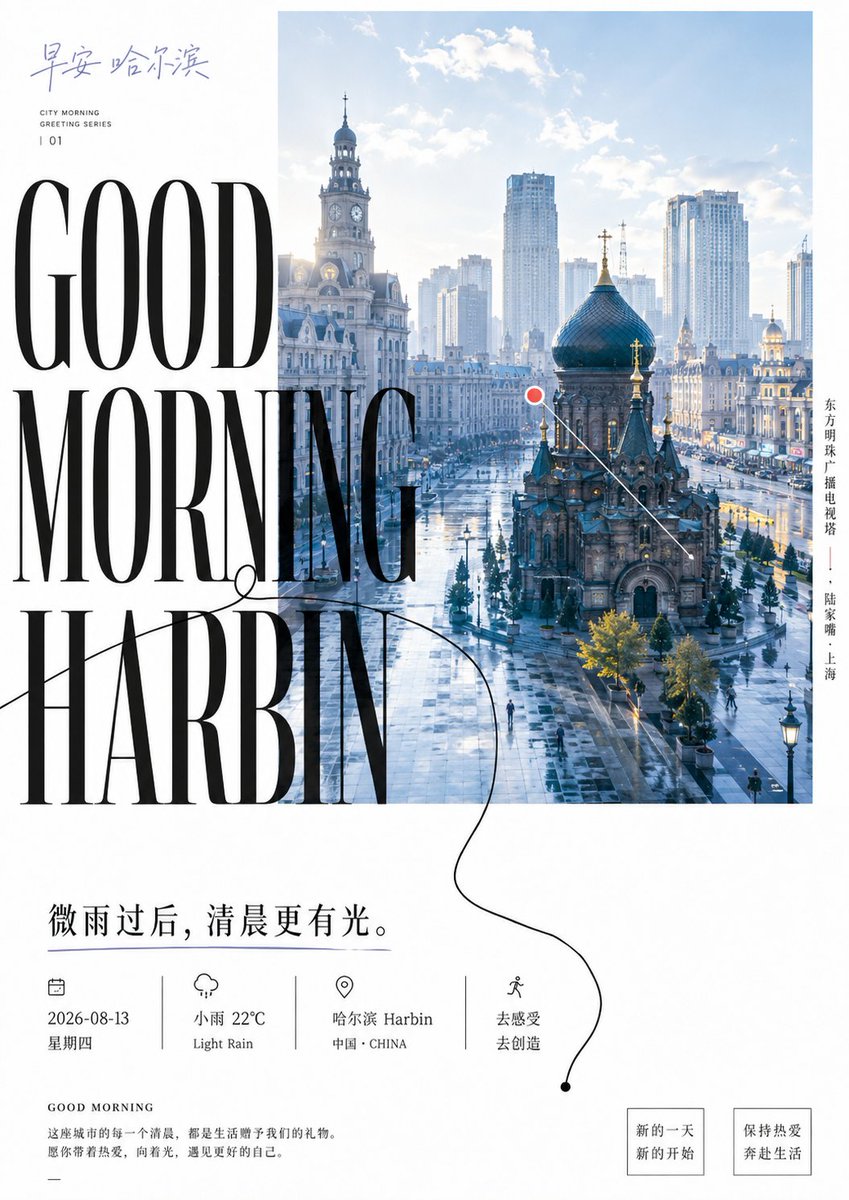
Organize a clear artistic poster visual around any theme object and event information: a rectangular main visual field positioned toward the upper right, close to the edge, carries the theme content, preserving readable spatial depth and environmental layers; leave a continuous large expanse of clean white paper on the left and below, forming an eccentric dynamic balance. Split the core title into three to five short lines, using a high-contrast, slender yet weighty serif display type, in large near-black characters stacked vertically; the text block crosses the left boundary of the visual field, with some letters landing on the white and some pressing into the image, so text and image share the edge and produce occlusion, cropping and scale tension; the title must become the first reading anchor, not a standalone label floating over the image. Inside the visual field, add a single symbolic mark derived from the theme, connecting the focal point to a small circular symbol with a thin straight line to establish place, direction or scale; also add a thin, slightly hand-drawn uneven continuous black line starting from the white on the left, entering the image edge, passing through loose bends, brief loops and discontinuous visual pauses, extending to the bottom caption area as a reading path running through title, image and information—do not draw it as a neat frame or decorative pattern. At the top, place a light handwritten theme signature and tiny auxiliary characters; along the upper or side edge of the visual, arrange a compact vertical caption; in the bottom white space, place a more prominent subtitle line, date/location or call-to-action information, closing with fine body text and small boxed labels; alignment follows an implicit grid, yet allows the drawn line and the main title to cross over, keeping an asymmetric, alternately dense-and-sparse rhythm. Hue and material are determined by the theme content, but maintain a high-brightness clean white base color, natural, bright and clearly layered visual color blocks, strong structural contrast from near-black text and lines, and a very small amount of highlighted theme marks as visual guidance; keep light translucent, depth built naturally by brightness and detail, avoiding a uniform filter. Use a clean flat-print texture, smooth paper, sharp edges on the photo or theme image, stable black ink density, with the drawn line retaining slight undulation; do not add yellowing, grain, creases, stains, aged fading, heavy shadows or excessive ornamentation. The overall reading order goes from the small signature into the vertical large title, the title crashes into the visual then descends along the positioning lines and hand-drawn curve, finally arriving at the bottom information; if the theme changes, replace the visual content, title text, symbol semantics and hue source, but never this eccentric relationship between white space and image, the boundary-crossing large characters, the single positioning mark, the continuous hand-drawn path and the clean print edges, or it will degrade into an ordinary centered promotional page. —————— Theme: Good morning + greeting + GOOD MORNING + city + quote + weather + 2026-08-13 Ten cities in total Ten images Each image with a completely distinct hue logic, radically different to avoid repeating hues.