
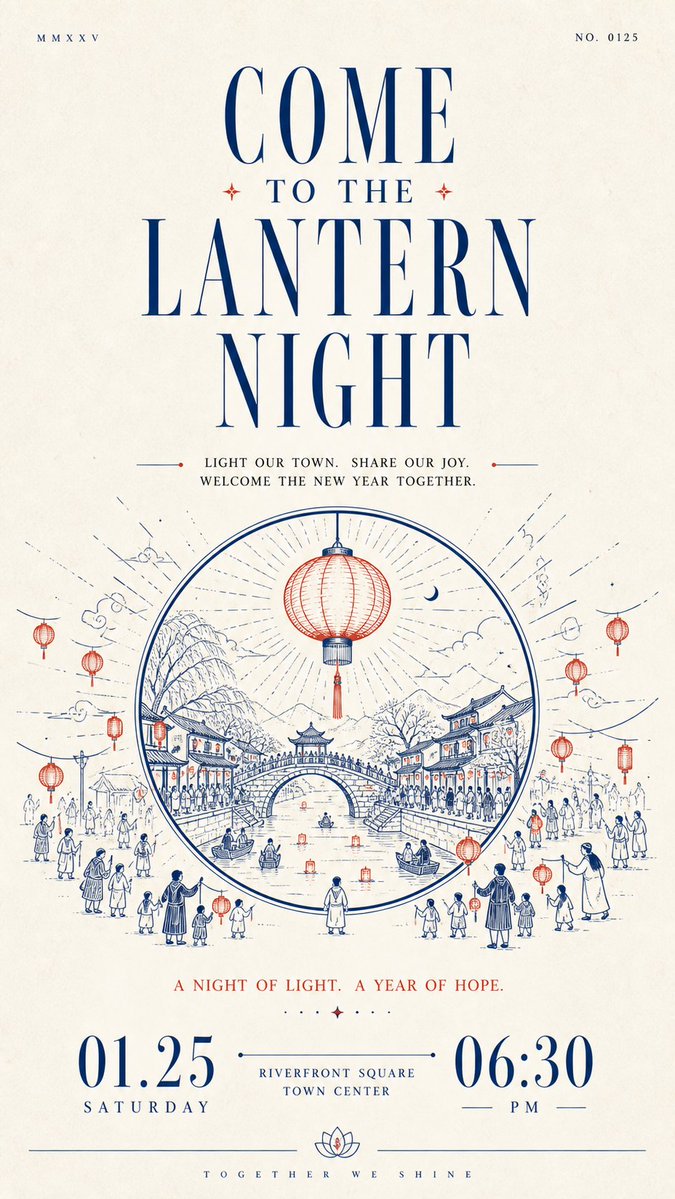
Build a restrained, solemn paper-based informational design with human warmth around any chosen thematic subject: let large areas of bright white space first establish quiet order, then let a striking headline, line-drawn narrative, and bottom numerals carry the reading onward in sequence. Organize clearly differentiated modules along a single main reading axis: near the top, place one extremely small, thin, widely letterspaced auxiliary text or numbering group on each side, separated by remote spacing to create slight asymmetry; beneath them, set an oversized, high-contrast Latin serif headline extending horizontally, with strong contrast between fine hairlines and thick stems, elongated letterforms, sharp terminals, and the same accent ink as the core illustration; then add a centered group of short Chinese phrases on the theme, built on a slender Songti skeleton with generous line spacing and breathing room between characters, so the dark text block both carries the headline and builds momentum toward the illustration. Distill the thematic subject's core image and its relationship to the environment into a monochrome printmaking-style line drawing rather than reproducing fixed objects: build outward spatial movement from the center with clear outer contours, continuous arcs, layered paths, and a few flat fills; keep foreground lines longer and more open, make the middle forms the heaviest, and finish the distance with fine short strokes; alternate dense detail with large expanses of empty paper, keep the contours legible, allow slight hand-drawn variation in line weight, and preserve the soft, blunted edges created by ink absorption at corners of a printed mark, so the image has a monumental stability without feeling heavy. Place the most important short notice phrase below the illustration, then anchor the bottom visual weight with a group of oversized, high-contrast numerals or equally scaled key information, spreading the left and right information apart and connecting the center with an ultra-fine horizontal line and small text, so the extreme scale differences create the ceremony of a formal announcement; finish with a hairline rule running across the bottom edge, lifted at its center by a small symmetrical emblem derived from the theme, and set a micro Latin wordmark beneath it with extremely wide letterspacing for a quiet, precise ending. Derive the color adaptively from the theme: the theme's meaning decides the specific hue and warm/cool character of the accent, which should stay medium-high in saturation, clean, and slightly pigment-like, occupying roughly one-tenth to two-tenths of the image and concentrated in the large headline, core line drawing, and bottom fine lines; give the background a near-white, low-saturation paper color that harmonizes with the accent, lets it dominate the composition, and keeps it high in lightness; use a near-black with the same warm/cool tendency for body text and numerals, limiting it to the typographic skeleton and local contrast. Keep an asymmetric area contrast rather than an even color balance: the more vivid the accent color, the more restrained the paper and the fewer, more precise the dark areas. Render the surface as fine uncoated paper fiber with slight uniform grain and a soft scanned feel; keep the texture mainly on the blank paper and visible through thin layers of ink, allow only tiny tonal variation in solid areas, and avoid heavy stains, strong creases, gloss, dimensional shadows, or decorative gradients; the whole design should remain bright, airy, and slightly edged by the paper's ink absorption, preserving the order among white space, line drawing, typographic scale jumps, and bottom closure, while preventing the illustration from expanding and squeezing the information or the text from averaging out and losing rhythm.