
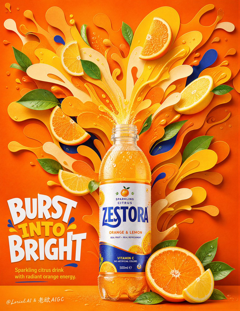
Create an ultra-premium commercial poster for an original beverage brand called ZESTORA, designed as a Cannes-level advertising key visual with one hyper-realistic citrus drink bottle as the absolute hero product and a bold upward explosion of layered fruit-splash shapes behind it. The composition must be a tall vertical poster with the bottle rising from the lower center, while a large radiant burst of sculpted yellow-orange splash forms expands upward and outward from the bottle mouth like a stylized flavor detonation. The overall image must feel bright, joyful, refreshing, graphic, highly controlled, and instantly memorable, combining hyper-real product realism with premium dimensional paper-sculpture aesthetics. Core composition: Use a strong centered composition. Place one realistic beverage bottle in the lower-center foreground, upright and slightly monumental, occupying the lower third of the poster. From the bottle opening, a compact creamy-citrus liquid burst rises directly upward and transitions into a large layered splash universe filling the upper two-thirds of the frame. This splash universe must feel like a series of overlapping abstract citrus-blast shapes, radiating outward in a clean symmetrical-organic arrangement. The bottle is the clear visual anchor; the splash world is the brand energy halo. Product design: Design the bottle as a globally market-ready premium citrus sparkling drink. Use the original brand name ZESTORA. The bottle must feel extremely real: transparent PET bottle, crisp highlights, subtle surface reflections, believable label wrap, condensation droplets, luminous orange-gold liquid inside, accurate cap threading, and tactile packaging detail. The label should use a refined bold logo system in deep cobalt, white, citrus orange, and leaf green accents, with a fresh premium international soda identity. The bottle should feel collectible, sharp, cold, and irresistibly drinkable. Splash and shape system: The explosion behind the bottle must be built from layered three-dimensional splash silhouettes in shades of lemon yellow, mango yellow, golden orange, and pale cream. These forms should look like sculpted paper-cut liquid clouds or premium molded graphic splash shapes, not random messy splatter. The splash cluster must begin tighter at the bottle mouth and grow broader and more dramatic as it rises upward. Keep edges rounded, clean, dimensional, and premium. The overall burst must feel playful and powerful, like citrus flavor physically blooming into space. Fruit and garnish elements: Scatter art-directed citrus wedges, small ring slices, and fresh green leaves around the splash composition. Use orange slices, lemon wedges, citrus rings, and a few small circular droplets. These elements must feel carefully placed, more designed than chaotic, orbiting the central splash with rhythm and balance. The fruit pieces should look premium, slightly stylized, and dimensional, matching the crafted poster world while still keeping believable citrus texture. Green leaves should add contrast and freshness, but remain clean and sparse enough to preserve visual sophistication. Background: Use a rich saturated orange background with subtle material texture, like luxury matte paper or premium embossed poster stock. The background must include softly layered tonal variation and a few recessed splash silhouettes so the entire frame feels immersive and designed, but not cluttered. Keep the atmosphere bright, warm, sunny, and refreshing. Typography and layout: Add original art-directed English headline typography only. Place a bold custom headline in the lower-left to lower-middle zone, integrated with the bottle and splash structure, such as “BURST INTO BRIGHT” or “TASTE THE SUNSPARK,” fully original and not copied from any existing ad. Add a smaller elegant support line beneath, such as “Sparkling citrus drink with radiant orange energy.” Include the ZESTORA logo small and refined on the label and optionally once in the poster layout. Typography must feel premium, playful, sculptural, and campaign-ready, never generic, never a plain font block. Lighting: Use soft premium commercial lighting with crisp edge definition and highly controlled color separation. The bottle must have studio-quality reflections and strong material clarity. The splash forms should cast gentle dimensional shadows onto one another, enhancing the paper-sculpture depth. Citrus wedges and leaves should catch clean highlights and soft shadows. The overall lighting must feel cheerful, silky, and luxurious. Creative direction: The poster must balance hyper-real beverage photography with bold graphic sculpture and high-end brand storytelling. It should feel like a world-class citrus drink campaign where flavor becomes an exploding visual identity. The image must be extremely clean, vivid, youthful, premium, and globally ad-ready, with zero cheapness and zero clutter. Mood and keywords: refreshing, radiant, citrus energy, premium, playful, sculptural, bright, collectible, product-first, dimensional splash art, clean graphic advertising, joyful impact Rendering style: ultra-premium beverage ad poster, centered hyper-real citrus bottle, layered yellow-orange splash explosion, dimensional paper-sculpture aesthetic, floating citrus wedges and leaves, saturated orange background, refined editorial typography, 8k, world-class commercial advertising quality Negative prompt: copied existing soda branding, copied headline text, messy splash, weak bottle presence, generic fruit layout, cheap clipart leaves, flat lighting, plastic-looking bottle, muddy colors, random composition, low-resolution label, cluttered poster, childish design, generic typography, low-end packaging mockup