
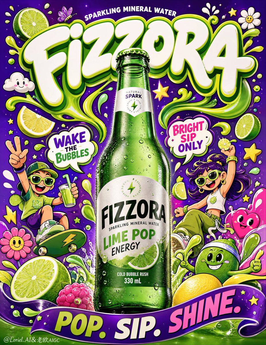
Create an ultra-premium advertising poster for a fictional sparkling mineral water brand called “FIZZORA”, designed as a high-impact pop-surreal beverage campaign with one hyper-realistic green glass bottle as the absolute hero and a vibrant illustrated universe built around it. The final image must feel like a Cannes-level commercial poster: loud, joyful, collectible, highly branded, and globally polished, while the bottle remains the clear focal point. Core composition: Use a tall vertical poster with one centered green sparkling-water bottle standing upright in the lower-middle center, enlarged slightly so it dominates the frame more powerfully at first glance. Build a vibrant illustrated world around the bottle in a symmetrical-but-playful upward burst: oversized bubble-like brand title at the top, thick ribbon-like splash shapes curling around the bottle neck and shoulders, cartoon mascots on both sides, fruits and abstract graphic elements near the lower third, and one bold wave-banner sweeping across the bottom foreground. The overall structure must feel explosive but highly controlled. Brand creation: Brand name: “FIZZORA” Main title: “FIZZORA” Support line: “SPARKLING MINERAL WATER” Flavor / concept line: “LIME POP ENERGY” Optional micro copy: “Natural Spark” “Cold Bubble Rush” “330 mL” All wording must be original, playful, premium, and beautifully art-directed. Do not copy any real brand text. Typography should feel custom, inflated, bold, and iconic. Product realism: Render the bottle with extreme photorealistic precision: translucent green glass, realistic wall thickness, crisp label print, subtle condensation droplets, cold glass sheen, premium cap detail, realistic reflections, and believable soft studio shadow. The bottle must feel tactile, fresh, chilled, and commercially perfect. Add tiny water droplets and a faint cool mist, but keep the product clean and sharply readable. Orbit-style impact: Increase the first-glance force by enlarging the bottle slightly and tightening the relationship between the bottle, the title, and the surrounding ribbon-like green splash forms. The bottle must behave like a visual pillar in the center, while the top title and side elements visually push toward it, amplifying product dominance and energy. Transit-style system discipline: Keep the entire poster standardized under one mature international beverage visual system. The characters, clouds, flowers, lime slices, droplets, stars, banners, and callout shapes must all share one consistent outline thickness, one coherent color hierarchy, and one graphic rhythm. The image should feel like part of a polished campaign family rather than a loose doodle collage. Illustration world: Surround the bottle with a polished contemporary doodle-pop universe including: - playful ribbon-like liquid streams - sliced lime forms and citrus wedges - whimsical cartoon characters with sporty summer energy - smiling flowers, stars, clouds, droplets, butterflies, and abstract blobs - wavy graphic banners and speech-bubble style callouts - a few bold fruit accents near the bottom All illustration elements must feel highly designed, color-rich, and collectible, not childish-chaotic. The linework should be clean, confident, and consistent. Typography layout: Place the large “FIZZORA” title near the top center in oversized bubble-inspired lettering. Add one or two smaller energetic graphic phrases inside the illustration cluster, such as: “WAKE THE BUBBLES” “BRIGHT SIP ONLY” Use a bold wave-banner near the bottom with a punchy slogan such as: “POP. SIP. SHINE.” All text must support the bottle and feel integrated into the illustration system. Color direction: Use a premium high-energy palette built around electric purple background, vivid lime green, aqua blue, sunshine yellow, hot pink, creamy white, and bright citrus accents. Keep the colors bold and saturated, but polished and intentionally controlled. Lighting: Use soft refined studio lighting on the bottle with smooth tonal transitions and no harsh glare. The illustrated environment remains graphic and flat-pop, but the bottle must feel truly dimensional, crisp, and premium. The final poster should feel bright, fresh, and tactile. Mood and quality: premium sparkling water campaign, enlarged hero green bottle, pop-surreal illustration world, collectible beverage poster, bold custom typography, citrus energy, youth-culture advertising, highly systemized doodle graphics, strong product dominance, 8k, world-class commercial image quality Negative prompt: real brand text, copied logo, weak bottle focus, cluttered composition, cheap cartoon style, muddy colors, oversaturated neon chaos, unreadable typography, low-detail bottle, plastic-looking glass, messy doodles, harsh reflections, hard shadows, low resolution