
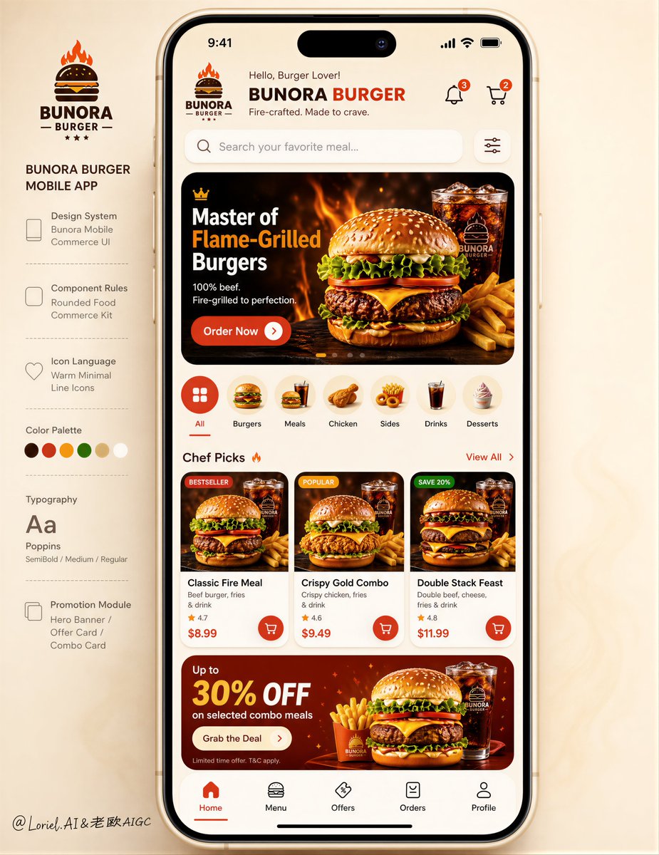
Create an ultra-premium mobile app design presentation board for a fictional international fast-casual food brand, fully preserving the exact composition logic of the reference image: a perfectly balanced 3-by-3 grid of nine smartphone screens arranged in a clean flat-lay composition on a rich golden-yellow tabletop background, with realistic food ingredients and plated dishes carefully framing the outer edges of the image. The overall result must feel like a top-tier Behance featured product design case study cover, combining strong brand identity, highly appetizing food commerce visuals, and a complete professional UI system. Composition and layout: Keep the exact structural rhythm of the source image: three phones across and three phones down, all vertically oriented, evenly spaced, viewed from directly above, with a clear editorial balance and strong negative space. Around the phones, place premium styled food elements such as burgers, fries, dipping sauces, herbs, sliced tomatoes, lettuce, pickles, lemon wedges, crispy chicken pieces, and plated signature meals, arranged naturally around the border without disrupting the symmetry of the phone grid. The phones must remain the dominant subject. Brand direction: Invent a completely new premium fast-food delivery brand with a short, memorable, global-ready name and a cohesive visual identity. The brand should feel warm, confident, youthful, appetizing, modern, and highly commercial, like a real international food-tech company. Use a refined brand palette built around deep signature red, toasted orange, creamy white, charcoal text, and rich golden-yellow environmental tones. All visible brand text, labels, UI copy, navigation terms, section names, and headlines must be original and newly invented. Do not copy any wording from the source image. Screen strategy: Design nine fully different yet visually unified mobile app screens that together communicate a complete product ecosystem: 1. a powerful splash screen with logo, 2. a refined home screen with hero campaign banner and featured menu categories, 3. a product listing screen with filters and sorting, 4. a detailed product page for a signature burger or meal, 5. a cart or basket screen, 6. a checkout or payment method screen, 7. a live order tracking screen, 8. a profile or loyalty membership screen, 9. a sign-in or onboarding screen. Every screen must feel realistic, production-ready, and thoughtfully designed, with consistent spacing, typography, iconography, component behavior, and visual hierarchy. UI and design system quality: This must look like a mature mobile design system, not just a set of isolated mockups. Include a coherent component language across all screens: rounded product cards, elegant buttons, segmented filters, tab bars, promo banners, loyalty indicators, quantity steppers, delivery status modules, payment selectors, badges, chips, and clean navigation patterns. The UI should feel polished, friendly, efficient, and conversion-oriented, with a clear modern food-commerce logic. Make the design language feel like the work of a senior product designer building a scalable commercial platform. Food styling and content: Inside the screens, use premium commercial food photography showing juicy burgers, crispy chicken sandwiches, loaded fries, wraps, sauces, desserts, soft drinks, and colorful combo meals. The food must look highly appetizing, realistic, and professionally lit. The surrounding tabletop props should visually match the food shown in the UI, reinforcing the brand world and making the whole board feel cohesive, immersive, and commercially believable. Presentation and realism: The final image must feel like a real design portfolio hero board photographed and art-directed at a very high level. Use realistic smartphone proportions, crisp glass reflections, subtle shadows, perfect screen alignment, excellent visual sharpness, believable material rendering, premium editorial composition, and refined lighting. The board should feel intentional, expensive, and completely free of AI collage chaos. Typography and portfolio framing: Add a clean editorial title zone near the bottom portion of the layout, with original headline typography, a concise product-design subtitle, and a short supporting line that suggests a professional UI/UX case study. The typography must feel architectural, premium, aligned, and internationally polished. The bottom caption area should reinforce that this is a complete branded app system rather than a simple food poster. Creative direction: The image should merge three layers at once: Orbit-level impact through stronger brand charisma, richer hero campaign energy, and more appetizing visual dominance; Transit-level maturity through clearer design-system consistency, stronger module standardization, and more complete UX logic; Port-level completeness through portfolio-grade framing, brand rollout polish, and a presentation style that feels suitable for an official product launch or award-level design showcase. No copied text, no random UI, no duplicate screens, no warped phones, no inconsistent perspective, no low-detail food, no cheap mockup feeling, no messy clutter, no broken hierarchy, no generic stock-app appearance.