
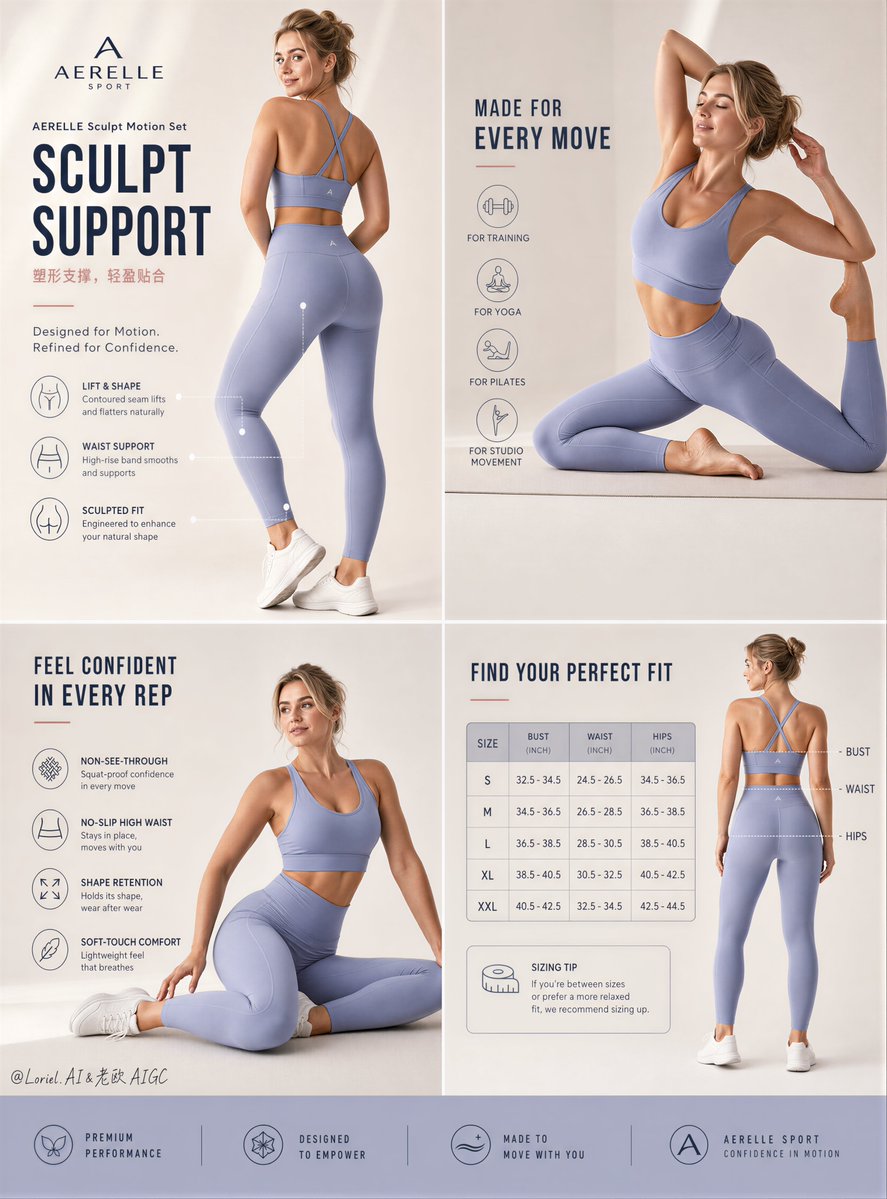
Create an ultra-premium Amazon-style e-commerce detail page poster for a self-created sunscreen lotion brand, strictly preserving the original four-panel collage composition logic without changing the macro layout. Keep the same structured beauty-detail-page system: one upper-left hero product panel, one upper-right skin-benefit and lifestyle panel, one lower-left application and usage panel, and one lower-right ingredient / formula explanation panel. Do not redesign the page architecture. Only strengthen it into a more premium, more realistic, more brand-driven, more commercially powerful sunscreen-lotion detail page. Brand identity: Use a self-created premium skincare brand: SOLMIRA SKIN Product name: SOLMIRA Daily UV Lotion Main English headline: SHEER SUN DEFENSE Small Chinese subtitle: 轻透防晒,柔润贴肤 Supporting English line: Invisible Protection. Everyday Radiance. Premium brand-unity requirement: The entire page must feel like one mature international skincare brand system. All four panels must share: the same font family, the same text hierarchy, the same icon language, the same callout style, the same margin rhythm, the same footer logic, the same image grading, the same premium sun-care palette, and one coherent beauty-editorial tone. The final page must feel like a flagship branded detail page, not four separate posters. Absolute layout rule: 100% preserve the original composition logic: - upper-left hero product panel - upper-right benefit and body-skin lifestyle panel - lower-left application / how-to panel - lower-right key ingredients and formula panel - rounded or soft-edged information capsules and elegant section dividers Do not alter the macro composition. Orbit enhancement: Increase the visual dominance of the upper-left product hero and the upper-right skin-benefit panel. Make the first read faster, more elegant, and more commercially magnetic. Let the packaging, texture, sunlit skin, and premium product cues read more strongly. Reduce weak decorative distractions and push the product-benefit story to the front. Port enhancement: Lock the commercial narrative into a complete and intentional sequence: 1. product hero and positioning 2. visible skin-benefit proof 3. application guidance 4. ingredient and formula trust Each panel must feel strategically necessary and directly tied to the purchase decision. Hero product panel: Create a warm premium upper-left panel showing the sunscreen bottle or tube as the absolute product hero. Place it on a clean sandy-beige or sunlit surface with refined shadows, soft reflections, and premium skincare styling. Add subtle surrounding cues such as sunlight, tropical leaf shadow, smooth sand-toned surface, or clean summer ambiance. Show the product capacity logically, such as 50ml, 75ml, or 100ml. The packaging must feel production-ready: matte or satin lotion tube, clean cap logic, real label spacing, UV-protection wording, subtle highlight roll-off, and believable print finish. Upper-right skin-benefit panel: Show a healthy youthful Western female model with real skin texture in a sunlit close crop or body-framing composition. She may hold the sunscreen product or simply appear with luminous protected skin. Her anatomy and pose must be natural, elegant, and believable. Her skin must feel warm, hydrated, realistic, pore-visible, and fully de-AI. Use this panel to communicate key sunscreen benefits such as: lightweight texture non-greasy finish hydrating comfort broad-spectrum protection no white cast Include a small close-up texture swatch or cream smear insert in the same panel. Female model rule: The woman must always be a healthy, youthful, naturally beautiful Western female model. She must never look like an influencer or an over-retouched beauty ad. She must have real skin texture, visible pores, subtle facial asymmetry, natural shoulder and waist transitions, realistic limbs, and a gentle natural smile if smiling. She must feel like premium skincare photography, not AI-generated beauty art. Lower-left application panel: Create a usage / application section showing how the sunscreen is applied to the skin. Use a realistic hand applying lotion to shoulder, arm, leg, or collarbone area. Show soft white lotion spread naturally on real skin with correct texture behavior. Use a professional step flow, such as: Apply generously Spread evenly Reapply as needed Add small elegant supporting notes about daily wear, comfort, and reapplication. All hand anatomy, fingers, skin folds, and lotion spread must be highly realistic. Lower-right ingredient and formula panel: Create a key-ingredients section with the product pack visible again plus ingredient callouts. Use a refined cosmetic-ingredient storytelling approach. Possible ingredient highlights: vitamin E niacinamide coconut water aloe extract ceramide complex marine minerals Add elegant arrows or lines pointing from ingredient names to the product or ingredient visuals. Keep it premium, sparse, and scientifically believable. Texture and formula realism: The sunscreen texture must feel highly realistic: silky lotion, light creamy emulsion, smooth spreadability, slight glow on skin, non-heavy finish, and no fake plastic cream look. If a texture swatch appears, it must feel tactile, creamy, and premium. Skin realism: Push all skin rendering toward extreme de-AI realism: visible pores, subtle body hair softness if appropriate, fine highlight texture, real elbow and knee structure, natural clavicle and shoulder transitions, and realistic skin shading. No waxy smoothing. No plastic skin. No anatomy glitches. Color system: Use a luxurious unified sun-care palette: warm sand beige, soft coconut cream, sunlit gold, milky ivory, pale caramel skin warmth, muted olive-green botanical accents, and restrained soft bronze or amber highlights. The full page must feel coherent, warm, elevated, and premium. Avoid random accent colors that weaken brand consistency. Lighting: Use ultra-soft premium skincare lighting. Panels should feel sunlit, warm, and clean, with delicate shadow transitions and skin-friendly light. The product hero should have refined studio-natural light. Lifestyle panels should feel like sun-filtered summer glow. No harsh HDR. No muddy shadows. No greasy over-shine. Graphic system: Use minimal official logo placement, clean editorial section headings, subtle callout lines, refined benefit bullets, and elegant information capsules. Keep all copy English-led with small Chinese subtitle support where needed. No discount labels. No noisy e-commerce clutter. No cheap beauty-ad styling. Product logic: The sunscreen must clearly read as a real premium daily UV lotion. Possible claims shown must remain commercially believable and operationally accurate: broad spectrum SPF lightweight feel hydrating finish no white cast daily protection skin comfort All claims must be visually supported in a professional way. Mood: premium, clean, luminous, skincare, sun-care, summer luxury, realistic, editorial, beauty-detail-page, elegant, fresh, high-end, de-AI, unified brand identity Rendering style: ultra-premium Amazon e-commerce detail page poster, luxury sunscreen lotion campaign, exact reference-style four-panel layout, hyper-real skincare packaging photography, de-AI Western female model, realistic skin texture, lotion application panel, ingredient explanation section, elegant English headline with small Chinese subtitle, highly unified premium brand system, 8k, world-class commercial realism Negative prompt: changed panel structure, AI-looking face, waxy skin, broken anatomy, unrealistic fingers, fake lotion texture, plastic cream smear, ugly bold fonts, discount graphics, cluttered layout, harsh HDR, greasy over-shine, oversaturated colors, low-resolution cosmetic rendering, inconsistent branding