
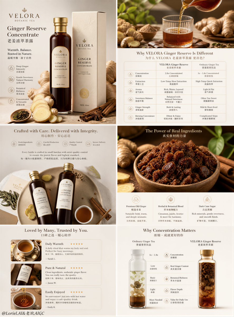
Create an ultra-premium e-commerce detail-page sales poster for a self-invented tea beverage brand, strictly preserving the exact original three-column long-form vertical layout logic, while merging Cream Halo Transit luxury brand precision with Milk Cloud Orbit tactile realism to make the entire detail page feel rarer, more expensive, and more flagship-level. Do not change the original structural composition. Keep the same three tall narrow columns side by side, the same top-to-bottom modular reading rhythm, the same infographic-detail-page hierarchy, and the same product-explanation sequence. The final artwork must feel like a design-award-level premium tea brand detail page: hyper-real, clean, elegant, materially rich, highly unified, and visually expensive, with minimal English main titles and smaller Chinese subtitle support. Brand and product: Create a self-invented premium tea beverage company such as “AUREL TEA LAB”, “VELORA TEA WELL”, or “EMBER TEA RESERVE”. The hero product should remain a premium powdered tea latte or grain-tea shake style tea drink, perfectly suited to the original page logic. The packaging must feel luxury-grade, modern, healthy, and giftable, with refined cylindrical canister design, elegant label hierarchy, premium matte paper texture, subtle embossing, and precise print clarity. Strict original page structure: Preserve the original logic exactly: Left column: - top brand / badge / intro block - middle hero product with one standing canister and one finished creamy tea drink - lower nutrition or key-value strip - bottom icon-based feature section Center column: - top quote-style brand statement block - middle powder / tea blend macro block with percentage logic - lower nutrient or function-circle cluster - bottom product spill / powder reveal image Right column: - top ingredient-value / spoon-comparison block - middle flavor and taste explanation block with finished drink visual - bottom raw ingredient ratio / source comparison section Do not change this structure into a homepage, collage, or different module order. It must remain a strict three-column product detail page. Make the detail page feel more expensive: This is critical. Upgrade the entire page into a higher luxury tier through: - more refined negative space inside each module - thinner, more elegant typography hierarchy - more premium material rendering on product, powder, spoons, packaging, and ingredients - calmer and more controlled section rhythm - more precise alignment of numbers, icons, headings, and explanatory blocks - less cheap “health product” feeling, more flagship brand editorial-commerce feeling The page should feel like a collector-grade commercial detail page, not a generic marketplace layout. Left column hero: Show one premium tea-latte powder canister standing next to a prepared creamy tea beverage in a transparent mug or elegant glass. The drink should show realistic foam, milk-tea density, powder suspension, and soft creamy meniscus. Around it, place restrained supporting ingredients such as tea powder, grain flakes, oat fragments, hojicha powder, matcha dust, or one premium spoon with powder. The hero must feel calm, expensive, and materially rich. The nutrition strip below must feel precise and luxurious, not crowded. Center column explanation: At the top, place a minimal English headline with a smaller Chinese subtitle in a quote-like refined composition. In the middle, show a large macro bowl or circular composition of premium tea powder blend with beautifully scattered fine powder around it. Use elegant numerical logic such as tea concentration, grain ratio, botanical content, or low-sugar structure. In the lower middle, create a refined cluster of circular nutrient or functional icons with better spacing and more premium finishes. At the bottom, show the canister slightly opened or tipped with powder spilling out in a controlled, tactile, luxurious way. Right column explanation: At the top, show two premium spoons or measuring tools holding different powder textures or tea concentrate references to communicate ingredient richness. In the middle, create a flavor block with one finished tea drink in a glass or cup showing creamy texture, foam body, and warm depth, paired with a short elegant explanation of taste, aroma, and mouthfeel. At the bottom, create an ingredient-ratio comparison area using circular bowls or neat ingredient clusters such as roasted grains, tea leaves, oats, sesame, beans, or herbs, with one elegant percentage badge. The whole right column must feel highly aligned and premium. Cream Halo Transit brand precision: Unify the entire page into one disciplined flagship brand system. All English titles, Chinese subtitle lines, percentages, icons, badges, nutrition stats, functional circles, ratio sections, and label areas must share one highly controlled visual language. Typography spacing, image-to-text proportions, module padding, and alignment must feel internationally premium and art-directed. Milk Cloud Orbit tactile realism: Push tactile realism to the highest level: - tea powder micro-grain texture - creamy liquid density and surface tension - foam micro-bubbles - powder spill softness and edge breakup - canister matte paper grain and emboss detail - label print sharpness and subtle ink contrast - spoon metal or ceramic realism - raw grains, oats, tea leaves, sesame, herbs, and beans with rich tactile definition - glass reflections and cup wall thickness Everything must feel touchable, de-AI, and materially expensive. Color direction: Use a premium palette of warm ivory, oat beige, milk-tea cream, toasted grain gold, hojicha brown, muted sage or matcha green accents, and soft taupe. Keep the three columns clearly differentiated enough to preserve the original page rhythm, but unify them into one elegant brand family. Lighting: Use soft premium commercial lighting with clean daylight-like highlights, elegant shadow falloff, refined reflections on packaging and cups, and delicate powder realism. The page must feel bright, healthy, premium, and visually expensive without looking loud. Rendering style: ultra-premium tea beverage e-commerce detail page, strict original three-column long-page structure, Cream Halo Transit luxury brand precision, Milk Cloud Orbit tactile realism, materially expensive flagship design, premium powdered tea latte product, hyper-real tea powder and creamy drink realism, elegant English main titles with smaller Chinese subtitles, award-winning commercial design, 8k, masterpiece quality Negative prompt: changed page structure, homepage layout, collage composition, cheap health-drink ad, plastic liquid, fake powder texture, cluttered page, messy typography, generic template, low-end packaging, cartoon infographic, oversaturated colors, harsh flash lighting, noisy props