
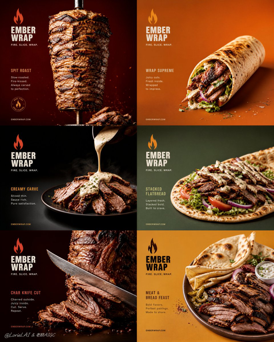
Create an ultra-premium 2x3 six-panel commercial poster for a fictional grilled-meat brand called EMBER WRAP, combining the tactile richness of Milk Cloud Orbit with the structural discipline of Cream Halo Transit, while enlarging the negative space, strengthening the color-block rhythm, and making the interaction between grilled meat and flatbread feel more sculptural and premium. The final image must feel like a world-class flagship street-food campaign: graphic, hyper-realistic, craveable, and collector-grade, with six highly disciplined mini-posters functioning together as one premium master layout. Use English-first branding only. Core layout: Use a strict 2x3 six-panel grid with six equally sized panels. The whole layout must feel highly controlled, spacious, and premium, with more breathing room inside each panel and stronger visual pacing across the full 2x3 structure. Every panel should read as part of one mature brand campaign, not as a random collage. The final poster must feel graphic, ordered, and rollout-ready. Milk Cloud Orbit enhancement: Push tactile realism much further in every panel. The grilled meat must show richer fibers, deeper char edges, better fat rendering, juicier sliced surfaces, and more premium roasted gloss. The flatbread must feel warmer, softer, more blistered, and more touchable. White sauce, butter-cream, or rich dressing details must feel thicker and more physically weighted where used. Vegetables, crumbs, herb flecks, spice dust, and tiny oil highlights must all feel sharper and more collector-grade. Cream Halo Transit refinement: Strengthen the campaign-system discipline across all six panels. Unify title hierarchy, descriptor placement, brand lockup, optional supporting text, and visual rhythm. The six panels must feel like one polished premium food-brand family. The arrangement of food, text, and color must feel more consistent, mature, and intentionally art-directed. Panel content logic: The six panels must include: 1. vertical meat-spit or stacked grilled-meat hero 2. wrapped flatbread meat roll 3. plated sliced meat with premium sauce pour 4. open flatbread layered with meat and fresh vegetables 5. close-up carved or knife-sliced meat hero 6. plated meat-and-flatbread composition with garnish interaction Three panels should emphasize standalone grilled-meat hero forms, and three should emphasize meat with flatbread pairings. Each panel must remain distinct while clearly belonging to the same series. Negative space: Increase the internal breathing room within every panel. Do not crowd the food or text. Let the grilled meat, flatbread, and garnish structures occupy clearer, more isolated visual zones so each composition feels more premium and more campaign-worthy. The empty space must feel intentional and expensive. Color-block rhythm: This is critical. Push the six-panel background system into a stronger, more disciplined rhythm. Use coordinated premium saturated tones such as deep red, burnt orange, charcoal black, sage green, warm mustard, and dark burgundy, arranged across the grid in a visually musical order. The six panels must feel balanced in chromatic intensity, with a cleaner alternation of light and dark blocks. Sculptural food interaction: This is critical. In the combination panels, make the relationship between grilled meat and flatbread feel more sculptural and designed. The bread should not just sit under the meat; it should wrap, lift, cradle, frame, or layer with the meat in a way that feels elegant and premium. The viewer should feel the meat-and-bread relationship as a designed food form, not a messy casual wrap. Hero food logic: The grilled meat must feel ultra-real and premium: charred edges, juicy fibers, caramelized browning, tender sliced surfaces, realistic fat rendering, and rich roasted color. The flatbread must feel warm, soft, slightly blistered, and physically believable. Vegetables such as lettuce, tomato, onion, herbs, or pickled accents should feel fresh and controlled. Typography and branding: Use English-first branding with a fictional premium identity: Brand: EMBER WRAP Campaign line: FIRE. SLICE. WRAP. Add short panel-specific names if needed, such as: SPIT ROAST WRAP SUPREME CREAMY CARVE STACKED FLATBREAD CHAR KNIFE CUT MEAT & BREAD FEAST Typography must feel bold, graphic, and art-directed, with a more disciplined hierarchy and spacing system than before. The text must support the food, not overpower it. Lighting: Use extremely delicate but high-impact commercial lighting. Each panel must have rich dimensionality, shaping the grilled meat texture, bread surface, sauces, vegetables, and crumbs with premium highlight rolloff. Lighting across all six panels must feel coherent enough to unify the campaign while allowing subtle internal panel variation. Material realism: Push realism to the maximum. Meat must feel juicy, charred, fibrous, and fresh off heat. Flatbread must feel soft and warm with browned blister spots. Sauces or butter-cream drizzles must feel glossy and physically weighted. Vegetables must feel crisp and fresh. All surfaces must read as physically convincing and appetizing. Mood: bold grilled-meat obsession, premium street-food sophistication, six-panel campaign order, sculptural food interaction, collector-grade appetite realism, modern brand confidence Rendering style: ultra-premium grilled-meat advertising poster, 2x3 six-panel campaign, Milk Cloud Orbit tactile enhancement, Cream Halo Transit brand-system refinement, enlarged negative space, stronger color-block rhythm, more sculptural meat-and-flatbread interaction, refined English branding, soft cinematic commercial lighting, extreme meat and bread texture realism, world-class food campaign aesthetic, 8k Negative prompt: cheap takeaway flyer, cluttered grid, low-detail meat, fake bread texture, messy sauces, cartoon rendering, oversized text, inconsistent branding, low-resolution texture, greasy chaos, weak panel differentiation, cheap fast-food styling, insufficient negative space, weak color rhythm