
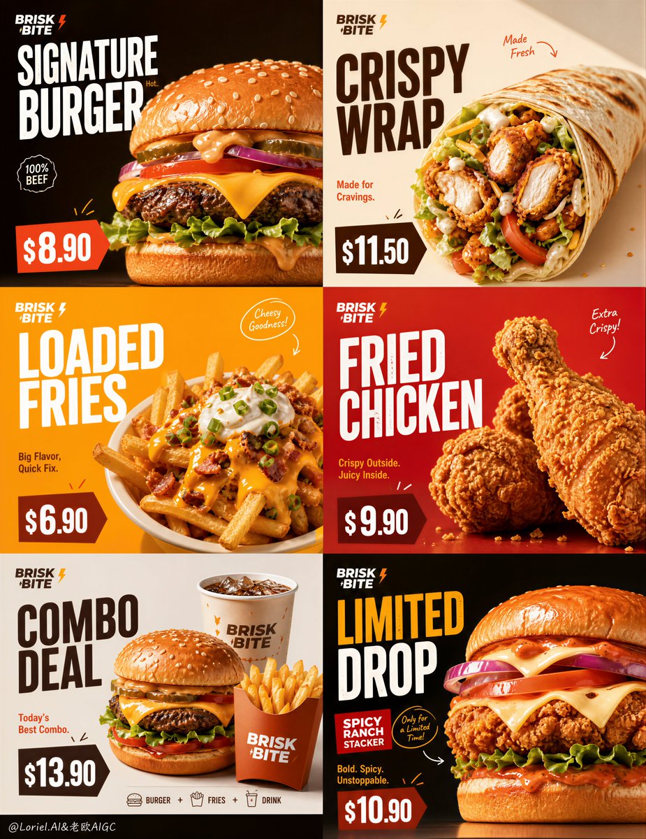
Create an ultra-premium 6-panel fast-food promotional poster for a fictional Western fast-food brand named BRISK BITE, merging extreme food realism with a stronger product-tier campaign rhythm. Fully preserve the exact structural logic and visual energy of a bold grid-based campaign layout: six square panels arranged in a strict 2x3 composition, each panel functioning like an individual high-impact promo card while remaining part of one unified brand world. The final artwork must feel like a world-class quick-service restaurant campaign: hyper-realistic, bright, graphic, youth-forward, clean, delicious, and highly commercial, with strong price labels, elegant English typography, minimal handwritten accents, and the food always remaining the visual hero. Core structure: Use a strict 2x3 six-grid layout with equal panel proportions and strong spacing consistency. Each panel must feel like a standalone fast-food promo visual, but all six together must read as one coherent branded campaign. Keep the structure bold, instantly readable, and optimized for promotional impact. Build a stronger sense of menu hierarchy by dividing the six panels into different fast-food product layers while keeping one visual system across all cards. Brand identity: Create a fictional premium fast-food brand: BRISK BITE Use modern English-only branding with a clean, bold, urban-friendly logo style. The brand must feel contemporary, accessible, energetic, and commercial, but still polished and premium. Include a small official-style logo placement consistently. Product lineup hierarchy: Design the six panels as a more clearly structured fast-food series: 1. Signature Burger 2. Crispy Wrap 3. Loaded Fries 4. Fried Chicken 5. Combo Meal 6. Limited Special Each item must look real, premium, and highly craveable. Products should vary clearly in silhouette, ingredients, and appetite mood, so the six panels feel diverse, fast-moving, and commercial, while still belonging to one campaign family. Panel design logic: Each panel should include: - one dominant real food hero - one bold title block - one clearly visible promotional price tag - one short supporting line in English - one or two minimal handwritten or drawn accents if useful - strong negative space around the product so the composition remains clean and impactful The product must remain the main visual focus. Typography and price blocks should support it, not overpower it. Each panel should feel like a fast-selling menu card with its own role inside the larger brand system. Typography and text style: Use bold premium English typography inspired by modern fast-food campaign design. Titles should be large, stacked, graphic, and highly legible. Example text system: BRISK BITE SIGNATURE BURGER CRISPY WRAP LOADED FRIES FRIED CHICKEN COMBO DEAL LIMITED DROP Use short supporting promotional lines such as: Hot. Fresh. Fast. Made for Cravings. Today's Best Combo. Big Flavor, Quick Fix. Weekend Favorite. Add clear promo price tags in a strong quick-service layout style, for example: $8.90 $11.50 $6.90 $9.90 $13.90 $10.90 Prices must be readable, bold, and naturally integrated like real fast-food advertising. Color system: Use a strong fast-food campaign palette with high contrast and promotional energy. Build the six panels from a unified set of premium commercial colors such as: bright orange warm yellow cream beige deep brown red accent blocks soft off-white Vary the panel backgrounds and graphic blocks so each product tier feels distinct, but keep the brand system consistent and intentional. The overall feel must be bold and appetizing, not chaotic. Food realism: Push the food realism to the absolute highest level. Buns must feel soft and glossy. Fried chicken coating must feel crisp and textured. Melted cheese must feel hot and elastic. Fries must feel golden and salted. Wrap bread must feel toasted and slightly blistered. Sauces must feel rich, thick, and glossy. Lettuce, tomato, pickles, onions, and herbs must feel fresh, hydrated, and vivid. Add subtle crumbs, sauce drips, tiny seasoning particles, and minimal steam or warmth cues where appropriate. Everything must feel hyper-real, clean, and commercial. Lighting: Use extremely delicate, soft, high-end commercial food lighting. Let each product catch beautiful highlights on bread, cheese, meat, sauces, fried crust, and vegetables. Shadows must remain short, soft, and controlled. The image should feel bright, juicy, appetizing, and polished, with no harsh glare. Handwritten accent logic: Add only minimal handwritten-style promotional accents or sketch lines: a few arrows, little emphasis marks, tiny note-like circles, or small energetic strokes around price tags or food edges. These accents must feel playful and commercial, not messy. Keep them sparse and well designed. Visual mood: The full 6-panel poster must communicate instant craving, strong product confidence, speed, accessibility, and modern fast-food culture. It should feel like a premium restaurant launch campaign or digital menu-promo series with clean commercial sharpness and youthful impact. The hierarchy between burger, wrap, fries, fried chicken, combo, and limited special should be immediately felt. Rendering style: ultra-premium photorealistic fast-food advertising poster, 6-panel grid campaign, fictional Western fast-food brand BRISK BITE, product-tier structure with burger wrap fries fried chicken combo and limited special, bold English typography, strong promo price tags, minimal handwritten accents, soft cinematic commercial lighting, hyper-detailed food textures, world-class quick-service campaign aesthetics, 8k, masterpiece quality Negative prompt: cheap takeaway flyer, cluttered composition, cartoon food, weak product focus, low-detail burgers, fake cheese, plastic ingredients, messy typography, unreadable prices, generic supermarket styling, flat lighting, oversaturated chaos, low-resolution textures