
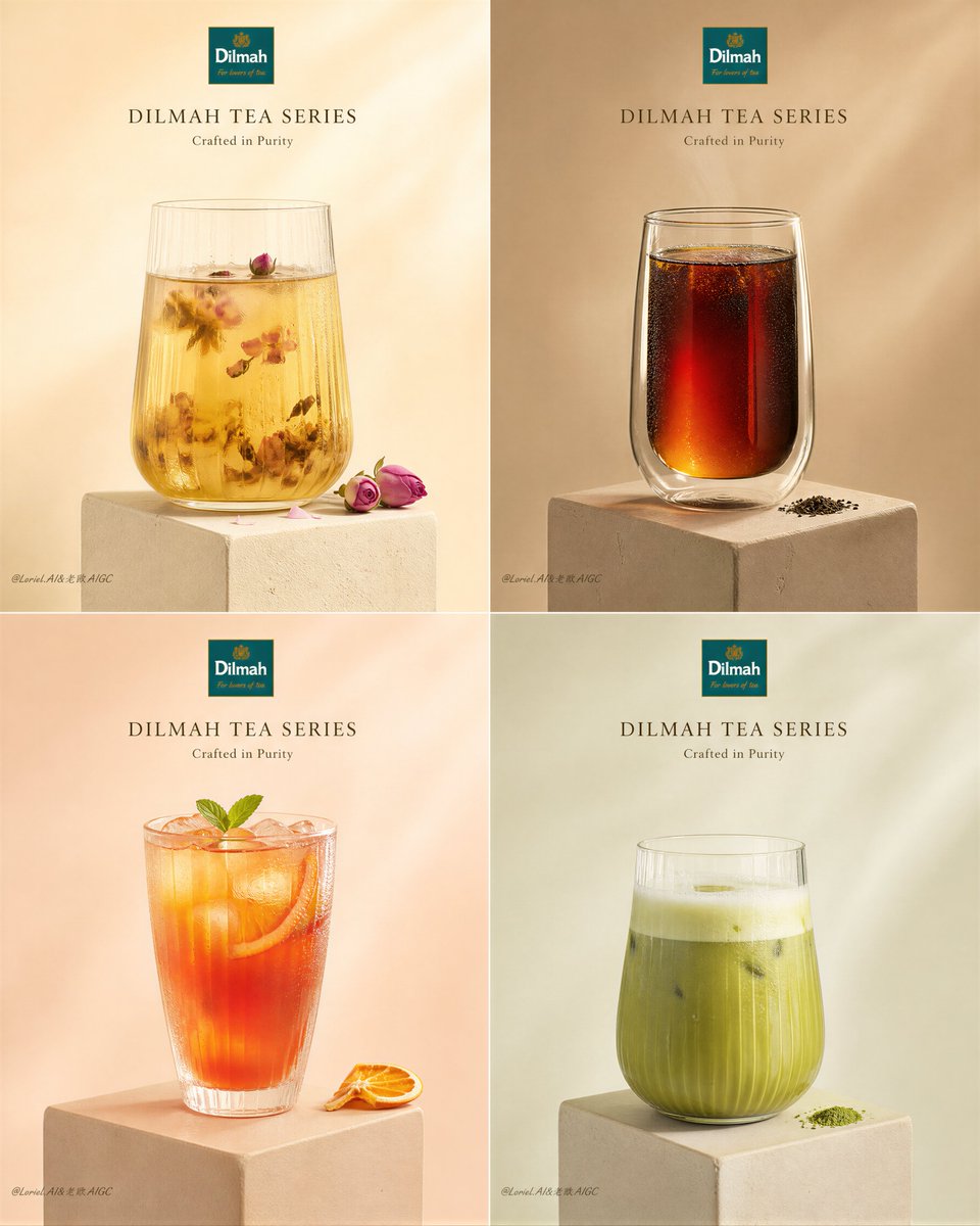
Create an ultra-premium 4-panel product poster for the Dilmah Tea series, merging extreme beverage realism with stronger flavor-based visual differentiation, while reducing all supporting elements to an even purer minimum. Fully preserve the exact visual logic and elegant minimal layout of a luxury beverage editorial campaign: a strict 2x2 grid, each panel featuring one real Dilmah tea product presented in a clean, isolated, highly refined still-life composition. The final artwork must feel like a world-class premium tea campaign: hyper-realistic, pure, elegant, visually quiet, and extremely polished, with the products remaining the absolute heroes. Core structure: Use a strict 2x2 four-panel layout with equal panel proportions and perfect spacing. Each panel must function like its own luxury still-life poster while remaining part of one unified Dilmah series. The overall composition must feel balanced, airy, minimal, and premium, with strong visual consistency across all four quadrants. Product system: Feature four real Dilmah Tea series products, each one clearly different in flavor identity, liquid color, glass styling mood, and visual personality while still belonging to the same elegant family. Suggested lineup: 1. floral tea 2. classic black tea 3. fruit tea 4. green tea or matcha-inspired tea variation Each panel must show the real Dilmah product in a beautifully styled glass or tea-serving presentation. Packaging may be subtly implied or very lightly integrated only if needed, but the drink itself must remain the main visual focus. The products must feel real, premium, and instantly desirable. Composition within each panel: In each quadrant, place one drink centered or slightly off-center on a small elevated stone, plaster, or matte pedestal block. Reduce supporting elements to the bare minimum. Use at most one tiny accent per panel, such as a single citrus wedge, one dried fruit slice, one flower sprig, one minimal herb accent, or one tiny tea powder trace. Some panels may have no extra accent at all if the composition feels stronger without it. The supporting elements must remain secondary and almost invisible in hierarchy. Each panel must feel pure, controlled, and editorial. 4-panel color variation: Keep the overall system luxurious and unified, but introduce stronger panel-to-panel color variation so each tea feels like its own quiet world. The background in each panel should remain soft and premium, but shift subtly in hue according to the drink identity: - floral tea panel: pale cream-beige with warm ivory undertone - black tea panel: deeper oat-beige or soft caramel-beige - fruit tea panel: blush sand or warm peach-beige - green/matcha panel: pale stone-beige with faint cool green undertone The color shifts must stay sophisticated and restrained, not loud. The four panels should feel harmonized but clearly differentiated. Background: Use warm soft neutral backgrounds with gentle tonal variation across the four panels. The surfaces should feel smooth, clean, luminous, and premium, with no heavy texture or visual noise. Each panel’s background should subtly echo its flavor family while preserving the overall calm luxury mood. Drink styling: Each drink must be styled with exceptional realism and refined individuality: - one pale translucent floral tea with quiet floral elegance - one darker layered black tea with rich depth and amber-brown density - one glowing fruit tea with warm brightness and juicy clarity - one soft green tea or matcha-based drink with creamy purity The glasses must feel premium, sculptural, and beautifully proportioned. Liquids must show real transparency, density, condensation, layering, foam or crema if needed, soft meniscus detail, and subtle internal light behavior. Every beverage must feel physically believable and luxurious. Typography and branding: Use minimal premium English typography only. Include: DILMAH TEA SERIES You may add one small refined line of supporting copy such as: Crafted in Purity or A Collection of Quiet Elegance Typography must feel highly restrained, modern, and editorial. Add a small subtle official-style Dilmah logo placement with elegance. Do not overcrowd the layout. The text must remain secondary to the product. Lighting: Use extremely delicate, soft, high-end studio lighting. Let each product catch elegant highlights along the glass rim, liquid surface, garnish texture if present, and pedestal edge. Shadows must be soft, short, and clean. The lighting must feel natural, quiet, and luxurious, with fine tonal falloff and no harsh glare. Material realism: Push realism to the highest level. Glass must feel crisp, smooth, and premium. Tea liquids must show subtle transparency, rich gradients, realistic ice or foam if present, and accurate reflections. Garnishes such as citrus, dried fruit, herbs, or blossoms must feel fresh and tactile if included. Add only a minimal amount of condensation, fine water droplets, or powder trace where appropriate. The image must feel pristine, not wet or chaotic. Visual mood: The poster must communicate purity, refinement, stillness, and product confidence. It should feel like a luxury tea editorial shoot with strong series discipline, elegant restraint, and quiet visual impact. The four panels should feel more differentiated in mood while remaining unmistakably one family. Color direction: Use a controlled premium palette of ivory, cream, warm beige, pale stone, oat, caramel-beige, blush sand, soft peach, herbal green, amber tea brown, citrus gold, and muted shadow taupe. The overall image must feel harmonious, elegant, soft, and quietly varied across the four panels. Rendering style: ultra-premium photorealistic beverage still-life poster, Dilmah Tea series, 4-panel luxury editorial layout, clean pedestal compositions, reduced supporting elements, subtle background color variation across panels, elegant English typography, soft cinematic studio light, hyper-detailed glass and liquid realism, minimalist premium brand aesthetics, 8k, masterpiece quality Negative prompt: cheap cafe poster, cluttered props, cartoon drinks, low-detail glass, bad liquid transparency, messy garnish, oversaturated colors, noisy background, generic packaging ad, flat lighting, low-resolution textures, too much text, supermarket drink styling