
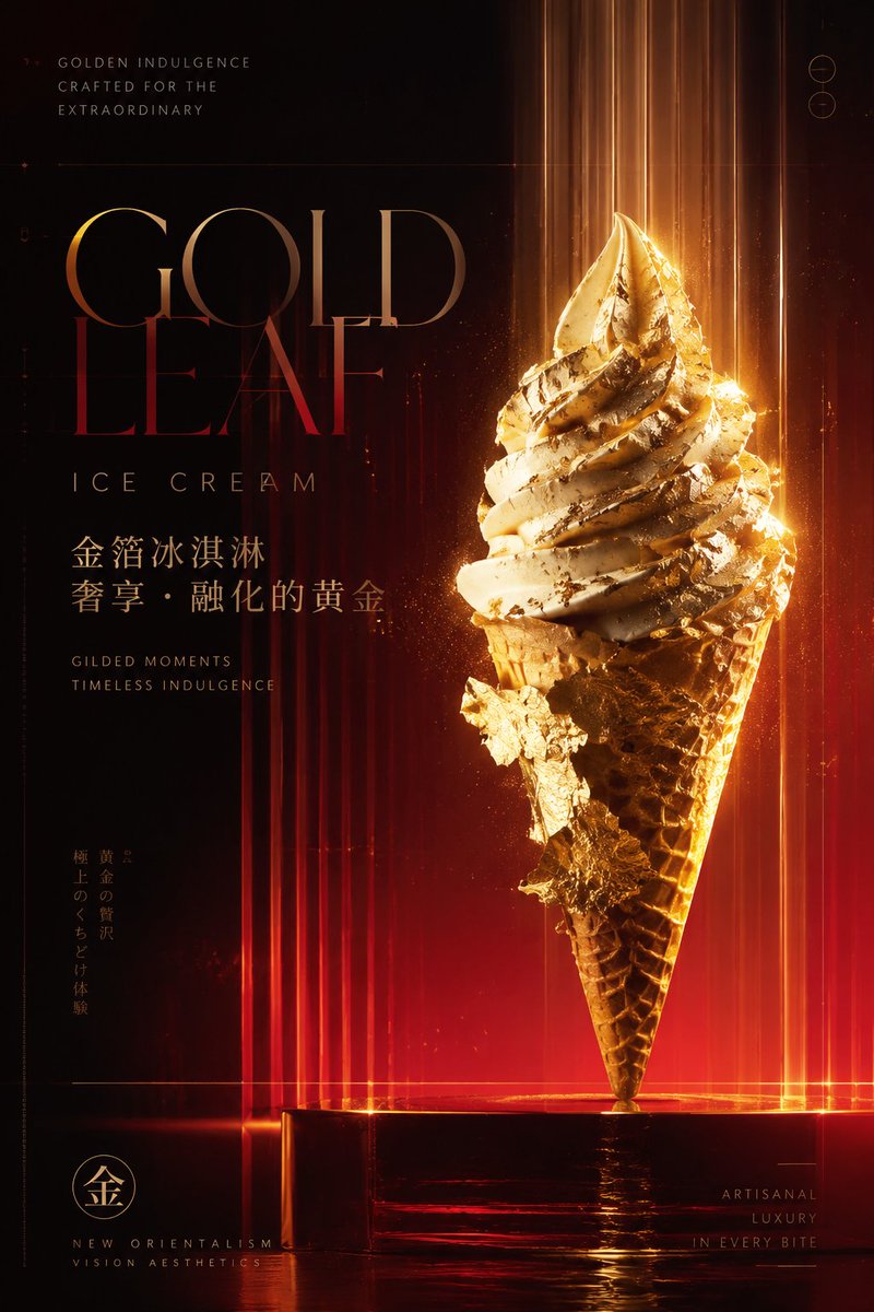
A neo-orientalist visual design theory system combining Bauhaus functional aesthetics, internationalist graphic design, the Swiss grid system, postmodern minimalism, and Eastern Zen aesthetics as its core framework, supported by Gunter Rambow's visual order, Kenya Hara's philosophy of emptiness, Naoto Fukasawa's minimalist perceptual design, and Kohei Sugiura's informational aesthetics, forming a restrained, high-end, futuristic brand visual language. The color scheme adopts color psychology, the Munsell color system, and modern luxury-brand color strategies, defaulting to a blazing warm-gradient palette of deep black, dark red, wine red, amber gold, and soft sand, creating strong light-dark contrast, highlighting bright energy colors against low-luminance backgrounds to build an authoritative, ardent, technological, and humanistic visual temperament, adjustable per theme. The composition logic uses the Swiss internationalist grid, the golden ratio, visual center-of-gravity balancing, and dramatic light-shadow composition, employing large negative space, central focus, vertical rhythmic repetition, and layered gradient progression to establish a high-end sense of order, combined with cinematic lighting design and the visual logic of luxury-brand launch events, reinforcing spatial depth, material texture, and futuristic atmosphere. The background uses procedural gradient art, light-shadow overlay, digital texture generation, and abstract material rendering, creating a technological and ceremonial visual environment through vertically flowing light beams, soft gradient layers, micro-granular texture, and semi-transparent material simulation, blending the luster languages of glass, metal, and silk to present a precise, premium, flowing brand space. The typography uses a mixed system of modern serifs and minimalist sans-serifs, following typographic proportion aesthetics, Bauhaus geometric composition, and high-end fashion-magazine layout logic, creating artistic lettering effects through stretched kerning, slender strokes, partial deformation, transparent overprinting, hierarchical dislocation, and glossy texture treatment, giving the text power, elegance, and futurism. Overall, the visual conveys a high-end, avant-garde, refined, mysterious, ardent, immersive, international, futurist, artistic, brand-gala-like emotional experience. Theme: gold-foil ice cream poster
Applying the theoretical system of Bauhaus functionalism, minimalist design theory, Eastern emptiness aesthetics, Gestalt visual psychology, the golden ratio, and dynamic-balance composition, supported by Dieter Rams's restrained rational aesthetics, Junya Ishigami's light spatial aesthetics, Kenya Hara's Muji perceptual design system, and Giorgio Morandi's low-saturation color philosophy, to create a high-end, pure, futuristic visual language. The color scheme adopts Morandi's low-saturation color principle, the natural light-gradient principle, and the metallic reflection principle, defaulting to warm white, champagne gold, light beige, and soft mist gray as core tones, crafting a luxurious yet restrained spatial atmosphere through subtle luminance differences, emphasizing fine-jewelry-like delicate luster and a futuristic technological feel. The composition logic uses golden-section division, asymmetric balance, axial order, spatial emptiness, and visual guide lines, creating a sense of breathing through large negative space and precise geometric structures, and reinforcing spatial depth with vertical rhythm, layered perspective, and fading relationships, presenting architectural-level order and ceremony. The background employs the language of parametric architectural design, minimalist sculptural composition, and light-installation art techniques, combined with precise 3D modeling, semi-transparent material rendering, soft diffuse light, brushed-metal finishing, and glass-crystal texture treatment, creating a flowing geometric space and high-end futuristic scene that highlights visual traits of lightness, purity, elegant luxury, and technological fusion. The typography uses a system fusing modern high-end serifs with Eastern minimalist calligraphic structure, referencing high-contrast serif aesthetics such as Didot and Bodoni, combined with the skeleton of the Song typeface, slender strokes, ultra-fine line control, precise kerning refinement, white-space proportion adjustment, metal embossing, and relief texture treatment, forming an elegant, dignified, international brand-ceremony lettering effect. Overall it presents visual quality on the level of a high-end aesthetic launch, futuristic commercial space, and art exhibition, conveying emotions of nobility, serenity, refinement, scarcity, purity, futurism, trust, ceremony, Eastern elegance, and restrained luxury. Theme: gold-foil ice cream product poster.