
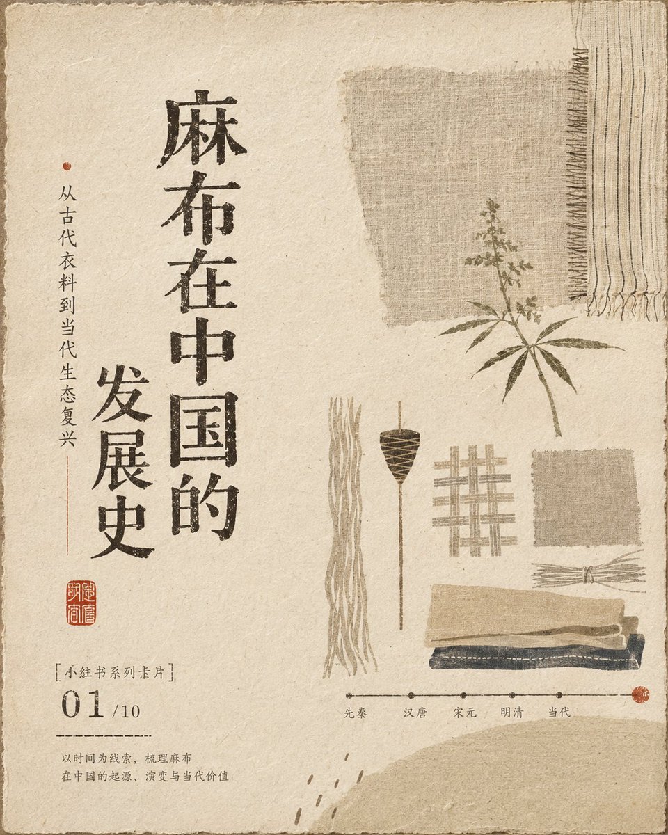
Core: **wabi-sabi aesthetics, the aesthetics of 'ma' (interval), mingei folk-craft theory, mono no aware sensibility, Eastern Zen negative space, classical book layout, and modernist visual order**, supported by **Soetsu Yanagi's plain folk-craft view, Keisuke Serizawa's stencil-dyeing structure, Rokuro Taniuchi's naive narration, Ikko Tanaka's geometric distillation, Jin Nong's rustic calligraphy, and Wu Changshuo's seal-carving spirit**. Overall texture of natural media like handwoven fabric, old paper fiber, and plant dye, keeping wrinkles, frayed edges, color bleeding, wear, slight overprint misalignment, and uneven ink absorption—but with controlled dirt density, for a more restrained, refined, breathing image. Color follows: **low-saturation unified tone, analogous-color gradation, value layering, implicit warm-cool contrast, area-ratio control, material-mixed colors, a few high-value highlights, and dark small-area anchoring**; large soft base tones carry, mid-value blocks build layers, a few deep values stabilize the center, and local light forms a gentle focus, revealing the color relations of old objects softened by time. Composition uses **asymmetric balance, Eastern negative space, visual triangle, diagonal movement, density rhythm, Gestalt proximity and closure laws, one-sided text anchoring, edge tension, and scale contrast**; main symbols are distributed in a loose yet orderly rhythm, avoiding standard centering and even arrangement, letting blank space be the main visual content, forming a quiet, slow, light reading path. The type system uses **classical vertical setting, woodblock-carved type, clerical-flavored handwriting, seal-carving marks, and modern information hierarchy mixed together**; letterforms de-mechanized, center of gravity slightly low, horizontal-vertical proportions not fully uniform, stroke ends keeping woodcut blade marks and dry-brush flying white, with local slight stretching, flattening, defects, and ink bleed; main text forms a spiritual axis in vertical rhythm, auxiliary text in small-size annotation style, airy character spacing and restrained line spacing, seal-style graphics as a visual signature; via **screen printing, woodblock rubbing, stencil dyeing, dry brushing, rubbing impression, overprinting, and slight misregistration** to create an authentic handcrafted feel. Illustration uses **Serizawa's flat stencil-dye generalization, Taniuchi's childlike naivety, Samiro Yunoki's folk-textile rhythm, Tanaka's geometric induction, woodcut's rough edges, and children's-drawing-like imprecise proportions**; content only suggested by abstract life symbols, plain blocks, silhouettes, and a few hand-drawn strokes, without depicting specific categories or pursuing realistic perspective, preserving chance, pause, and handcrafted warmth. Overall mood: **warm, quiet, nostalgic, rustic, soft, restrained, intimate, healing, subtle, relaxed, everyday poetry, sense of old times, handcrafted warmth, faintly sweet, low-voiced narration, sense of Eastern life ritual, refined without over-refinement.** —————— Theme: the history of hemp/linen fabric development in China Use: serialized images, Xiaohongshu cards. Multi-image logic like a slideshow A total of 10 images