
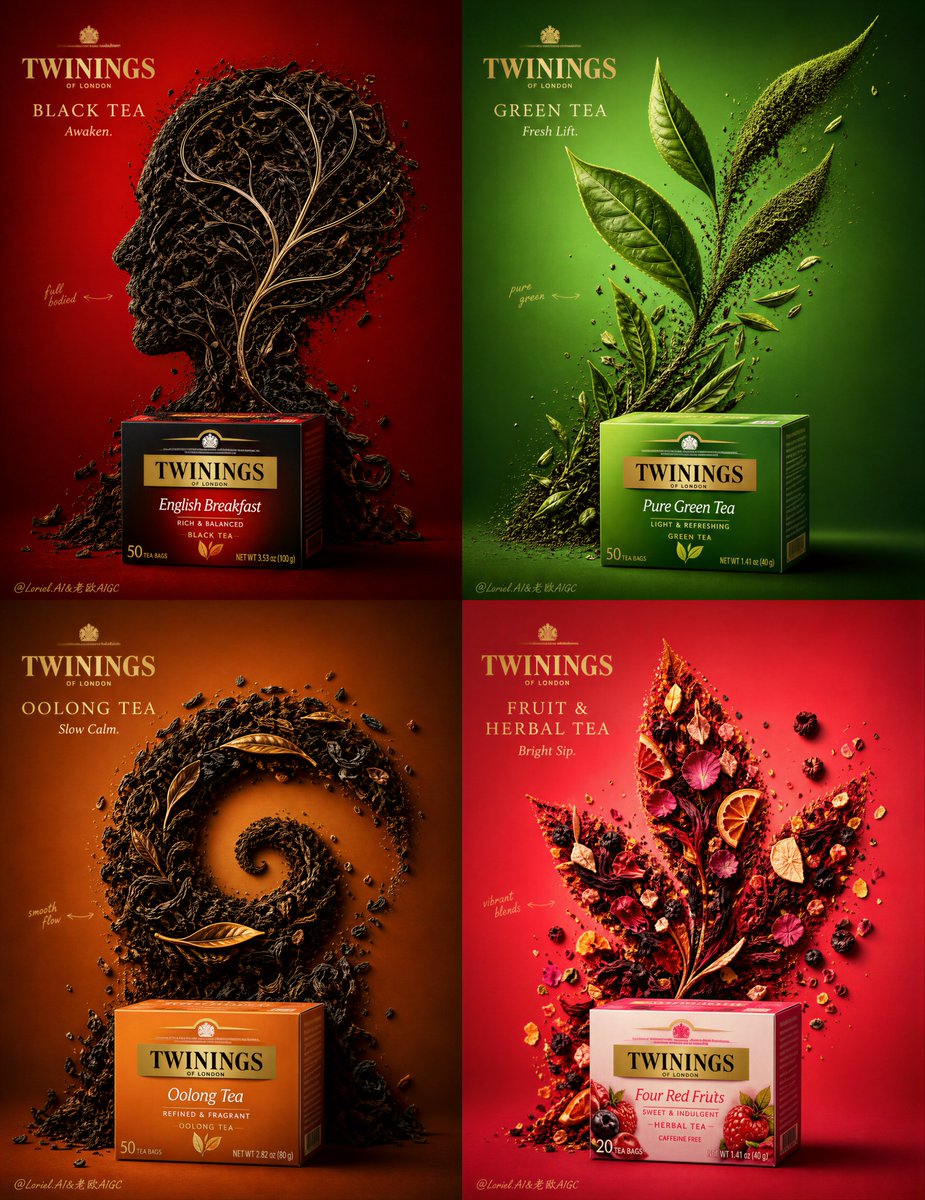
Create an ultra-premium 4-panel commercial poster for Twinings, featuring four real tea products: black tea, green tea, oolong tea, and fruit herbal tea. The composition must preserve the bold advertising logic of a high-impact minimalist product poster: each panel uses one real Twinings tea pack as a premium hero product and transforms loose tea leaves, dried botanicals, petals, fruit fragments, and fine tea particles into one striking high-contrast symbolic visual formation with a leaf-inspired spirit. The final artwork must feel like a world-class Twinings campaign: hyper-realistic, clean, graphic, richly colored, and luxurious, while keeping the product visually dominant in every panel. Core structure: Use a strict 2x2 four-panel layout. Each panel must present one different Twinings tea variety with its own distinct creative concept, while all four panels remain united as one campaign family. The four panels must be strongly contrasted in both color and shape logic, but share the same premium visual discipline, product-led hierarchy, and restrained handcrafted annotation language. Each panel should feel like its own poster, yet together they form one iconic series. Product system: Feature four real Twinings tea categories: 1. Black Tea 2. Green Tea 3. Oolong Tea 4. Fruit & Herbal Tea Each panel must show the corresponding Twinings package as a real premium object, beautifully lit and compositionally integrated. The package should feel crisp, tactile, and unmistakably authentic, with realistic print texture, edge definition, folds, shadow logic, and brand visibility. The product must remain central to the campaign logic, never overshadowed by the concept art made from tea. Tea-leaf concept shapes: In each panel, the loose tea ingredients must form one distinct high-contrast symbolic creative shape with a leaf-inspired spirit, but interpreted differently for each tea type. The shape should feel bold, iconic, and extremely graphic, while still being physically believable as material assembled from tea ingredients. Black Tea: deep twisted black tea leaves forming a dramatic mind-bloom or cerebral leaf structure, dense, intelligent, dark, bold Green Tea: fine green tea leaves and fresh leaf fragments forming a clean upward new-growth symbol, crisp, airy, fresh, energizing Oolong Tea: curled amber-brown leaves forming a refined spiral leaf or mountain-breath motif, elegant, layered, calm, flowing Fruit & Herbal Tea: petals, hibiscus, berries, dried citrus, and floral fragments forming an expressive blooming leaf or radiant fruit-floral crest, vibrant, fragrant, luminous The four shape concepts must be highly different from one another, with clear personality, strong contrast, and strong series logic. Background color system: Each panel must use a different highly saturated premium background color: - Black Tea: deep crimson red - Green Tea: vivid botanical green - Oolong Tea: warm amber-copper - Fruit & Herbal Tea: vibrant berry-coral The backgrounds must feel bold, luxurious, and clean, never cheap. Keep them flat, controlled, and visually pure so the tea shapes and product stand out with maximum impact. Typography and brand layout: Use elegant premium English typography in each panel. Main brand presence: TWININGS Refined product titles: BLACK TEA GREEN TEA OOLONG TEA FRUIT & HERBAL TEA Keep the typography more restrained than before. Supporting copy must be shorter, lighter, and more minimal, with only a very small poetic phrase if needed, such as: Awaken. Fresh Lift. Slow Calm. Bright Sip. Typography must feel artistic, modern, official, and highly controlled, never bulky, never crude. Add a subtle official Twinings logo placement with restraint. All text should remain secondary to the product and tea-formed concept. Hand-drawn annotation logic: Add only a very small amount of tasteful hand-drawn auxiliary elements around each tea concept shape: one or two fine arrows, a few delicate emphasis marks, or one tiny botanical gesture. The linework must be sparse, elegant, and restrained. No busy doodles, no dense explanatory lines, no excessive commentary. The annotations should feel like a minimal designer whisper around the concept, not a major graphic layer. Material realism: Push the realism to the highest level. The tea leaves must feel tactile, dry, aromatic, and highly detailed: twisted fibers, curled edges, fine particles, dust, stem fragments, petal textures, dried fruit skin, citrus rind pores, and botanical micro-debris. The product pack must have believable material finish and studio-level lighting. Add subtle floating micro-particles, tiny tea dust, and controlled scattered crumbs to enhance realism while keeping the composition pristine. Lighting: Use extremely delicate, soft, high-end commercial lighting. Let each panel have refined studio illumination with subtle directional highlights and soft shadows that define the tea textures, product surface, and graphic shape edges. The lighting must feel premium, clean, vivid, and luxurious, with smooth highlight rolloff and no harsh glare. Visual balance: Each panel must preserve an excellent relationship between product, tea-formed shape, typography, and minimal hand-drawn accents. The composition should feel visually striking but not overcrowded. Product first, concept second, typography third, annotations last. Each panel must be immediately readable and graphically strong even at a glance. Mood: luxury tea campaign, premium botanical branding, graphic minimal advertising, tactile ingredient realism, vibrant tea storytelling, high-contrast creative composition, modern handcrafted elegance, collectible commercial poster design Rendering style: ultra-premium photorealistic 4-panel tea advertising poster, Twinings product campaign, tea leaves forming symbolic graphic shapes, highly saturated luxury backgrounds, elegant restrained English typography, minimal hand-drawn annotations, soft cinematic studio lighting, hyper-detailed ingredients, world-class packaging realism, 8k, masterpiece quality Negative prompt: cheap tea ad, cluttered layout, weak product visibility, cartoon leaves, fake packaging, crude typography, too much text, too many doodles, low-detail tea textures, random messy crumbs, flat lighting, oversaturated cheap colors, busy composition, generic supermarket poster, low-resolution print quality