
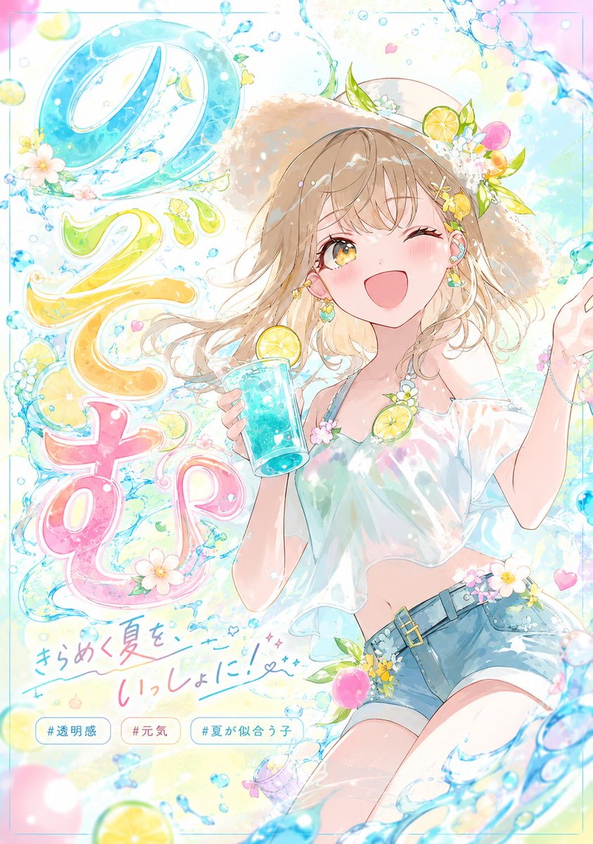
【Input fields】 Character name: 【Enter a name / if blank, auto-generate naturally from the image's impression】 Main lettering: 【Optional / if blank, use the character name】 Main copy: 【Optional / if blank, auto-generate naturally from the image's impression】 Text mood: 【cute / elegant / fantastical / cool / pop / if blank, decide automatically from the image】 Image ratio: 【4:5 portrait】 【Prompt body】 Use the attached character illustration as the most important reference and reconstruct it while faithfully preserving, as much as possible, the original's facial features, the impression of the eyes, eye shape, iris color and sparkle, hairstyle, hair color, bangs, contours, expression, sense of age, physique, the impression of the outfit, color scheme, transparency, atmosphere, and the character's unique cuteness, beauty, and charm. Turning it into a different person is forbidden. Above all, prioritize preserving the face, eyes, hairstyle, and hair color. The theme is: "a dedicated typography poster that visualizes this character's charm as lettering." Keep the character as the main subject while displaying the entered "Main lettering" as large main text. If the main lettering is blank, use the entered character name. If the character name is also blank, auto-generate a natural Japanese name or a short title from the image's impression. Above all, prioritize that the main lettering reads naturally, correctly, and clearly in Japanese. Do not produce missing letters, garbled characters, meaningless strings, or the addition of unnecessary characters. Do not merely place the letters flat; make them a dedicated design born from the character's impression. Incorporate elements that suit the original image — the flow of hair, the sparkle of the eyes, the texture of the outfit, flowers, light, ribbons, water, bubbles, stars, lace — and decorate beautifully while keeping the letter shapes from breaking too much and preserving legibility. The staging of the letters may emerge naturally from hair tips, the outfit, or the flow of the background, but keep the shape of the letters themselves clear and maintain a state that is easy to read in Japanese. In the composition, keep the character as the main subject while treating the typography as the visual core. Arrange the letters overlapping in front of and behind the figure, connecting to the hair and outfit, blending into the frame with depth. Unify the whole as a high-quality anime illustration × refined poster design. Emphasize a stylish, polished impression; do not overdo sparkle and decoration, and make it a graceful, well-organized, beautiful design. The background should not be a single flat white; use a stylish background that makes use of negative space and lets the character and letters stand out. Do not cram in too much information; compose it clearly and beautifully. The letters in the image should be in Japanese only. Do not use too many characters; limit it to about: One large main text: 1 One line of short copy: 1 Small supporting keywords: 2 to 3. English headlines, existing logos, or expressions imitating real brands are not needed. For each attached illustration, make the shape, texture, color, decoration, and manner of appearance of the letters change naturally. Do not use the same staging every time; emphasize that it becomes a dedicated typography possible only because of that character. Overall, create a single high-quality piece that makes people want to imitate it and conveys at a glance: "this is what it looks like when you design this character with lettering."