
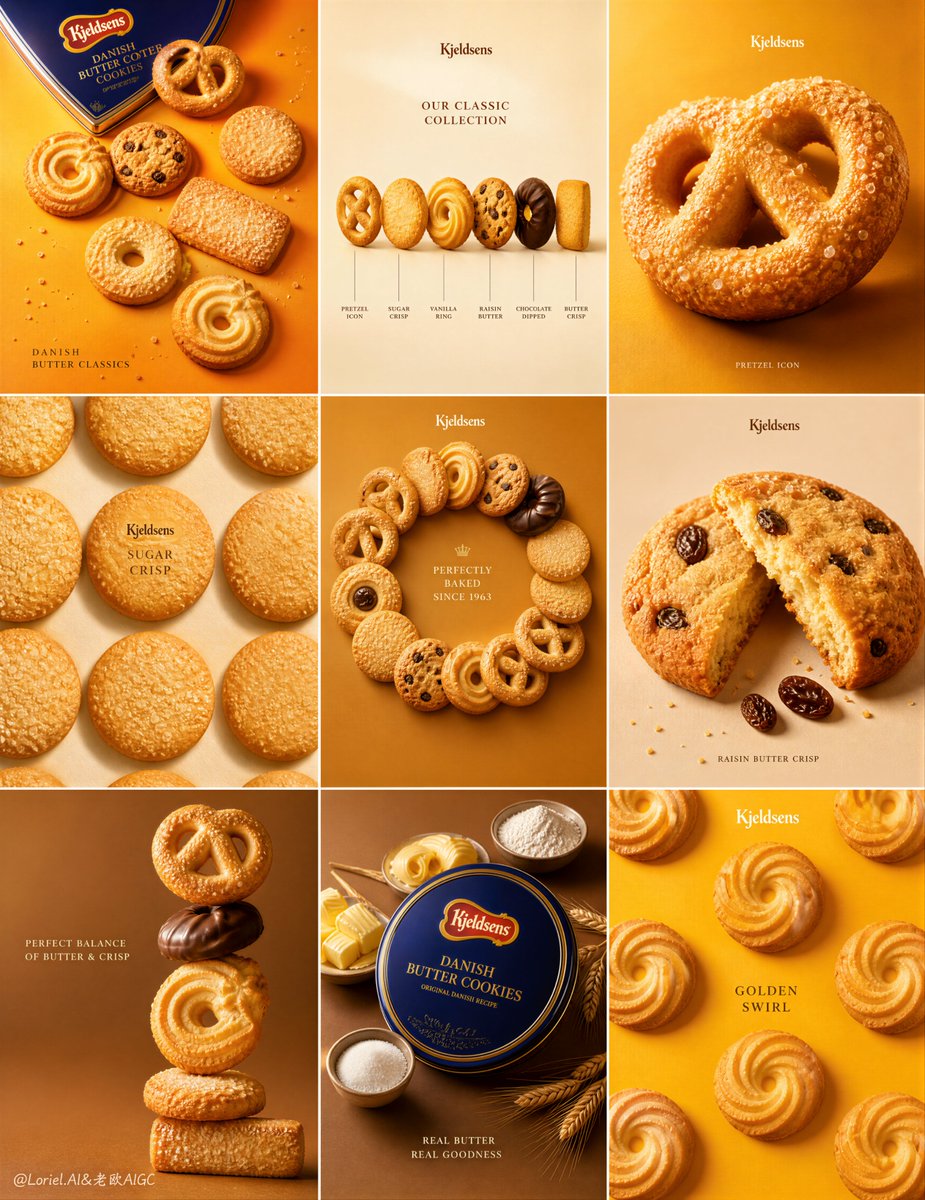
Create an ultra-premium 3x3 campaign poster system for Kjeldsens Danish Butter Cookies, designed as a collector-grade brand advertising board with absolute series unity. The final artwork must use a strict 9-grid layout, each square functioning like one elegant brand tile, with highly realistic cookie products, minimal premium typography, restrained graphic accents, and different refined saturated background color fields. The entire board must feel like a world-class bakery-brand annual advertisement: bright, luxurious, graphic, highly organized, product-dominant, and visually irresistible. Creative direction: Combine Milk Cloud Orbit and Cream Halo Transit. Keep the exact 9-grid campaign skeleton, but intensify the most premium tactile food-light details and reduce non-product distractions. Push cleaner butter reflections, brighter sugar-crystal sparkle, more refined golden baked-edge highlights, and sharper biscuit texture realism. At the same time, reduce the amount of text, linework, and graphic annotation inside each tile so the cookies dominate more fully and the layout feels more elegant, intelligent, and controlled. Core composition: Use a strict 3x3 square grid. Each tile must feel structurally related but not repetitive. Across the 9 panels, present a curated series of Kjeldsens cookie products and product families with a consistent visual system: - product hero centered or slightly offset - minimal premium English typography - subtle official brand/logo area - occasional thin graphic lines, labels, or restrained compositional accents - generous negative space - clean background color blocking The whole 9-grid must feel like one unified premium campaign. Brand direction: This is a Kjeldsens Danish Butter Cookies campaign. Keep the brand unmistakably premium, classic, Danish, giftable, golden, and refined. Use elegant English-only headline and label language. Typography must feel clean, premium, and commercial, never loud or crude. Add minimal official-feeling logo and brand-title treatment where appropriate. Product lineup: Feature a carefully curated set of classic Kjeldsens cookie varieties and related butter-cookie forms, such as: - pretzel butter cookie - round butter cookie with sugar crystals - raisin butter cookie - vanilla ring cookie - chocolate-dipped butter cookie - rectangular crisp butter biscuit - swirl butter cookie - assorted butter-cookie gift-tin presentation - stacked or radial assortment composition Every product must feel consistent with the Kjeldsens world and packaging identity. Tile logic: Create variety across the 9 panels while maintaining series logic: 1. one panel with scattered hero cookies and packaging 2. one panel with lineup comparison or flavor family presentation 3. one panel with one iconic cookie enlarged dramatically 4. one panel with elegant repeated cookie arrangement 5. one panel with multiple cookie varieties arranged in a circular or branching composition 6. one panel with sliced or cross-section cookie details 7. one panel with dynamic stacking or balancing composition 8. one panel with packaging + macro ingredient or texture combination 9. one panel with one large signature cookie shape repeated rhythmically in the background The structure must feel highly designed and playful, but still clean and premium. Food realism: Render every cookie with extreme realism and irresistible tactile detail: golden-brown baked surfaces, butter-rich sheen, sugar sparkle, crumb texture, raisin wrinkling, crisp edges, chocolate gloss, porous baked structure, subtle flour dust, and premium biscuit detail. The cookies must feel dry-crisp, buttery, fragrant, and physically believable. Milk Cloud Orbit food-light logic: This is critical. Purify the most convincing product zones: butter-rich highlights on the surface curves, sugar-crystal sparkle, crisp golden edge bands, and refined baked texture shadows. Each cookie must feel more radiant, more tactile, and more luxury-editorial without becoming greasy or artificial. Cream Halo Transit layout logic: Keep the same 9-grid structure, but reduce the amount of typography and graphic assistance inside each tile. Let the cookies speak more strongly. The remaining text and linework must feel more selective, more premium, and more architecturally integrated. The composition should feel calmer and more brand-confident. Product dominance: The cookies must remain the absolute heroes. Typography, packaging, lines, icons, and playful composition devices must support the products, never overpower them. Every tile should feel like a premium cookie shrine. Background color system: Use minimal different saturated color fields across the 9 tiles, built from a refined bakery palette: warm butter orange, pale cream, toasted gold, soft caramel, muted biscuit beige, vanilla ivory, and occasional deeper honey-brown accents. The backgrounds must feel bright, clean, and premium, with strong graphic contrast against the cookies. Typography and label logic: Use elegant English headings and small product labels only where needed. You may include restrained titles such as: “DANISH BUTTER CLASSICS” “PRETZEL ICON” “ASSORTED SELECTION” “RAISIN BUTTER CRISP” “GOLDEN SWIRL” Keep text minimal, beautifully spaced, and secondary to the products. Avoid over-explaining. Graphic accent logic: Add only subtle premium graphic devices: thin lines, tiny callout labels, mini product identifiers, or very restrained bakery-diagram accents. These should make the board feel intelligently designed, but still minimal. Packaging logic: Where packaging appears, it must feel elegant and premium, with realistic Kjeldsens-style gift-cookie branding. Packaging should support the product family and never dominate the board. Lighting: Use extremely delicate, soft high-end product lighting. Let the baked surfaces glow with refined highlight rolloff, gentle crumb shadows, sugar sparkle, and subtle edge brightness. The lighting must feel luxurious, soft, and premium. Surface and finish: Keep every tile clean, polished, and sharply art-directed. The final board should feel like a museum-grade bakery campaign print, balancing commercial clarity with graphic beauty. Mood: premium, bright, buttery, graphic, clean, elegant, giftable, appetizing, refined, commercial, collector-grade, brand-forward Rendering style: ultra-realistic Kjeldsens Danish Butter Cookies 9-grid campaign poster, premium bakery brand system, multiple cookie varieties, refined saturated backgrounds, reduced typography and graphic clutter, stronger butter highlights and sugar-crystal detail, sharp biscuit realism, elegant commercial lighting, design-annual quality, 8k, world-class image quality Negative prompt: cheap supermarket flyer, cluttered layout, low-detail cookies, fake crumb texture, greasy biscuit surface, generic packaging, too much text, crude fonts, messy composition, cartoon rendering, muddy lighting, low resolution, weak product focus