
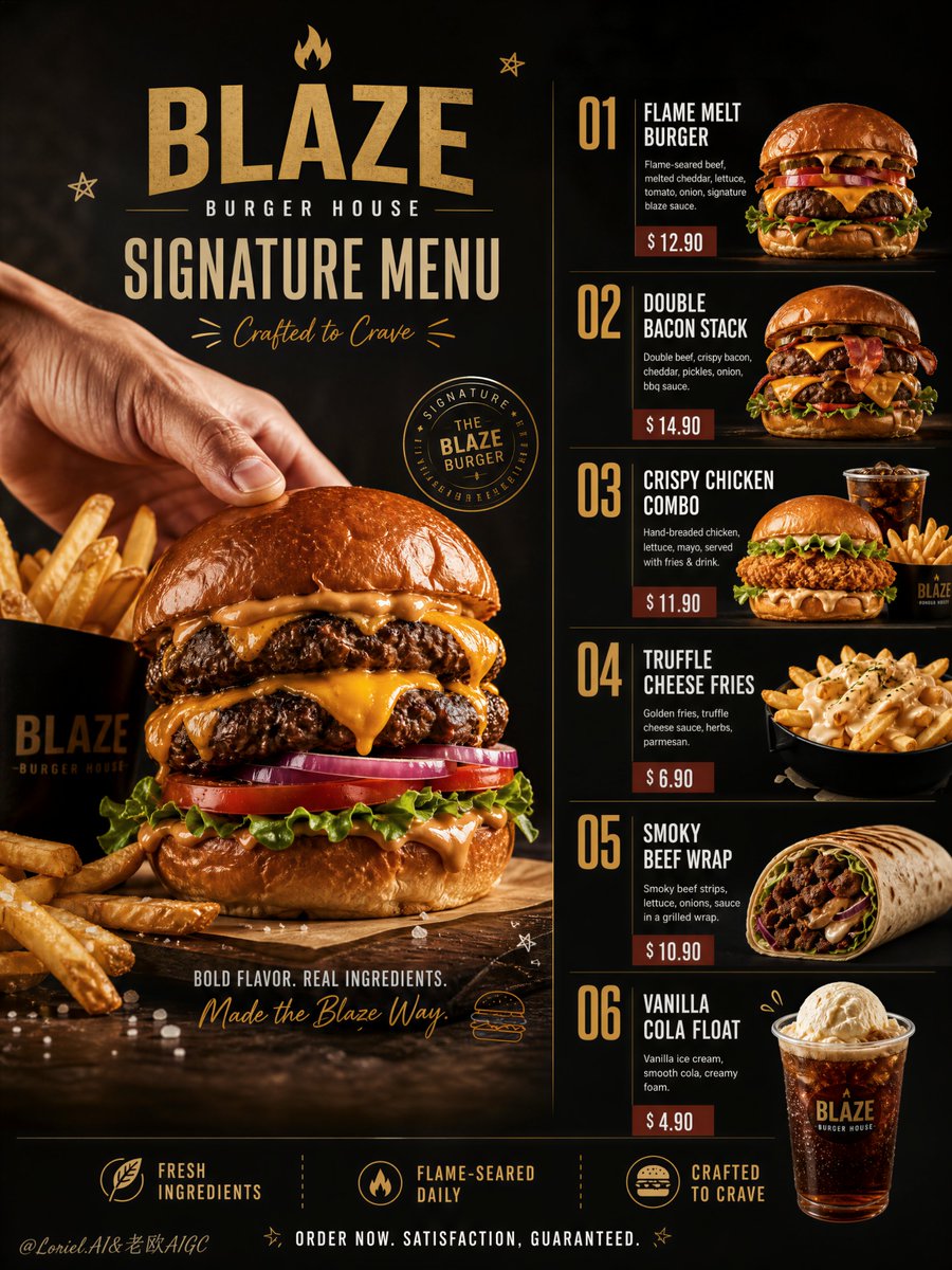
Create an ultra-premium vertical Chinese fast-casual campaign menu poster for a self-created brand called “锅气食堂 WOK CANTEEN”. The final artwork must preserve a strong editorial menu-board structure: a refined left-side typography and pricing system, three large hero Chinese fast-casual dishes stacked vertically on the right, a dark premium background, minimal official brand identity, and only a very small number of restrained playful hand-drawn accents. The overall feeling must be bold, product-dominant, highly organized, and luxurious, but more restrained and premium than a typical lively takeaway poster. Creative direction: Combine Milk Cloud Orbit and Cream Halo Transit, and shift the entire visual system into a more restrained black-gold-sauce-red palette. Reduce noisy excitement, reduce decorative clutter, and make the poster feel calmer, more expensive, more urban, and more internationally polished. The food remains vivid and appetizing, but the design tone becomes tighter, darker, and more brand-controlled. Core layout: Use a tall vertical poster with a premium split composition. Left side: brand logo area, large Chinese brand title with smaller English subtitle, category blocks, short menu descriptions, and clean readable prices. Right side: three large highly realistic Chinese fast-casual dishes stacked vertically, each occupying its own premium visual zone. Use only a few minimal doodle-like arrows, curves, or accent marks to support layout rhythm. Everything must feel clean, structured, premium, and product-first. Brand identity: Create a self-invented modern Chinese fast-casual brand: 锅气食堂 WOK CANTEEN Brand language: urban, contemporary, premium, flavorful, restrained, youthful. Use Chinese main headline and smaller English subtitle. Typography must feel modern, elegant, and highly readable. Add a minimal official logo mark with refined contemporary branding. Menu structure: Create clearly separated category sections on the left such as: 招牌主食 / SIGNATURE MEALS 精选饮品 / DRINKS Use short English descriptions and visible price markers under each item. Keep the text hierarchy clean, premium, and beautifully spaced. Dish system: On the right side, create 3 large hero Chinese fast-casual dishes: 1. Black Pepper Beef Rice Bowl 2. Kung Pao Chicken Set 3. Braised Beef Noodle Bowl Each dish must feel iconic, realistic, premium, and visually distinct. Food realism: Render all dishes with extreme realism and rich tactile detail: glossy stir-fry sauce, juicy beef slices, visible wok-seared edges, chili-oil highlights, fresh scallion moisture, roasted peanuts, lacquered chicken cubes, bright but controlled vegetables, hand-pulled noodle texture, steaming broth, sesame sparkle, and refined ceramic bowl reflections. The food must feel hot, fragrant, fresh, and physically irresistible. Milk Cloud Orbit food-light logic: This is critical. Purify the most craveable details: cleaner sauce highlight bands, sharper beef sear edges, more elegant oil reflections, richer broth gloss, and a more refined steam layer. The dishes must feel luminous in the right places, more premium, and more flagship-like without becoming greasy or loud. Cream Halo Transit hierarchy logic: Keep the same structure, but tighten the relationship between the left-side title, category labels, price lines, and descriptive text. The menu information should feel more integrated into one graphic system. Reduce playful graphic interruption so the layout becomes cleaner, calmer, and more architectural. Color system: Push the poster into a restrained black-gold-sauce-red palette: deep charcoal black, muted black-brown, dark soy red, lacquered sauce red, warm antique gold, and soft cream text accents. Avoid bright orange excitement. The background must feel dark, premium, smooth, and controlled, allowing the food and typography to glow with more sophistication. Hand-drawn graphic logic: Add only a very small number of restrained playful doodles such as hand-drawn arrows, small curved strokes, tiny spark marks, or steam-line accents. These must feel subtle, witty, and premium, never childish or crowded. Typography and pricing: Use Chinese main titles with smaller English subtitles and clean English descriptor lines. Price markers must be modern, readable, and visually integrated into the left-side system. The type must feel premium, urban, and brand-consistent, with excellent spacing and strong hierarchy. Lighting: Use extremely delicate soft commercial food lighting. Let sauces, broth, oils, meats, vegetables, and bowl edges glow with controlled highlights and premium dimensional separation. The lighting must feel warm, polished, and high-end, while still matching the darker restrained palette. Surface and props: Use realistic bowls and plates with minimal supporting props. No clutter. No unnecessary extra ingredients outside the dishes. Every object must support appetite, order, and clarity. Mood: bold, appetizing, urban, premium, restrained, modern, organized, graphic, warm-dark, craveable, fast-casual, high-impact, product-dominant Rendering style: ultra-realistic Chinese fast-casual campaign menu poster, premium vertical menu-board layout, restrained black-gold-sauce-red palette, three large stacked hero dishes, Chinese titles with English subtitles, integrated pricing, minimal doodle accents, refined commercial lighting, 8k, world-class image quality Negative prompt: cheap takeaway flyer, bright noisy orange palette, crowded layout, unreadable text, weak hierarchy, low-detail food, greasy blur, plastic-looking sauce, too many doodles, cartoon rendering, cluttered props, muddy lighting, low resolution, generic menu design