
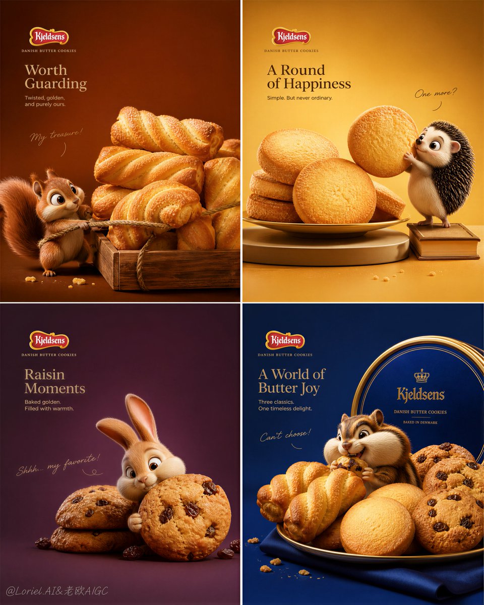
Create an ultra-premium commercial poster for Kjeldsens Danish Butter Cookies in a strict 2x2 four-panel layout, designed as a world-class global luxury cookie campaign. Each panel must feel like a complete premium advertising key visual with one hyper-real cookie product group as the dominant subject, one original adorable 3D cartoon animal character, one elegant humorous interaction, and one distinct saturated color world. The entire campaign must feel luxurious, playful, cinematic, highly polished, and collectible, but now more spacious, more restrained, and more design-driven than a typical snack advertisement. The backgrounds in all four panels must be pulled further open with more negative space, cleaner gradients, and fewer visual distractions. Typography must be more restrained and minimal, supporting the composition rather than dominating it. The cookies must remain the clear hero in every panel. Core layout: Use a strict 2x2 four-panel composition with strong consistency in spacing, margins, scale control, and premium layout rhythm. Each panel must function as its own ad, but together they must form one unified Kjeldsens brand universe. Every panel should include: 1. one hero cookie type or cookie grouping, 2. one 3D cartoon cute animal interacting with the cookies in a humorous but elegant way, 3. minimal official-feeling Kjeldsens logo placement, 4. a more restrained English main headline, 5. a smaller English support line, 6. subtle handwritten accent text used sparingly. The cookies must remain visually dominant in every panel, while the animals serve as emotional amplifiers and storytelling accents. Milk Cloud Orbit + Cream Halo Transit direction: Push the strongest established qualities further: larger and more premium cookie presence, cleaner and more refined interaction logic, more breathing room in the backgrounds, and more restraint in the text system. Keep the same four-panel skeleton, but refine the animal-cookie relationships so they feel smarter, more characterful, and more brand-elevated. Replace broad playful clutter with fewer, stronger storytelling gestures. Let the cookies occupy more visual authority, and let the animal actions feel like a clever narrative moment discovered inside a luxury layout. The result should feel calmer, richer, more iconic, and more globally premium. Brand and product focus: Center the campaign on Kjeldsens Danish Butter Cookies with three main cookie varieties clearly represented across the four panels: twisted butter cookies, round butter cookies, and raisin cookies. One panel may use a mixed cookie composition to complete the rhythm. The cookies must feel extremely real, golden, buttery, crisp, fragrant, and premium, with visible baked texture, crumb detail, delicate browned edges, and irresistible surface realism. They must feel unmistakably like luxury Danish butter cookies. Panel 1, twisted butter cookies: Feature a premium arrangement of twisted butter cookies as the hero product, larger and more dominant than before. Pair them with an original 3D squirrel character in a clever protective or tugging interaction, as if the squirrel is desperately guarding a precious cookie stash. The squirrel should support the scene emotionally but never dominate the cookies. Use a warm chestnut-caramel saturated background with more open empty space. Add only a restrained English headline, a smaller support line, minimal handwritten accent text, and subtle logo placement. Panel 2, round butter cookies: Feature a hero arrangement of round butter cookies, presented on a minimal tray, pedestal, or refined stacked display. Pair them with a cute 3D hedgehog character reaching, balancing, or carefully inspecting one cookie in a way that feels charming and highly art-directed. The round cookies must remain the visual center. Use a honey-gold or creamy warm background with more breathing room and less layout density. Typography should be elegant and minimal. Panel 3, raisin cookies: Feature a hero composition of raisin cookies with strong baked realism, visible raisins, crumb richness, and artisanal warmth. Pair them with a playful 3D rabbit or hamster character in a smart, slightly sneaky interaction, such as hugging, presenting, or quietly guarding a cookie. Use a raisin-plum or cocoa-brown saturated background with open negative space and restrained text. Keep the scene premium, warm, and product-led. Panel 4, mixed Kjeldsens assortment: Feature a mixed hero arrangement of twisted cookies, round cookies, and raisin cookies together as the brand closure panel, possibly displayed beside a luxurious Kjeldsens tin or elegant serving box. Pair them with a fourth original 3D cartoon animal, such as a chipmunk-like character joyfully overwhelmed or secretly hiding among the cookie abundance. This panel should feel like the richest product statement, but still highly organized and spacious. Use a signature royal blue or deep biscuit-gold brand world with controlled typography and more empty background space. 3D character rendering: The animals must be rendered in a high-end animated 3D style with premium fur simulation, realistic contact shadows, believable material response, expressive eyes, and cinematic pose design. They should feel like top-tier animation studio characters, not cheap mascots. Their expressions must be funny, lovable, and instantly readable, but their purpose is to elevate the cookie story, not compete with the product. Cookie realism: Render the cookies with obsessive realism and premium food-advertising fidelity. Show buttery baked surfaces, golden-brown edges, tiny cracks, delicate crumb texture, real raisin embedding, subtle sugar sparkle, and natural imperfections. Use crumbs sparingly and strategically. The cookies must feel warm, crisp, fragrant, and irresistible, like high-end luxury food photography. Supporting elements: Use restrained supporting details only: a few cookie crumbs, tiny broken cookie fragments, minimal soft dust, elegant small trays or mini crates, gentle rope details if needed, and carefully placed fragments. Remove clutter. Every element must feel intentional, premium, and compositionally necessary. Lighting: Use extremely delicate, soft, premium commercial lighting with cinematic polish. The light must flatter both cookies and animals: buttery highlights on cookie edges, soft sheen on raisins, velvety fur lighting, and elegant grounding shadows. The lighting should feel warm, luxurious, and controlled, never harsh and never flat. Background and color system: Each panel must use its own distinct saturated minimalist background color while staying within one coherent luxury cookie palette: 1. warm chestnut caramel, 2. honey gold cream, 3. raisin plum brown, 4. royal blue with biscuit gold accents. The backgrounds must be cleaner, more open, and more spacious than before, with subtle gradients, soft vignette depth, and a strong sense of luxury negative space. Typography and branding: Use a restrained premium text system. Add a smaller English main headline, refined English support text, very limited handwritten accent text, and subtle official-feeling Kjeldsens logo placement. Typography must feel artistic, elegant, and spatially integrated into the layout. Reduce the overall text footprint so the composition feels more elevated and less commercial-heavy. Mood: playful, luxurious, appetizing, premium, collectible, cinematic, charming, tactile, warm, elegant, high-end, brand-driven, whimsical, restrained Rendering style: ultra-premium Kjeldsens Danish Butter Cookies campaign, strict 2x2 four-panel poster, hyper-real cookie photography realism, four original cute 3D cartoon animals, more open saturated minimalist backgrounds, restrained premium typography, subtle official logo placement, cinematic commercial lighting, world-class food advertising aesthetic, top-tier animation character rendering, 8k, collector-grade image quality Negative prompt: cheap cartoon mascot, low-detail cookies, generic biscuits, cluttered composition, weak product focus, childish toy style, plastic-looking fur, oversized typography, noisy background, cheap snack ad style, flat lighting, too many props, chaotic crumbs, low-resolution details, overcrowded layout