
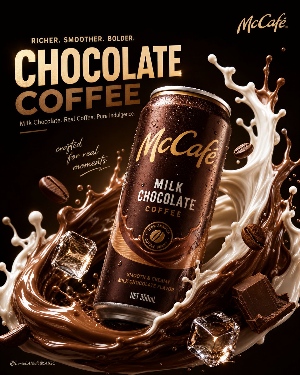
Create an ultra-premium commercial poster for McCafé, featuring a hyper-realistic 350ml canned milk chocolate coffee drink as the absolute hero product, designed with the exact structural logic of a bold global beverage campaign. The composition must center on one dominant can placed in the middle or slightly upper-middle area of the frame, with a subtle dynamic tilt for presence and energy. Around the can, build an elegant semi-enveloping explosion of creamy milk and rich milk-chocolate coffee liquid, forming a sculptural wrapping motion that partially embraces the product without obscuring its branding. The final image must feel bold, indulgent, saturated, luxurious, hyper-real, and highly collectible, while also feeling more refined, more controlled, and more brand-expensive than a typical canned beverage advertisement. Add strong English headline typography, a refined English support line, minimal handwritten artistic accent text, and a discreet official-feeling McCafé logo placement. Core composition: Use a hero-centered composition with one 350ml can as the unmistakable focal point. The can should be large, dominant, and highly readable, positioned front and center with a slight dynamic angle. The splash system must rise and arc around the can in a semi-halo structure, creating a sense of liquid energy wrapping the product from below and the sides. The liquid should reinforce the can silhouette, not bury it. Supporting elements such as floating coffee beans, ice cubes, and flavor accents must be reduced in quantity and placed more strategically, so the composition feels more premium, less crowded, and more art-directed. The final balance must feel explosive but controlled, dramatic yet elegant. Milk Cloud Orbit + Cream Halo Transit direction: Push the strongest existing qualities further: make the can more dominant, the liquid structure more sculptural, the flavor identity more immediate, and the lighting more luxurious. Keep the same hero-can skeleton, but refine and replace part of the supporting composition so the poster feels cleaner and more elevated. The splash should become the second main protagonist after the can, with richer form, stronger flow direction, better silhouette framing, and more premium control. Reduce any decorative excess and let fewer, sharper elements do more work. The result should feel more iconic, more global-brand, and more like a flagship campaign key visual. Product design and realism: Render the McCafé 350ml milk chocolate flavor can with extreme realism and premium commercial fidelity. The can must feel like an official branded product with accurate cylindrical form, realistic aluminum texture, subtle condensation, fine surface reflections, premium label sharpness, and high-end print realism. The product branding should feel crisp, official, and globally polished. The can should visually communicate chilled indulgence, coffee richness, and creamy milk-chocolate flavor. Every edge, highlight, droplet, and printed area must feel physically correct and advertising-grade. Liquid behavior: Use a dual liquid system of rich milk-chocolate coffee and creamy white milk, both rendered with world-class physical fluid realism. The chocolate-coffee liquid should feel deep, silky, glossy, and luxurious, with warm brown density, smooth viscosity, and appetizing tonal depth. The milk should feel creamy, luminous, soft, and slightly lighter in motion, creating elegant contrast. The two liquids should collide and twist around the can in a more refined and sculptural way than a chaotic splash, forming arcs, sheets, droplets, and semi-transparent stretched forms that feel physically believable and visually expensive. The splash should partially wrap the can like a liquid crown or orbit, enhancing product dominance instead of competing with it. Chocolate and coffee flavor identity: Strengthen the milk chocolate identity through restrained but highly intentional accents. Introduce subtle premium chocolate cues such as elegant chocolate shards, soft cocoa richness, or minimal broken chocolate planes integrated into the splash world. Keep them sparse and well-placed. Floating roasted coffee beans should remain a clear flavor signifier, rendered with rich oil sheen, sharp cracks, realistic roast depth, and tactile detail. The overall flavor impression must instantly communicate creamy milk, chocolate indulgence, and coffee energy. Supporting elements: Reduce the number of supporting elements and place them more precisely. Use only a few highly realistic ice cubes with crisp glass-like refraction, internal fractures, cold transparency, and delicate condensation. Use a restrained number of floating coffee beans and droplets at key depth points to support motion and appetite appeal. Avoid overcrowding the frame with unnecessary ingredients. Every element must feel deliberate, premium, and compositionally necessary. Background: Keep the background extremely minimal and premium, built from deep espresso black, dark chocolate brown, and subtle warm vignette glow. Remove any unnecessary environmental complexity. The background should feel like a luxurious dark studio void that allows the product and splash to dominate with maximum impact. Let the darkness support bold saturation and strong highlight contrast. Color direction: Use a rich, saturated premium palette built from deep coffee brown, chocolate brown, creamy milk white, golden caramel highlights, espresso black, and subtle warm metallic reflections. The image must feel indulgent, warm, powerful, and highly appetizing, with bold flavor color balanced by controlled darkness and elegant empty space. Lighting: Use extremely delicate yet dramatic premium commercial lighting. The highlights should sculpt the can, liquid arcs, droplets, beans, and ice with cinematic precision. The milk should glow softly, the chocolate-coffee liquid should have glossy density, and the can should feel cold, tactile, and beautifully illuminated. The lighting must feel luxurious, controlled, and globally polished, never harsh, never flat, never cheap. Typography and graphic design: Follow the logic of a bold international beverage campaign. Use a large English main headline in the upper area, a refined smaller English descriptive line, minimal handwritten artistic accent text, and discreet official-feeling McCafé logo placement. Typography must feel bold, premium, modern, and spatially balanced. It should work with the product and splash structure instead of competing with them. The overall graphic design should feel like a flagship global canned beverage launch poster. Mood: bold, indulgent, premium, rich, chilled, energetic, sculptural, saturated, luxurious, collectible, high-end, irresistible Rendering style: ultra-premium McCafé ready-to-drink coffee campaign, hyper-real 350ml can hero product, sculptural milk and chocolate-coffee liquid splash partially wrapping the can, restrained coffee beans and glassy ice accents, minimal deep dark background, bold English headline, handwritten accent text, official logo placement, soft cinematic commercial lighting, world-class beverage advertising aesthetic, 8k, collector-grade image quality Negative prompt: cheap canned coffee ad, cluttered composition, weak product focus, muddy liquid, fake splash, too many ingredients, fruit elements, low-detail can, plastic-looking metal, oversized logo, ugly typography, cartoon drink, noisy background, chaotic droplets, amateur fast-food poster style, low-resolution details