
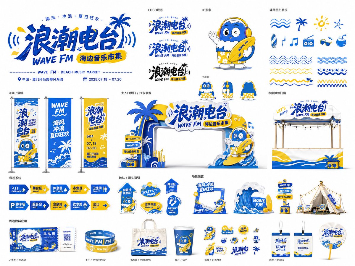
Based on [Theme: ____], [Brand / Event name: ____] and [Industry / Scenario: ____], create a highly polished "Event Visual Identity Application Board." This is not a single poster nor a simple logo, but a complete brand visual system unfolded around the event theme. The image should look like the visual-application overview page a professional design studio presents to a client, concentratedly showing the full extension of the event — from the key visual, logo, IP character and auxiliary graphics, to offline spatial materials, wayfinding system, merch stickers and scene installations. [Overall positioning] Design [Brand / Event name] as a strongly recognizable event visual system, suitable for offline events, festival markets, brand pop-ups, commercial spaces, cultural-tourism activities or urban public events within [Industry / Scenario]. The whole should carry a strong sense of brand, festivity, youthfulness, spatial feasibility and visual unity. [Format and presentation] Aspect ratio: [4:3 landscape]. Present as a single brand visual system board. A [pure white background, easy to cut out] is recommended, so each material module is laid out clearly like a portfolio. Show multiple application modules of different sizes and functions, not just one key visual. [Core visual system] Automatically build a unified visual language around the [Theme], including: 1. Main logo / main title — a striking [Brand / Event name] title; a strongly designed typeface combining geometric distortion, hand-drawn feel, thick outline, graphic interlock or theme symbols; may add an English subtitle, date, location, slogan; the logo should extend onto gateways, posters, stickers, wayfinding boards, etc. 2. Auxiliary graphics system — generate auxiliary symbols per the [Theme]: lines, ripples, geometric blocks, icons, arrows, flowers, stars, light rays, theme patterns, sticker borders; all consistent with the key visual, never chaotic decoration. 3. IP character / mascot / theme figure — design one or more cute, trendy, shareable IP characters per the [Theme]; can be people, animals, anthropomorphized objects or mascots; able to appear on various materials (gateway, flags, stickers, wayfinding boards, check-in installations); style consistent with the whole, highly recognizable and likeable. [Material application showcase] Within the same image, show a complete event material system including several of: 1. large key-visual logo or entrance installation; 2. event gateway / arch / check-in installation; 3. booth fascia / pop-up stall / market stall; 4. road flags / hanging flags / vertical banners; 5. wayfinding system (entrance, rest area, parking, toilet, stage, service desk, etc.); 6. sticker system / social-media stickers / small icons; 7. floor wayfinding / arrows / functional signage; 8. scene installations (camping area, lounge, product display, interactive photo zone); 9. merchandise (wristband, ticket, bag, card, cup, badge, sign, etc.). These should not stand isolated but form a complete brand design system expressing "same theme, same color, same graphic language, different application scenarios." [Color and style] Main color: [e.g., ocean blue, sunny yellow, pure white, black]. Auxiliary colors: [e.g., pink, orange, green, light gray]. Overall style: [e.g., young-trendy, festive-energetic, beach summer, urban culture-tourism, family-cute, tech-future, outdoor camping, retro market]. Color requirements: high recognition, clear color blocks, strong contrast, suitable for offline materials; avoid dark, dirty, low-saturation tones; keep a unified brand order between colors. [Composition and layout] Use a "multi-module brand system board" composition. Do not make a single poster or just one logo. Arrange the materials in an orderly yet dynamic way for a professional board effect. Suggested layout: top shows the main logo and a large entrance installation; left shows large flags, vertical banners or visual extensions; center shows core applications like gateway, booth, wayfinding boards; right shows scene installations, stickers, merch icons; bottom shows arrows, functional wayfinding, small materials and auxiliary graphics. Keep clear whitespace, hierarchy and visual rhythm. Each module should look like a real, deployable event material, not a random collage. [Materiality and feasibility] Give some materials real offline-application texture: acrylic standee, PVC board, printed banner cloth, metal stand, fabric flag, floor decal, display rack, 3D letters, sticker white border, booth fascia, outdoor installation. The whole can stay in flat illustration style but convey "manufacturable, deployable, installable" event material feel. [Text handling] The image may contain a little clear text: [Brand / Event name], [Location], [Date], [English subtitle], [slogan], and functional wayfinding text such as Entrance, Rest Area, Market, Parking, Toilet. Text should blend in as a design element, not be densely packed. If the model cannot stably generate accurate text, prioritize layout structure, logo feel and the integrity of the visual system. [Final effect] The final image should look like a complete brand visual system portfolio page, with: a professional design-proposal feel, a complete brand identity system, unified graphic language, rich offline material applications, strong event atmosphere, high commercial feasibility, suitable for series expansion. Avoid: generating only a single poster, only a logo, inconsistent styles across materials, overly chaotic elements, missing application scenarios, missing wayfinding and spatial feasibility, and excessive text that clutters the image.